- Item Name : Truelysell - Service Marketplace, Service Provider List Template
- Item Version : v2.4.7
- Author : Dreams Technologies
- Support via email: [email protected]
- Support via codecanyon: Take me there
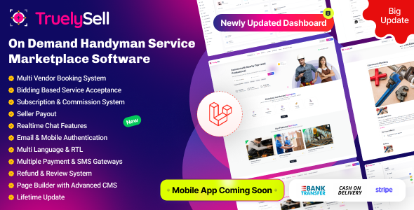
 Truelysell - Service Marketplace, Service Provider List Template
Truelysell provides a multiple on-demand serice based boostrap html template. Truelysell template built into LTR format for all regional Suppport.
composer install
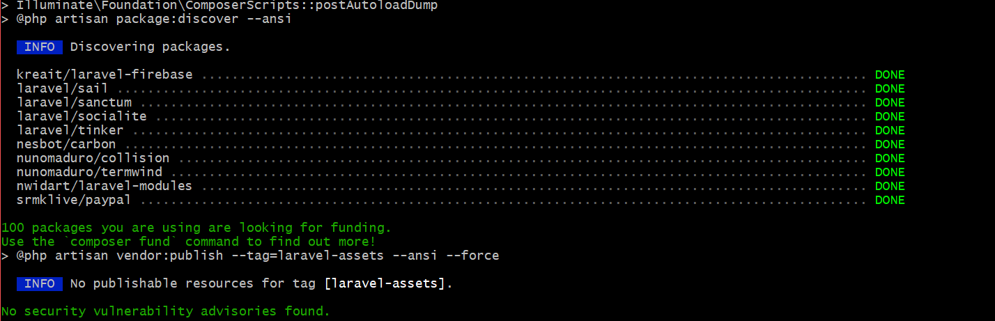
Description:
Installs all the dependencies listed in the composer.json file. This command is used when setting up a project for the first time or when a team member clones the repository.
Purpose:
Ensures all necessary PHP packages required for the Laravel application are downloaded and installed in the vendor directory.
Composer update (If you already have a vendor file. You can use this command.)
Description:
Updates all installed dependencies to the latest versions allowed by the constraints defined in the composer.json file. Use this when you want to bring packages up to date while staying within specified version ranges.
Purpose:
Keeps the project dependencies updated and ensures compatibility with the latest versions.
php artisan storage:link
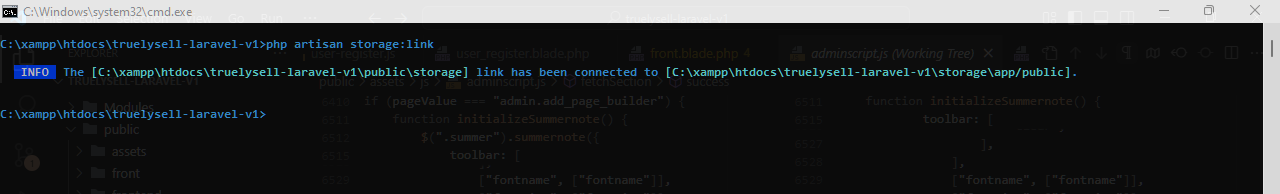
Description:
The php artisan storage:link command creates a symbolic link from public/storage to storage/app/public, making files in the storage folder accessible via a public URL.
php artisan serve
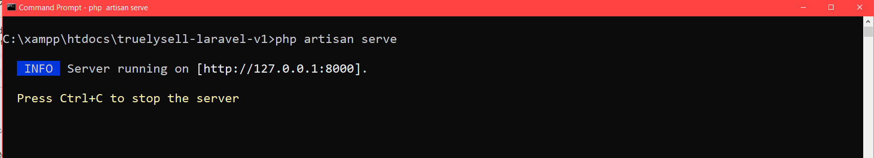
Description:
Starts a built-in development server for running the Laravel application locally. No need for an external web server like Apache or Nginx during development.
Purpose:
Simplifies testing and development by providing a quick way to host the application locally.
php artisan cache:clear
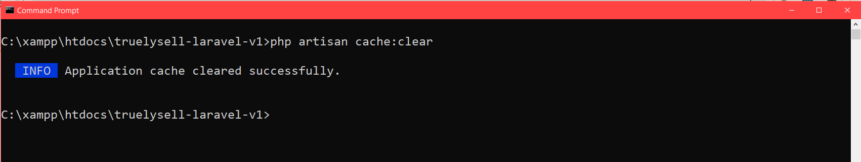
Clears all application caches, including data cached via the cache() helper or Cache facade.
php artisan config:clear
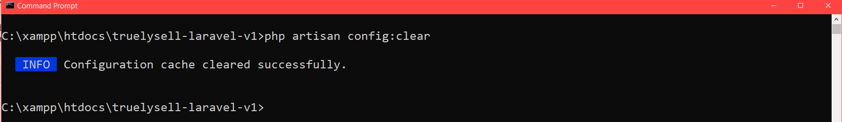
Clears the configuration cache, ensuring that updates to .env or config files take effect.
php artisan route:clear
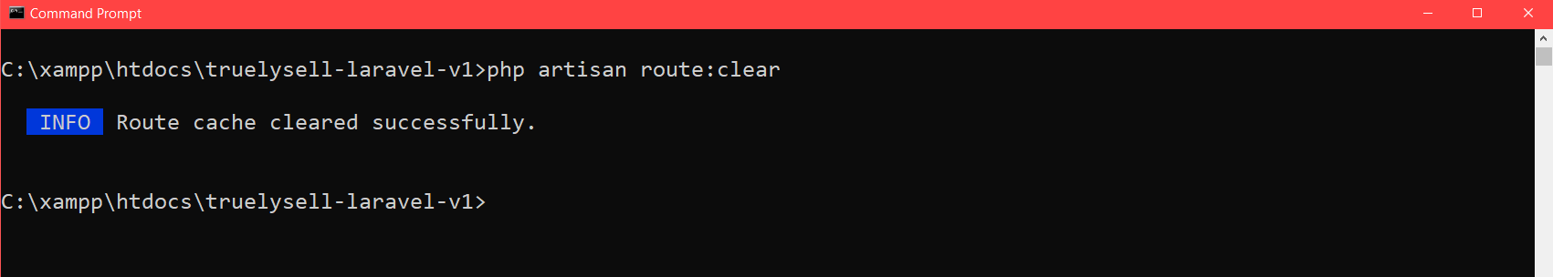
Removes the cached routes to reflect new or updated routes in the application.
php artisan view:clear
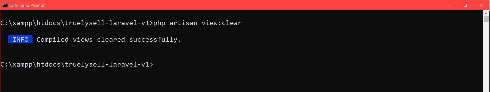
Clears compiled Blade templates, forcing the framework to regenerate them.
Verification
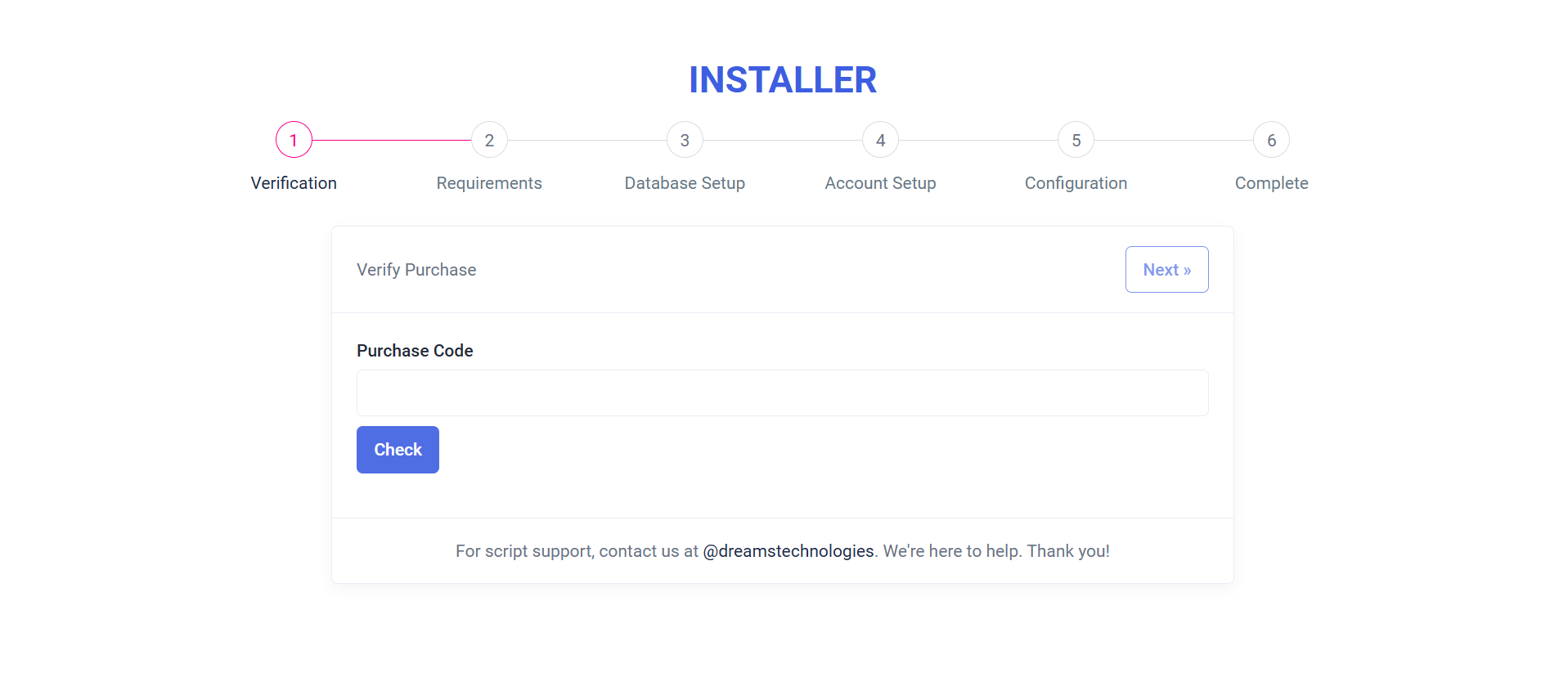
Purpose:
The "Verify Purchase" form ensures the legitimacy of the installation by validating the purchase code. It also facilitates a smooth installation process by allowing demo mode users to bypass verification, ensuring flexibility for testing and development environments.
Layout:
The form features a clean and intuitive design with a heading, an input field for the purchase code, and action buttons ("Check" and "Continue"). Clear messages guide users, and a loading spinner appears during verification for visual feedback. A footer provides support information for additional assistance.
Responsive Design:
Built with Bootstrap classes, the form is fully responsive, ensuring an optimal user experience across all devices, including desktops, tablets, and mobile screens.
Requirements
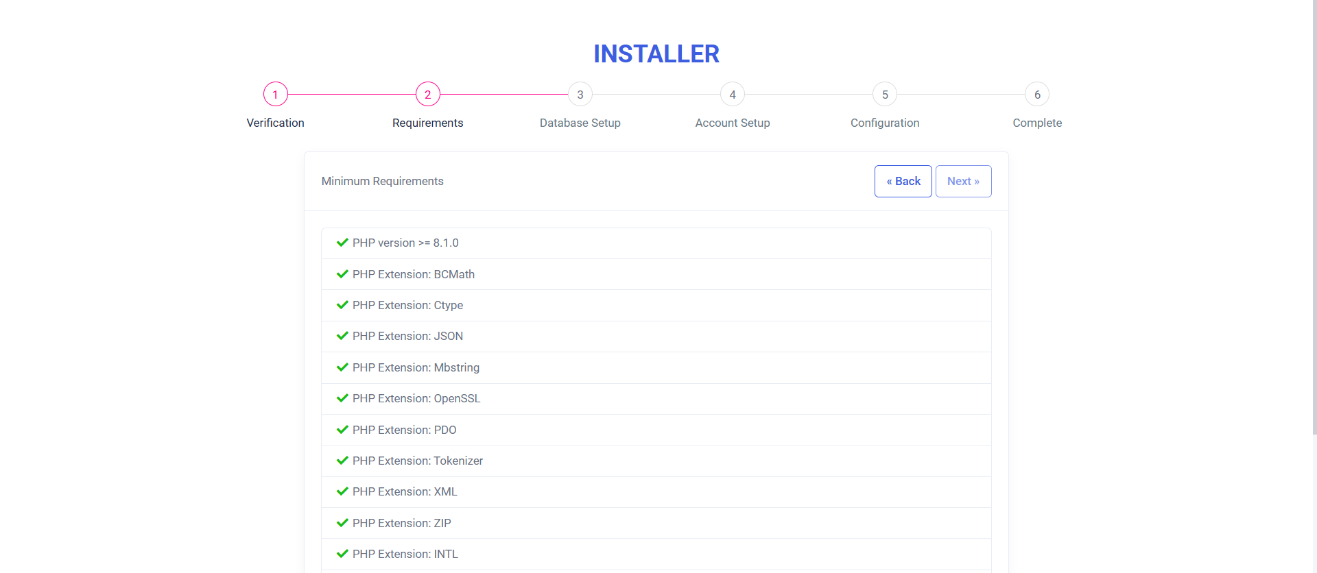
Purpose:
The "Minimum Requirements" form verifies system compatibility by checking PHP version, required extensions, and file permissions. It ensures all prerequisites are met before proceeding with the installation, guiding users to resolve missing components.
Layout:
The form presents a clean, user-friendly list of checks with indicators: green checkmarks for passed items and red icons with informative messages for failures. Each failed check includes optional links for further assistance. Navigation buttons allow users to go back or proceed if all checks are successful.The form presents a clean, user-friendly list of checks with indicators: green checkmarks for passed items and red icons with informative messages for failures. Each failed check includes optional links for further assistance. Navigation buttons allow users to go back or proceed if all checks are successful.
Responsive Design:
Utilizing Bootstrap, the form adapts seamlessly across devices, ensuring an optimal experience on desktops, tablets, and mobile screens.
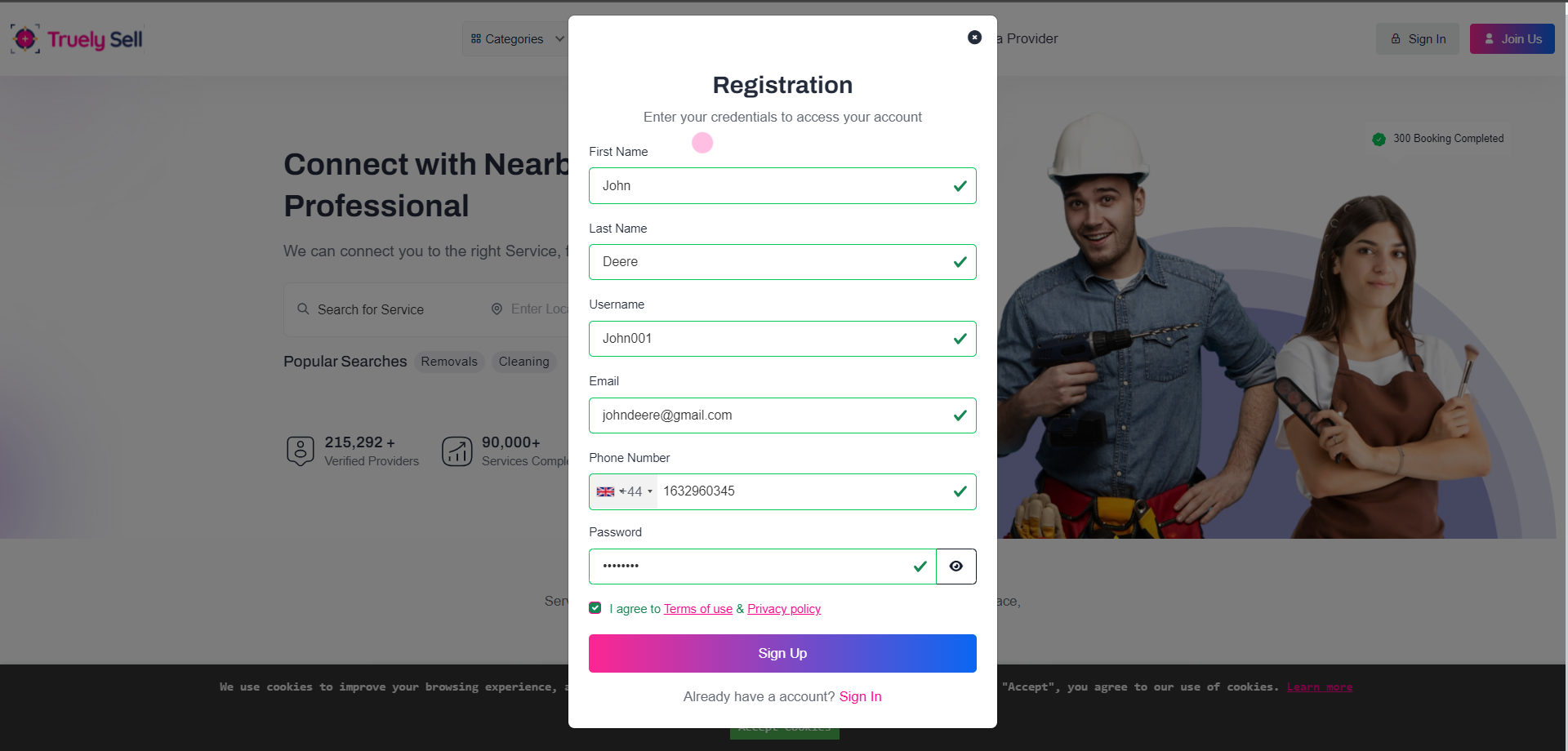
Where users can register:
Registration page (accessible via "Sign Up" button/link on the homepage or navigation menu).
Fields required in the registration form:
First Name (required)
Last Name (required)
Username (required)
Email Address (required, must be unique)
Password (required)
Phone Number (required)
Terms and Conditions Agreement
Privacy Policy Agreement
User Registration Flow with Email and SMS OTP Verification (Optional).
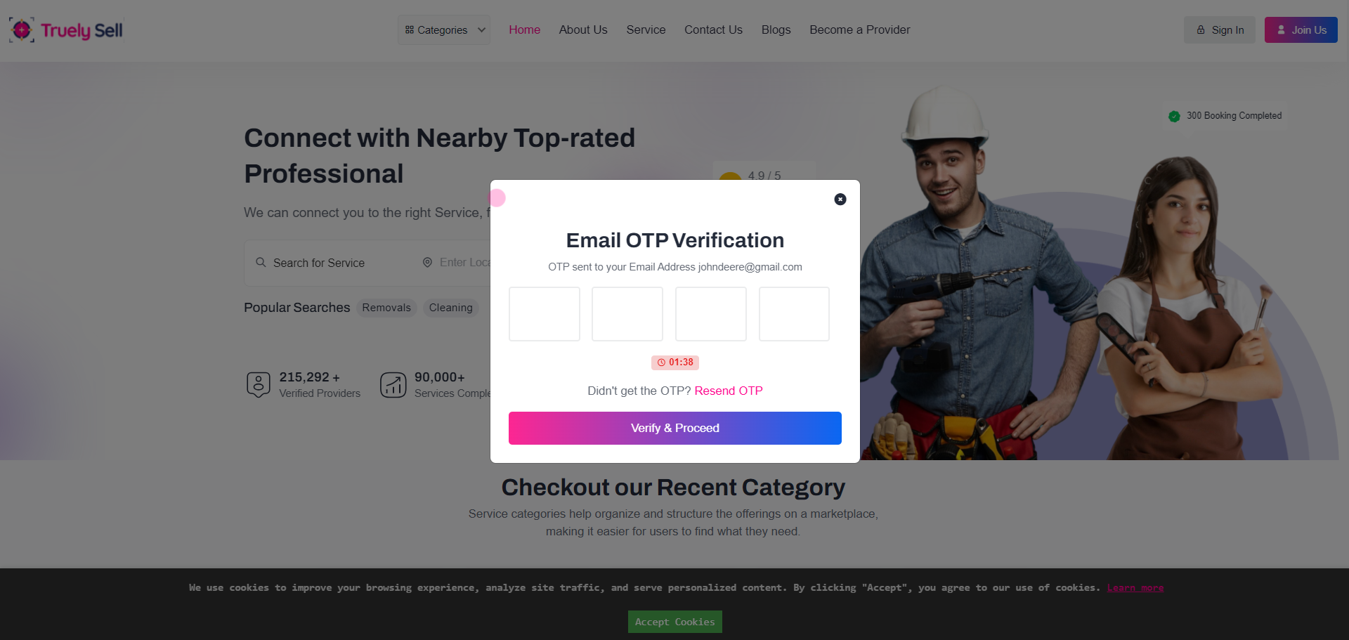
Upon form submission, generate and send:
Email OTP: A random 4 to 6-digit numeric code sent to the provided email address.
SMS OTP: A random 4 to 6-digit numeric code sent to the provided phone number.
Allow users to resend OTP if expired.
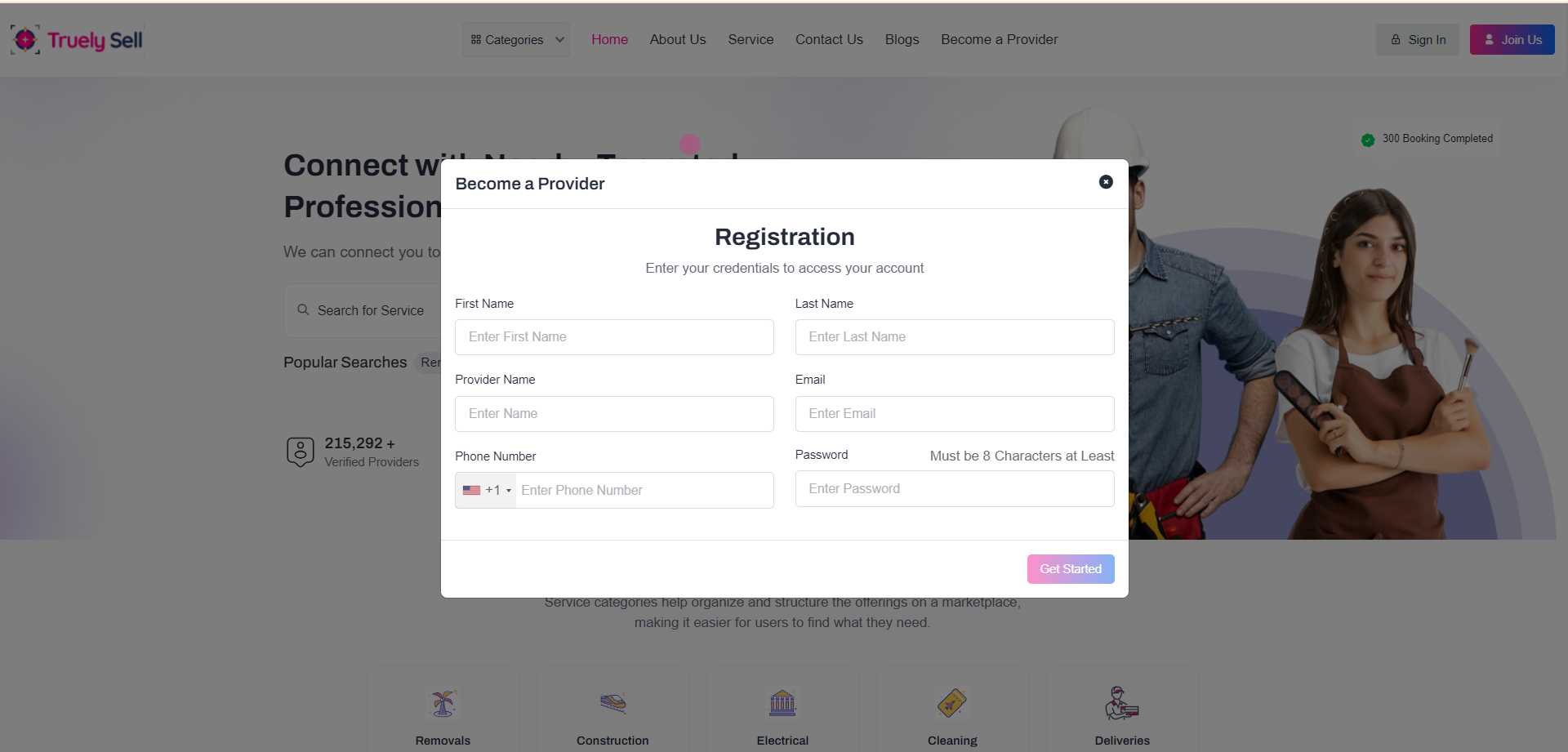
Overview
The Provider Registration form allows new providers to create an account and list their services.
This documentation outlines the steps, field details, and user flow for successful registration.
The registration form consists of two fieldsets:
First Fieldset - Basic personal and account details.
Second Fieldset - Service and company details.
User Flow
Step 1: Enter basic details in the first fieldset and click Get Started.
If any field is invalid, error messages are displayed below the respective fields.
Step 2: Select a service category and sub-services in the second fieldset.
Choose a user type (Individual or Company). If Company is selected, additional fields appear for company details.
Step 3: Agree to the terms and policies and click Sign Up.
Technical Notes
CSRF token is included for security.
Use AJAX to validate fields dynamically and enhance user experience.
Ensure responsiveness for mobile and desktop devices.
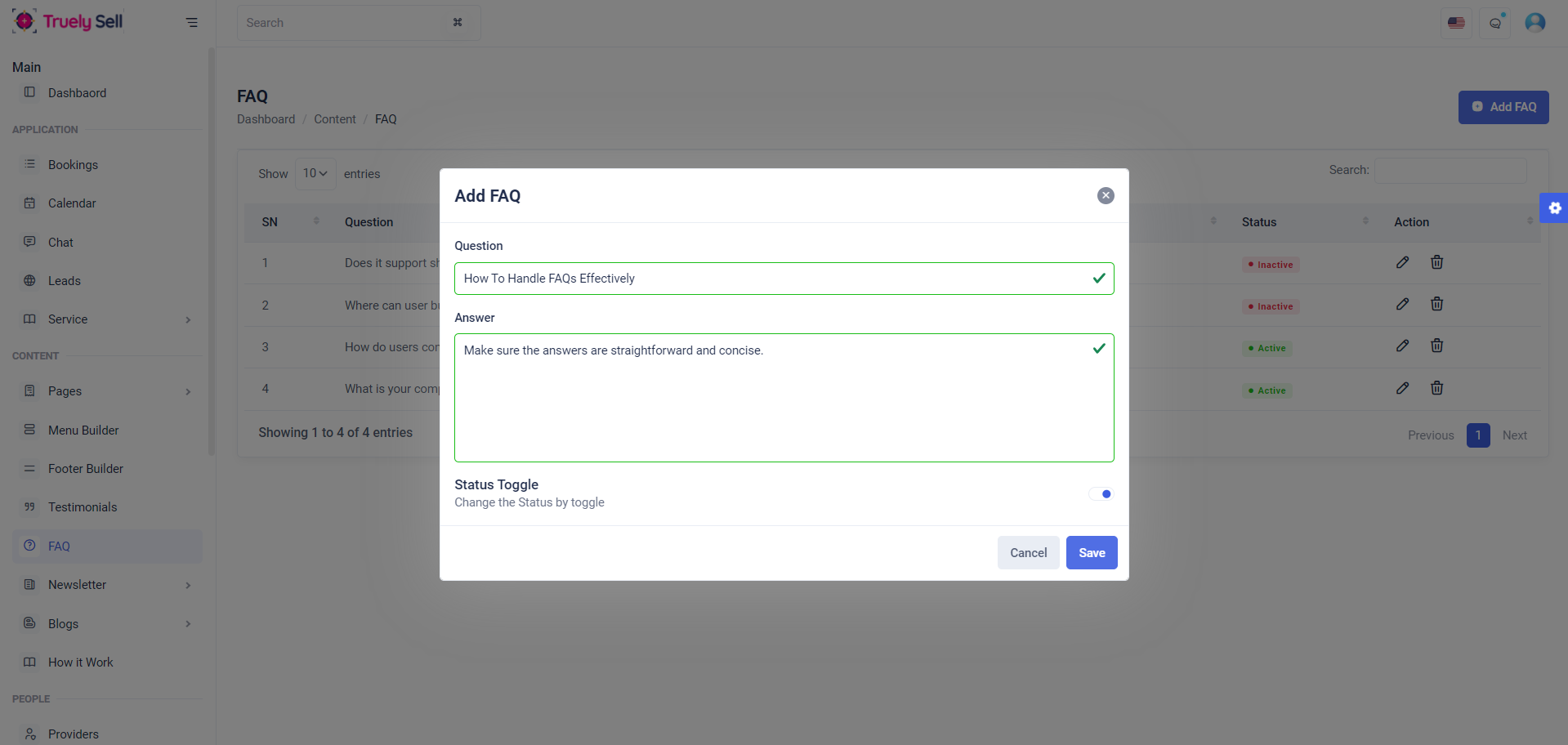
Overview
The FAQ module allows administrators or users to manage frequently asked questions, including adding, editing, viewing, and updating the status of FAQs. This document outlines the features, structure, and user flow for managing FAQs effectively.
Features
Add FAQ:
Admins can create new FAQ entries by providing a question, an answer, and a status (active/inactive).
Edit FAQ:
Modify existing FAQ entries, including updating the question, answer, or status.
Delete FAQ:
Remove outdated or irrelevant FAQs.
Status Toggle:
Enable or disable FAQs dynamically.
Search and Filter:
Search FAQs by keywords and filter by status.
Responsive Interface:
User-friendly design compatible with multiple devices.
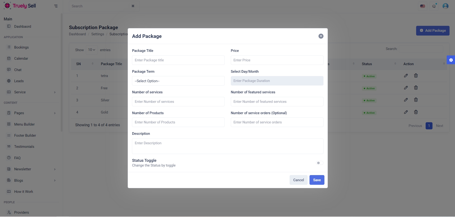
Overview
The Add Subscription Package Form is designed for creating subscription packages with various configurable options such as title, pricing, duration, number of services, products, and additional attributes. It includes validation, status toggling, and dynamic input handling for different subscription terms.
Subscription Form Fields with Info:
Package Title
Input field for the subscription package name.
Price
Input field to specify the price of the package.
Package Term
Dropdown to select the term type (e.g., Day, Month, Yearly, Lifetime).
Package Duration
Input field to define the duration based on the selected term (number of days or months).
Number of Services
Input field to set the number of services included in the package.
Number of Featured Services
Input field to specify the count of featured services.
Number of Products
Input field to indicate the number of products allowed.
Number of Service Orders (Optional)
Input field for specifying the maximum number of service orders.
Description
Textarea for adding a description of the subscription package.
Status Toggle
Checkbox toggle to enable or disable the package status.
Conclusion:
The Add Subscription Form provides essential fields for creating or updating subscription packages, including details like title, pricing, duration, service limits, and a status toggle. This structure ensures a straightforward and efficient way to manage subscription plans.
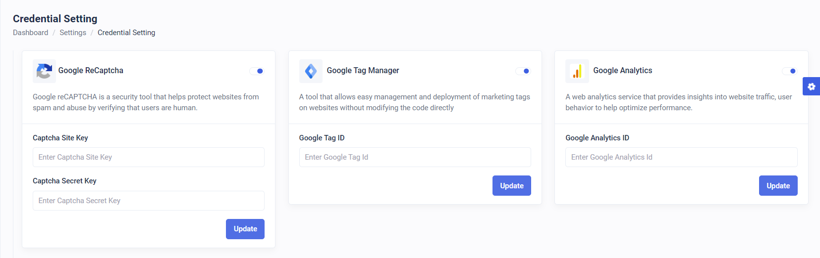
Description of Features:
1. Google reCAPTCHA:
A security tool designed to protect websites from spam and abuse by distinguishing humans from bots.
Allows users to enable/disable reCAPTCHA and input the Site Key and Secret Key.
2. Google Tag Manager:
A management tool for deploying and managing marketing tags on a website without altering the code.
Provides a toggle to enable/disable and a field to input the Tag ID.
3. Google Analytics:
A web analytics service to track and analyze website traffic and user behavior.
Includes a toggle for enabling/disabling analytics and a field to input the Analytics ID.
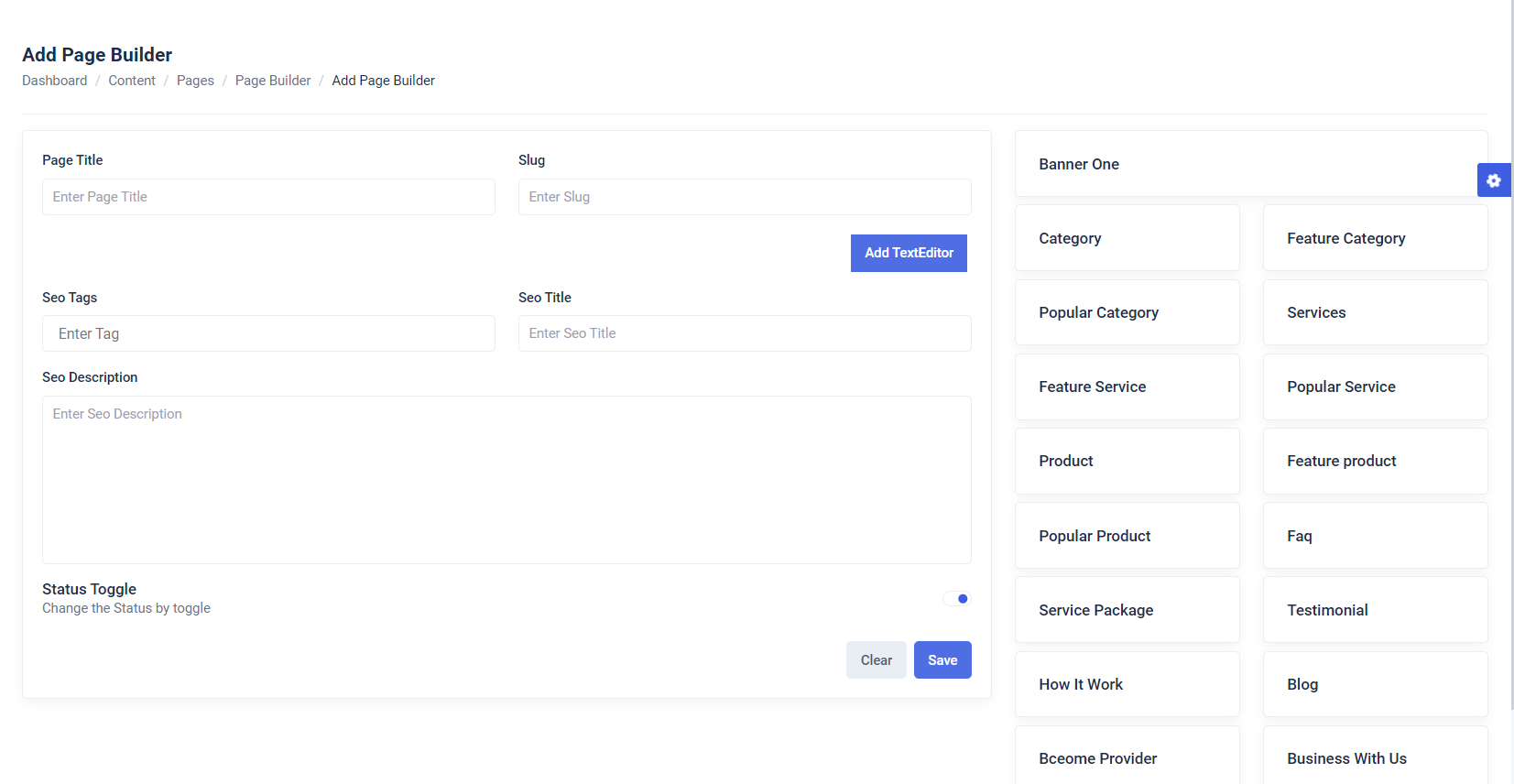
Overview
The Page Builder Form is a dynamic feature designed for creating and customizing pages with various input fields and functionalities. It provides users with an easy-to-use interface to add content, manage SEO metadata, and toggle the page's status.
Page Title and Slug Management
Input fields for the page title and slug allow the user to define the page's name and URL-friendly identifier.
Validation feedback for both fields ensures data accuracy.
Dynamic Content Editing
Includes a Text Editor section where users can add multiple content areas dynamically by clicking the "Add TextEditor" button.
SEO Metadata Management
Fields for SEO Title, SEO Tags, and SEO Description allow users to optimize the page for search engines.
TagsInput is integrated for efficient tag management.
Status Toggle
A toggle button enables users to easily activate or deactivate the page.
Form Validation and Submission
Feedback for each field ensures proper validation.
Submit and clear buttons are available to save or reset the form data.
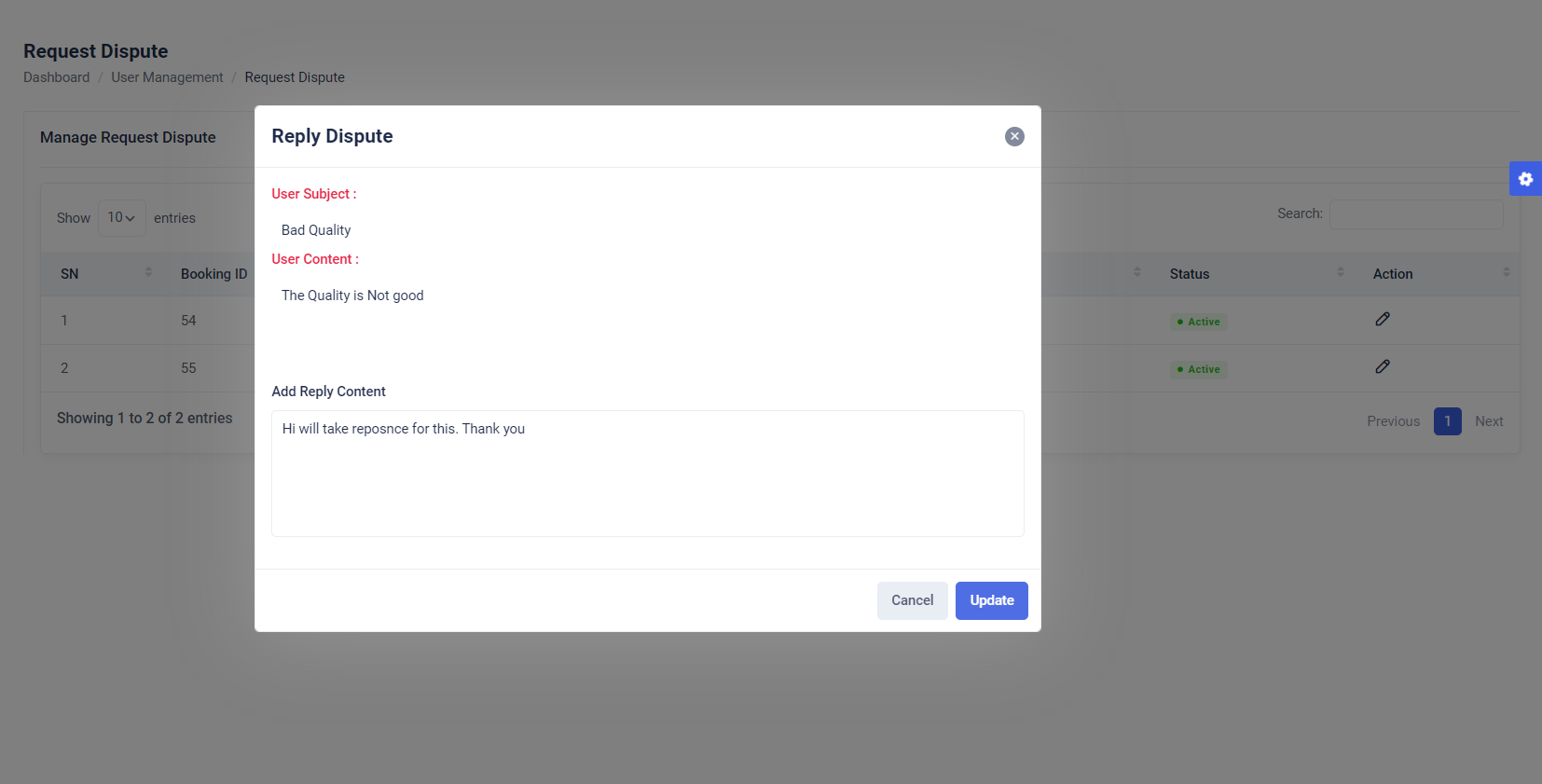
Overview
The Reply Dispute modal is a user interface component designed to handle dispute replies. It displays the subject and content of the user’s dispute in a read-only format and provides an input area for administrators or moderators to add a reply.
View User Dispute Details
Displays the dispute's subject and content submitted by the user in read-only fields.
Reply Content Input
Provides a text area for adding reply content to the dispute.
Includes validation to ensure reply content meets required standards.
Form Actions
Allows users to cancel the reply action or submit the reply.
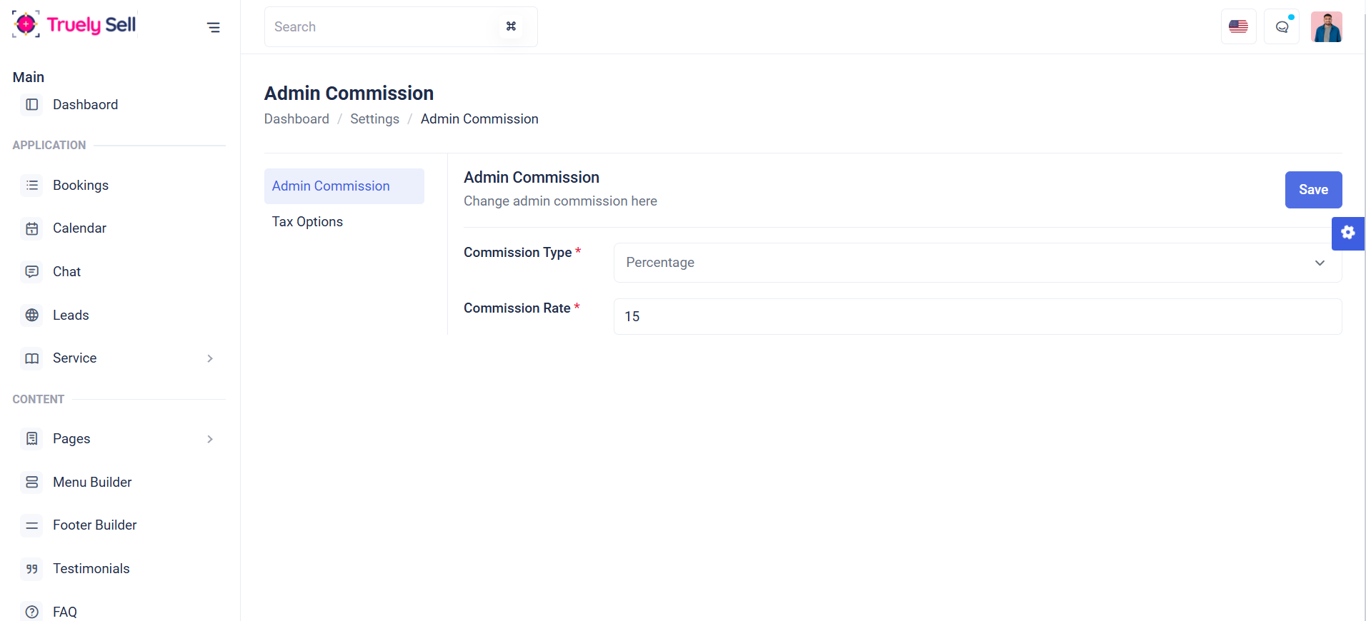
Form Overview
This form adjusts based on commission type chosen (Percentage or Flat). Commission rate can be set for each (percentage or flat). The form should be clean, intuitive, and easy to follow. Each field will be clearly labeled, and validation messages will guide the provider through the process.
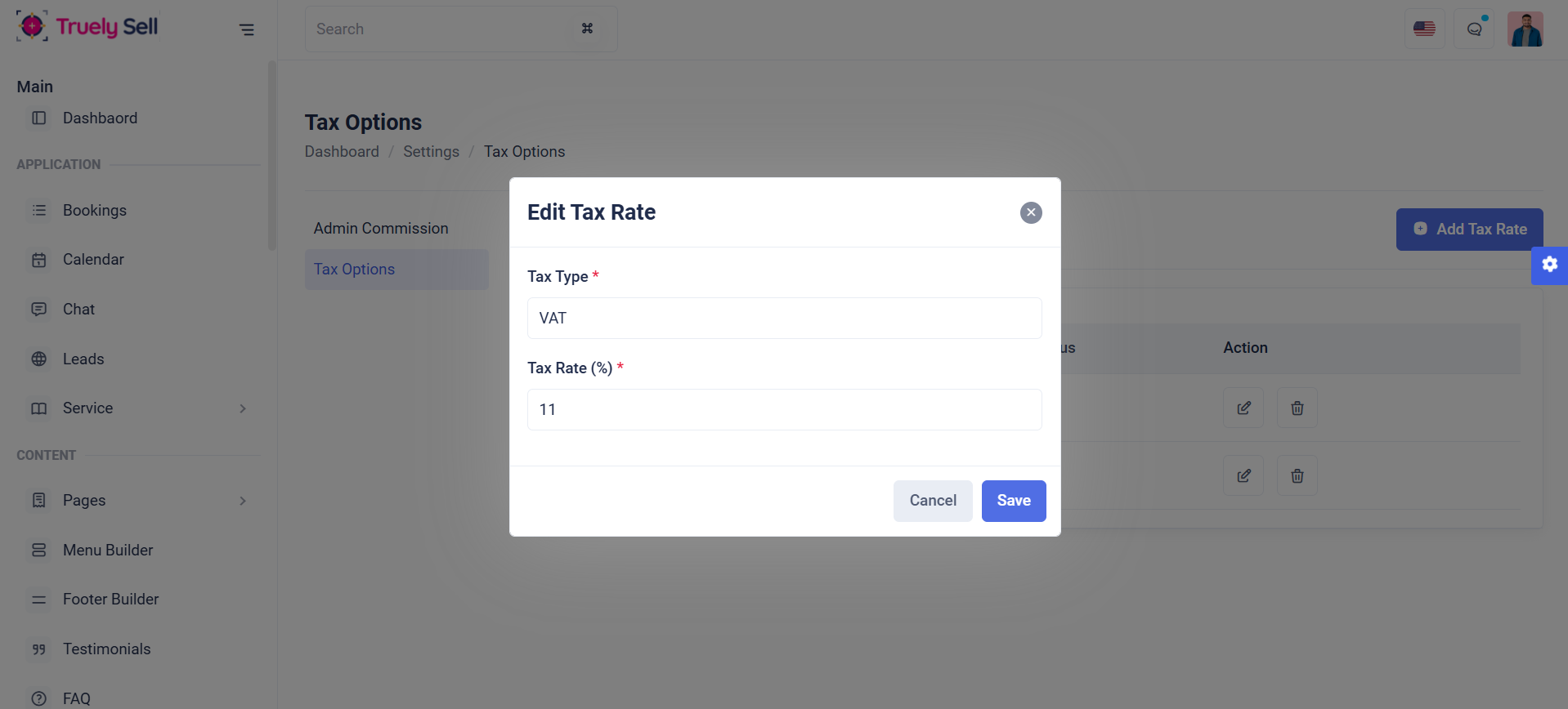
Tax Options
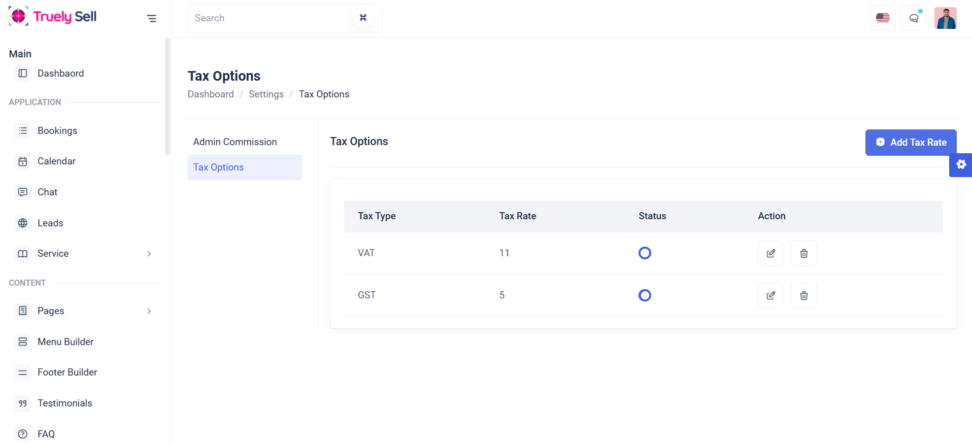
Overview:
This table is designed to display a list of tax options, showing their tax type, tax rate status toggle(enable or disable), action (edit or delete). It serves as a management interface for administrators to review and manage available tax options in the system.
Features
Add Tax: Admins can create new tax options by providing a tax type, tax rate and allows to add a maximum of 5.

Edit Tax: Modify existing tax options.

Delete tax:Remove outdated or irrelevant tax option
Status Toggle:Enable or disable tax option dynamically.
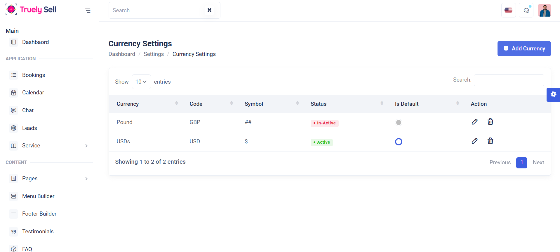
Overview
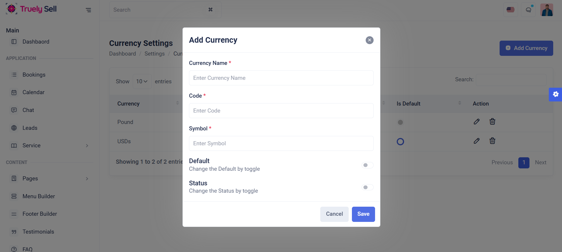
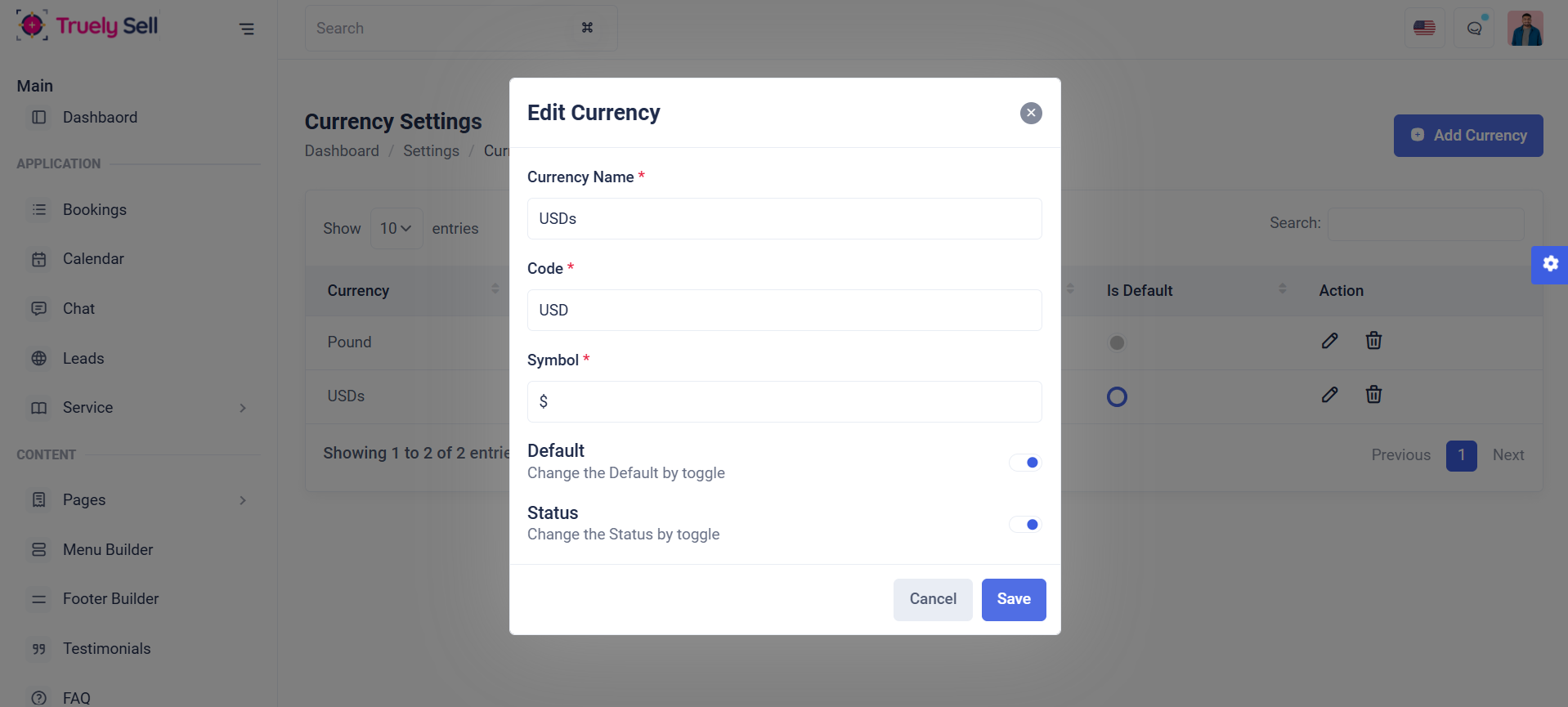
This table is designed to display a list of currency settings, showing their currency, code, symbol, status(active or inactive), default status toggle(enable or disable), action (edit or delete). It serves as a management interface for administrators to review and manage available tax options in the system.
Add Currency: Admins can create new currency by providing a currency name, code, symbol, status(enable or disable), and also set default currency by (enable or disable). Each field will be clearly labeled, and validation messages will guide the provider through the process.
Edit Currency: Admins can modify the existing currency. Each field will be clearly labeled, and validation messages will guide the provider through the process.
Delete Currency: Admin can remove outdated or irrelevant currency.
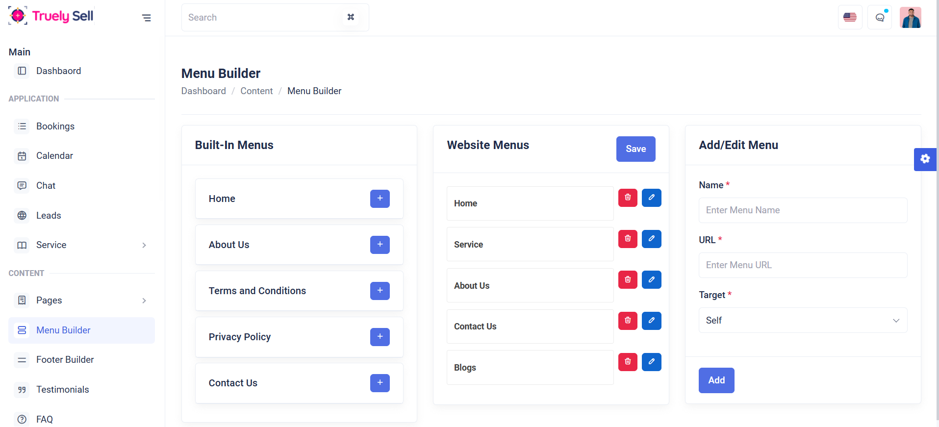
Overview
In this page, Listing the built-in menus, website menus and add/edit the menu. It serves as a management interface for administrators to review and manage menus in the system.
Built-in menus: Admin can add built-in menus by clicking the add button and listing in the website menus section.
Add / Edit menus: Admin can add custom menus by providing menu name, url, target and list in website menus section.
Website menus: Admins can edit or delete menus in the website menu list. The system also provides features such as changing the order of menus through top-to-bottom drag-and-drop functionality, adding items to submenus by dragging them to the right, and moving submenu items back to the main menu by dragging them to the left.
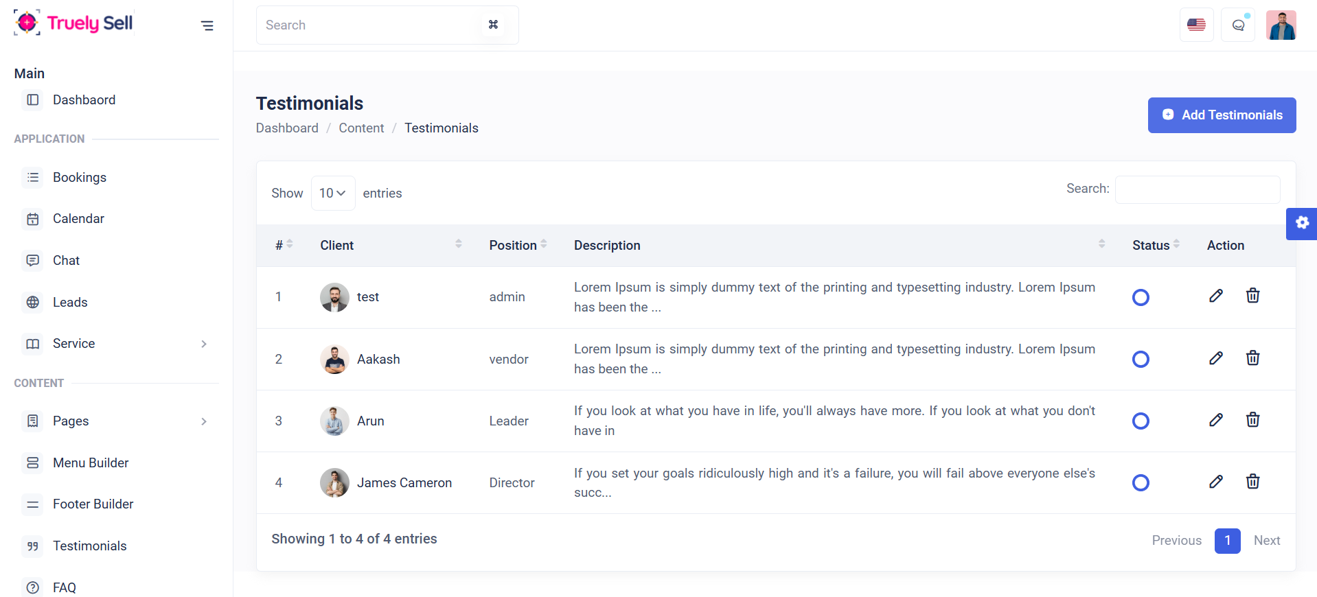
Overview
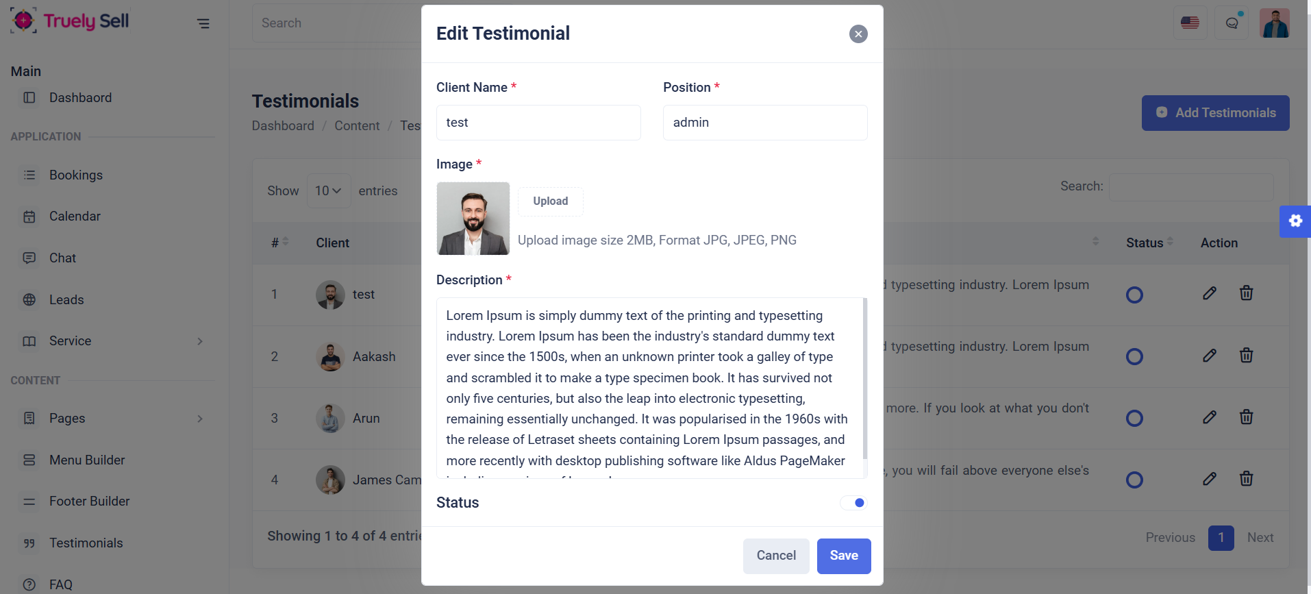
This table is designed to display a list of Testimonials, showing their client name, position, description, status(enable or disable), action (edit or delete). It serves as a management interface for administrators to review and manage available testimonials in the system.
Add Testimonial: Admins can create new testimonials by providing a client name, position, image, description, status(enable or disable). Each field will be clearly labeled, and validation messages will guide the provider through the process.
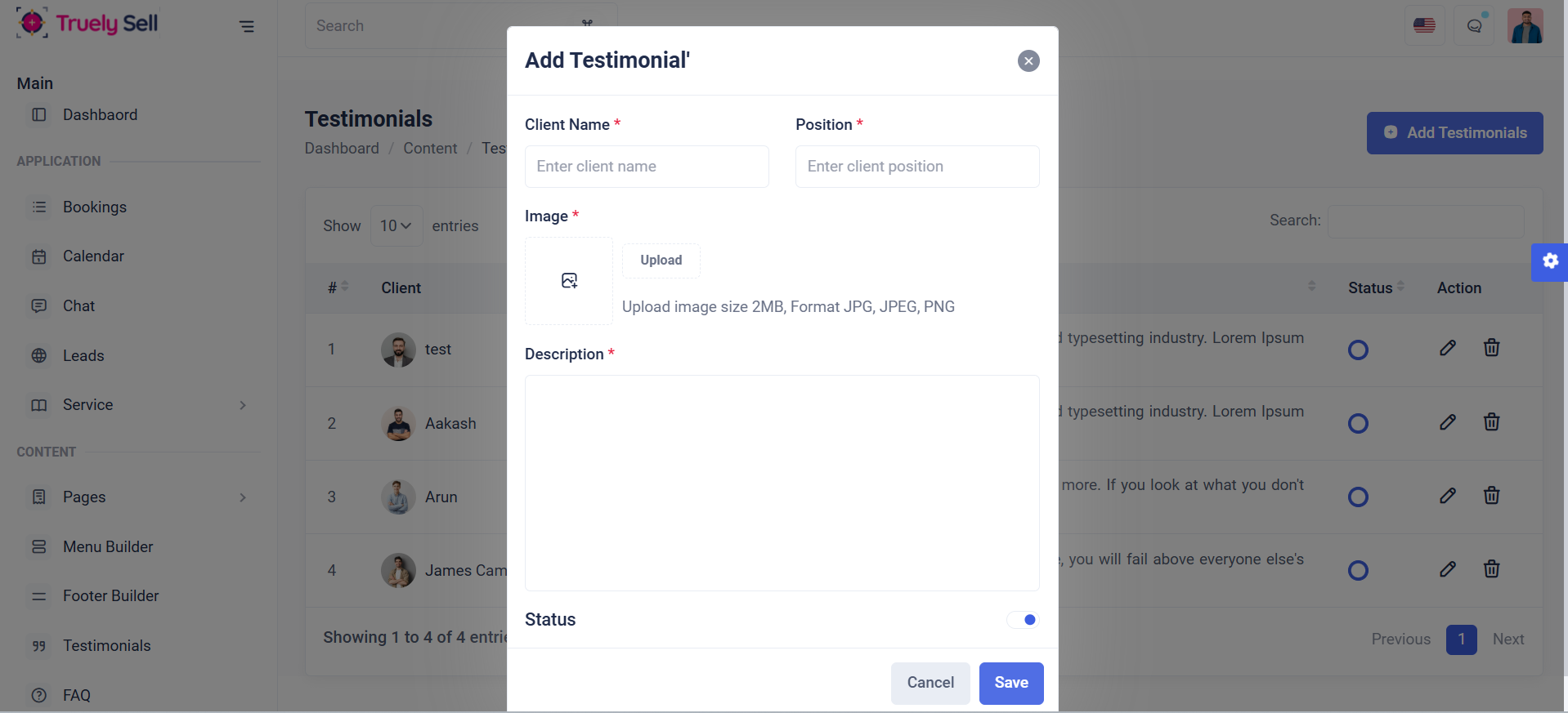
Edit Testimonial: Admins can edit existing testimonials. Each field will be clearly labeled, and validation messages will guide the provider through the process.
Delete Testimonial: Admin can remove outdated or irrelevant testimonials.
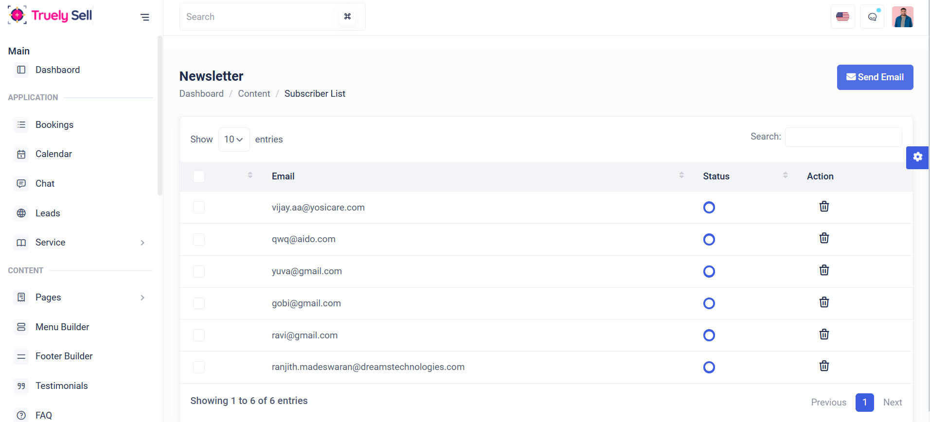
Overview
This table is designed to display a list of newsletter subscribers, showing their email, status (enabled or disabled), actions (such as delete), and providing a search function by email. It serves as a management interface for administrators to review and manage the subscriber list in the system.
Features
Send Email: By clicking the checkbox in the table list, you can select one or more rows to send emails (clicking Send Email button) to newsletter subscribers.
Status: Enable or disable newsletter subscriber dynamically
Delete Subscriber: Admin can remove outdated or irrelevant newsletter subscribers.
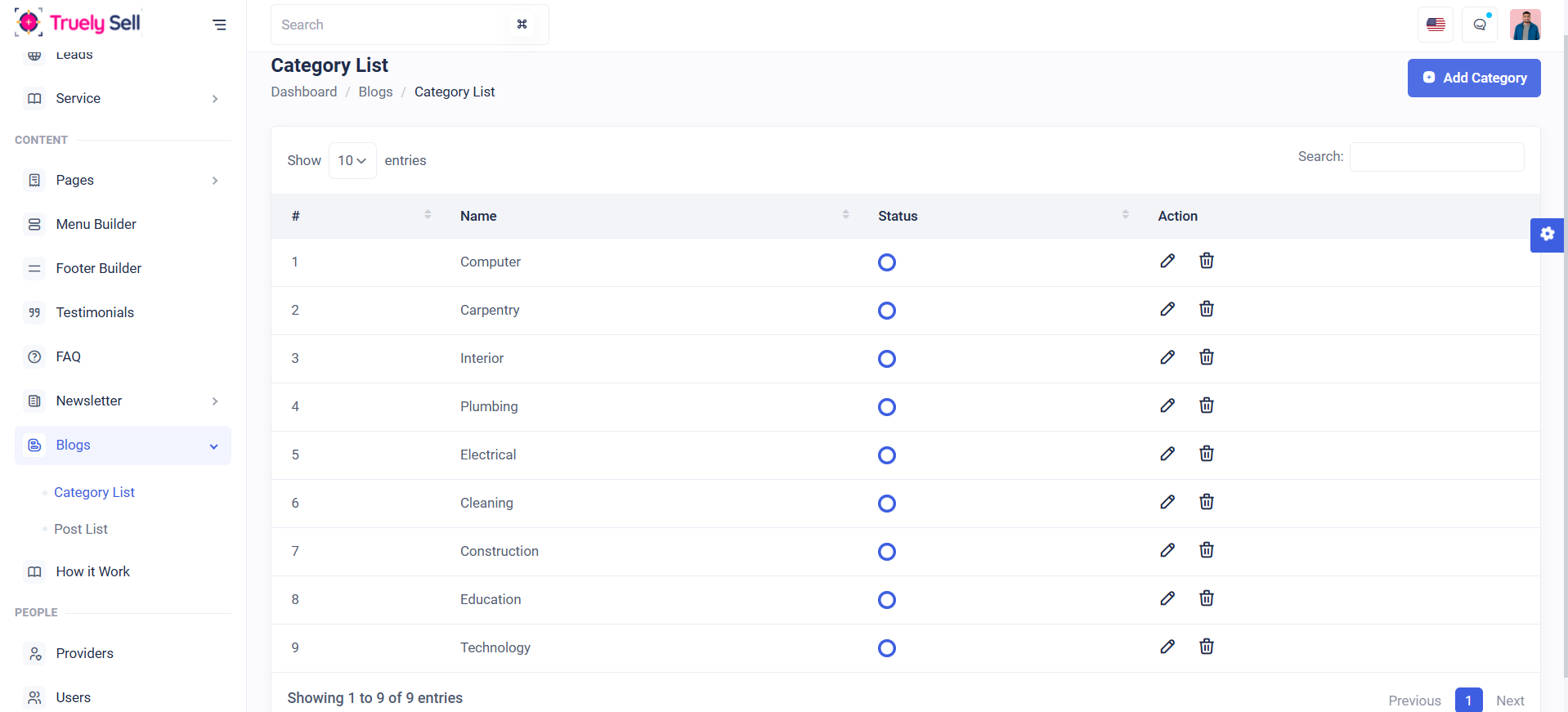
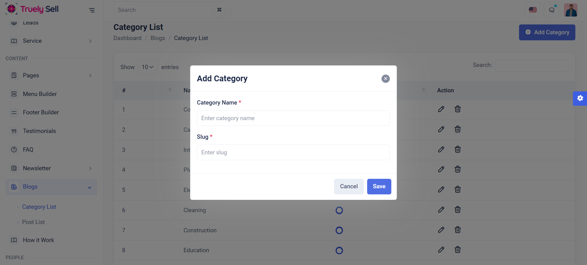
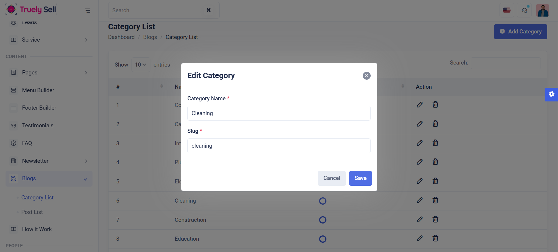
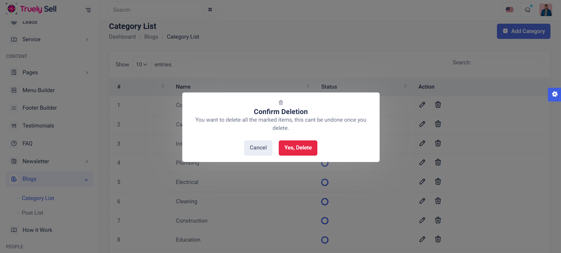
Overview
This table is designed to display a list of blog categories, showing their category name, status(enable or disable), action (edit or delete). It serves as a management interface for administrators to review and manage available blog categories in the system.
Add blog category: Admins can create a new blog category by providing a category name, slug. Each field will be clearly labeled, and validation messages will guide the provider through the process.
Edit blog category: Admins can edit existing blog categories. Each field will be clearly labeled, and validation messages will guide the provider through the process.
Delete blog category: Admin can remove outdated or irrelevant blog categories.
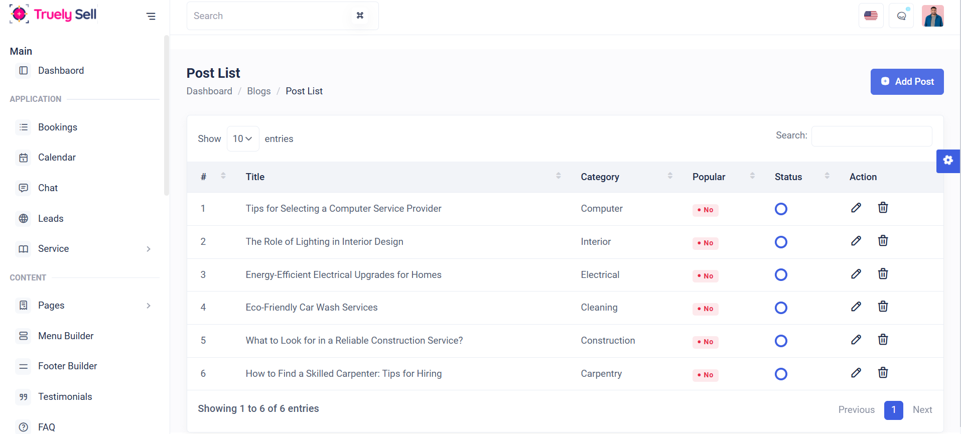
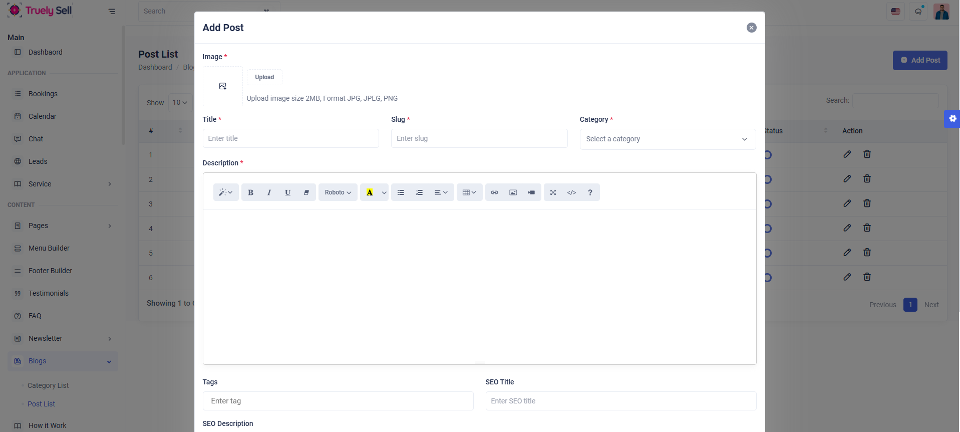
Overview
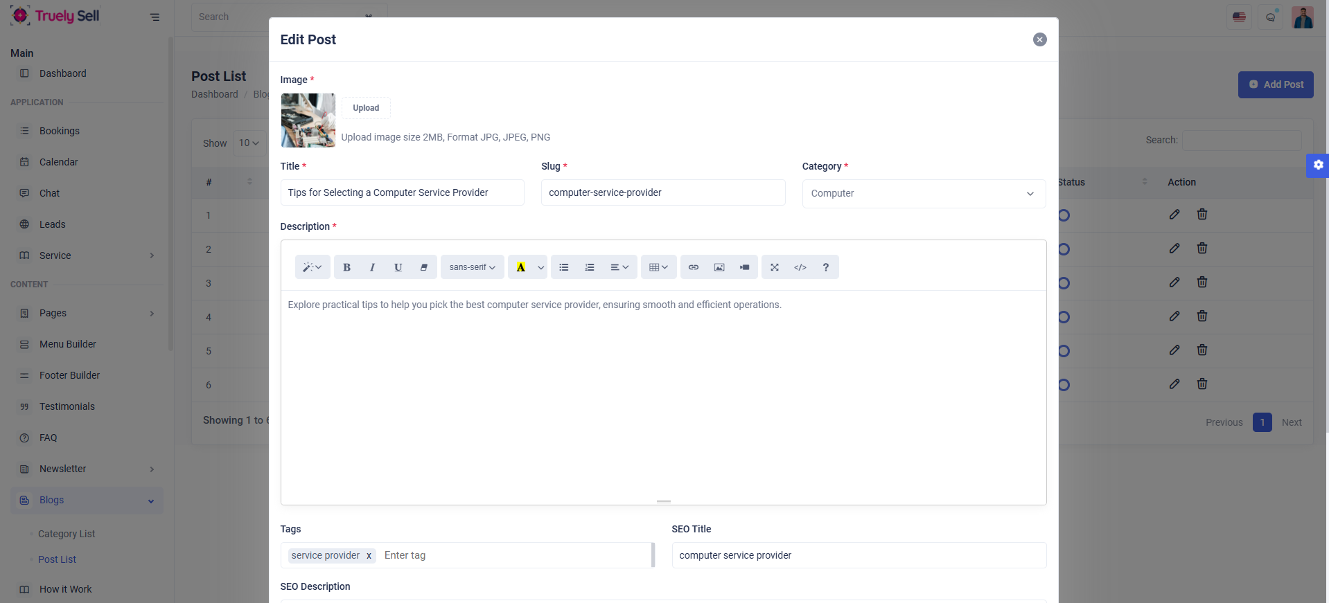
This table is designed to display a list of blog posts, showing their blog post title, category name , popular(yes or no), status(enable or disable), action (edit or delete). It serves as a management interface for administrators to review and manage available blog posts in the system.
Add blog post: Admins can create a new blog post by providing a blog post image, title, slug, category, description, tags, seo title, seo description, popular, status(enable or disable). Each field will be clearly labeled, and validation messages will guide the provider through the process.
Edit blog post: Admins can edit existing blog posts. Each field will be clearly labeled, and validation messages will guide the provider through the process.
Delete blog post: Admin can remove outdated or irrelevant blog posts.
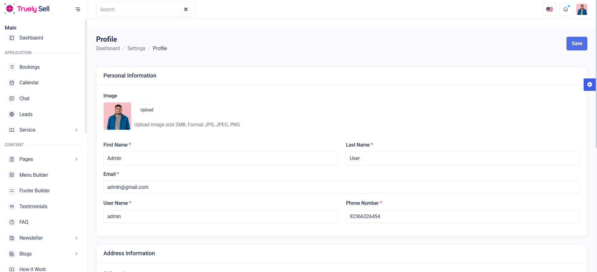
Form Overview:
Personal Information:
Image - image size(less than 2mb), format(jpg, jpeg, png)
Firstname
Lastname
Username - (if allowed to edit)
Phone number
Address Information:
Country, state, city, postal code
Change Password:
The admin can update their password, ensuring that the new password matches the confirmation password and is at least 8 characters long.
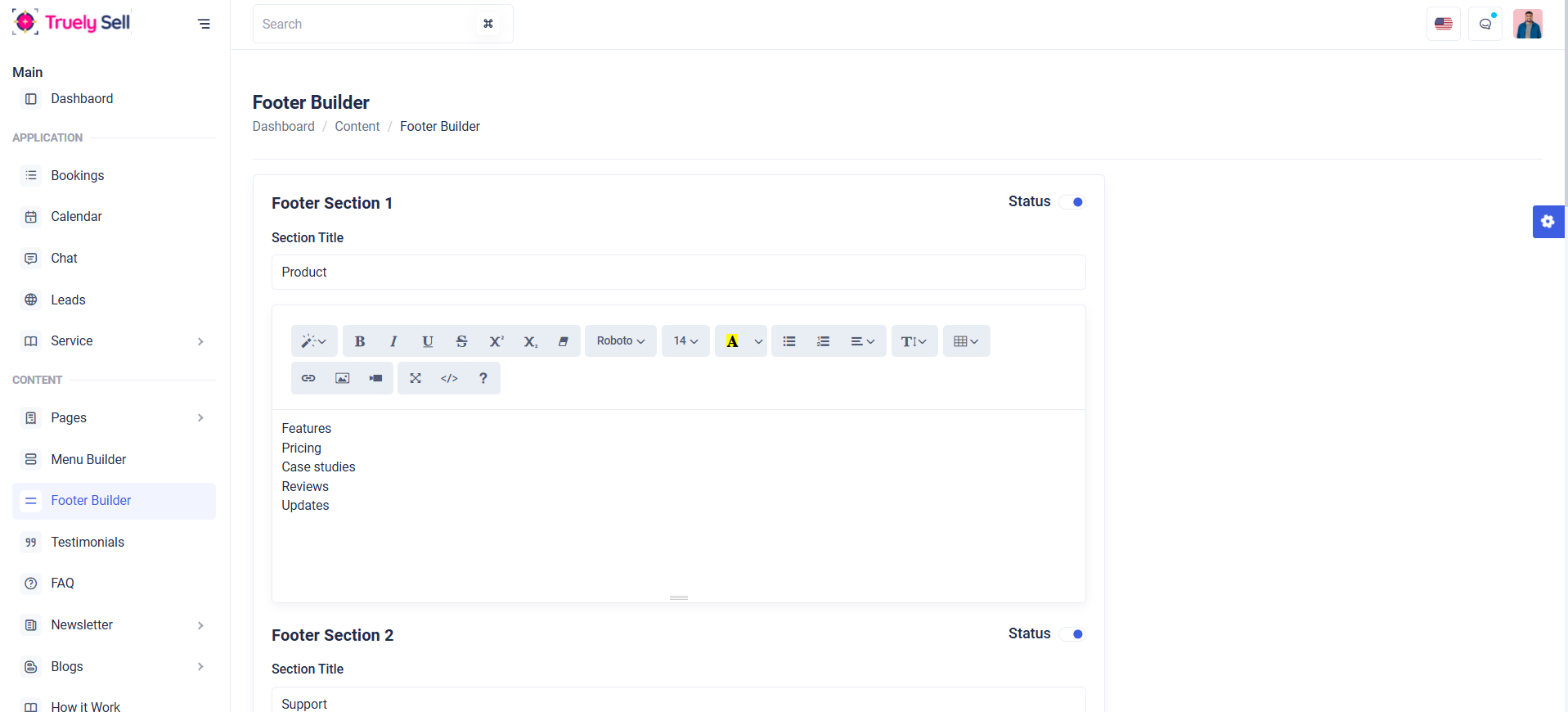
Overview:
In this page, admin can update the footer section by providing section title, section content and maximum section of 5 and also provides features like status (enable or disable for each section) and overall status. It serves as a management interface for administrators to review and manage available footer builders in the system.
In Email settings, There are two configuration settings. They are,
i) SMTP
ii) Twilio
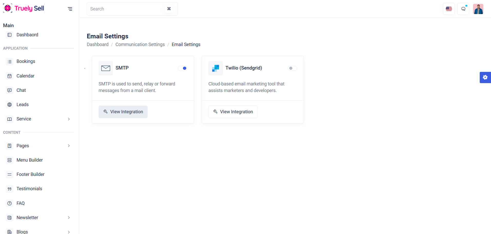
i) SMTP:
SMTP (Simple Mail Transfer Protocol) is a standard protocol used to send and receive email messages. It enables email clients and applications to communicate with an email server to deliver messages to the intended recipients.
When configuring SMTP email settings in your application, the following details are required:
Key SMTP Settings:
SMTP Host:
SMTP Port:
SMTP Username:
SMTP Password:
From Address:
From Name:
The address of the SMTP server responsible for sending emails. Examples:
Gmail: smtp.googlemail.com
The port number used by the SMTP server. Common ports are:
587: Secure SMTP with STARTTLS (most recommended)
The email address or username used to authenticate with the SMTP server.
The password for the provided email account. Some providers may require an App
Password instead of the regular account password.
The email address displayed as the sender of the email.
A user-friendly name displayed alongside the "From Address" in the recipient's inbox.
ii) Twilio
Twilio SendGrid is a reliable cloud-based email service that enables applications to send transactional, marketing, and notification emails at scale. Configuring SendGrid for mail settings in your application involves setting up SMTP or API integration to enable seamless email delivery.
Key Components for SendGrid Configuration:
1) From Email Address:
The email address used as the sender. Ensure this address is verified in your SendGrid account under Sender Authentication.
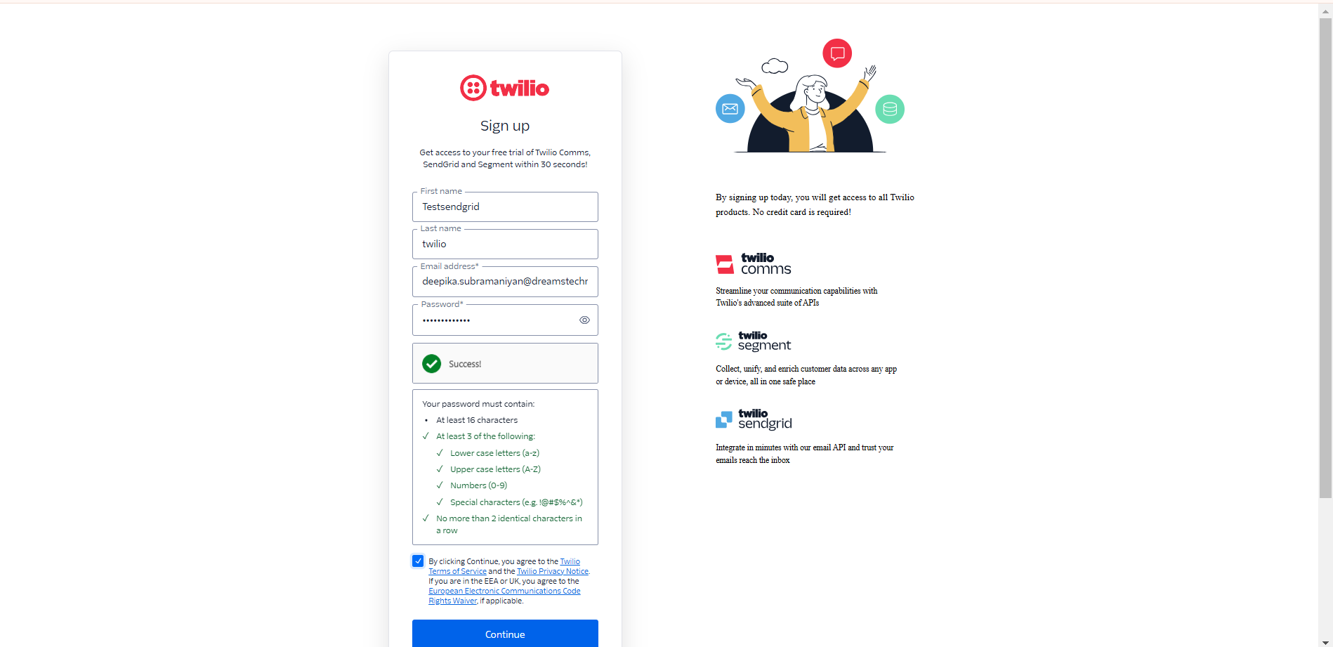
2) Sendgrid key:
Go to https://signup.sendgrid.com/
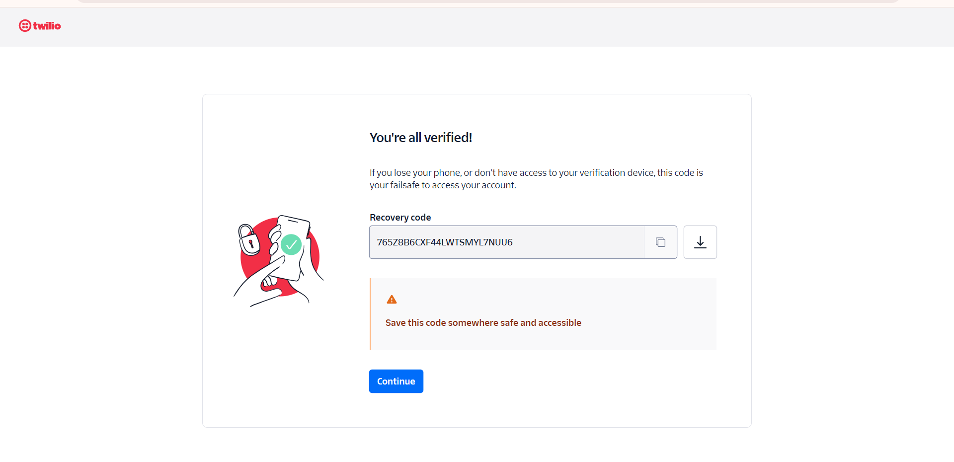
Signup with Details
After Signup process, save the recovered key for future reference in below screen shot.
Your SendGrid API Key serves as the SMTP password. Generate this key from your SendGrid dashboard:
Go to Settings > API Keys > Create API Key.
Assign appropriate permissions (e.g., full access for sending emails).
2) SMS Settings
In SMS settings, There are two configuration settings. They are,
i) Nexmo
ii) Twilio
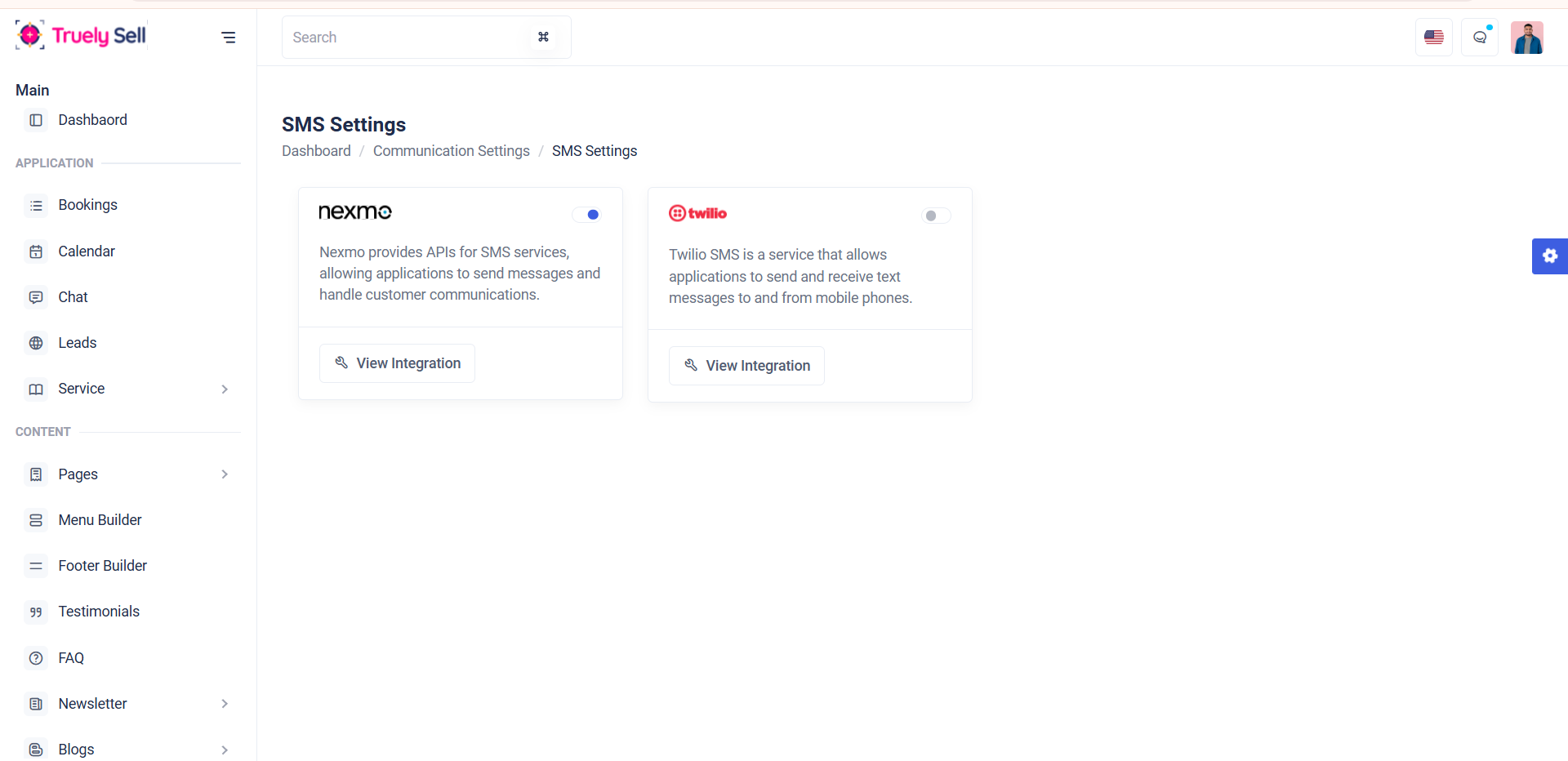
i) Nemo
Nexmo, rebranded as Vonage, is a communication platform that provides APIs for sending and receiving SMS messages, making it a reliable choice for integrating SMS functionality into your application.
To configure and use Nexmo for SMS delivery, you need the following settings and API details.
Key Components for Nexmo SMS Configuration:
- API Key:
- API Secret:
- Sender ID:
A unique identifier for your Nexmo account, used to authenticate API requests.
A secret token linked to your API Key for secure communication with Nexmo's API.
The name or number that will appear as the sender in the recipient's SMS inbox.
This can be an alphanumeric string (up to 11 characters) or a numeric phone number.
ii) Twilio
Twilio is a robust cloud communication platform that provides APIs to send and receive SMS globally. Configuring Twilio SMS in your application allows you to implement features such as transactional notifications, alerts, and two-factor authentication (2FA).
Key Components for Twilio SMS Configuration:
- Account SID:
- Auth Token:
- Twilio Phone Number:
A unique identifier for your Twilio account. This is used to authenticate API requests.
Found in your Twilio Console under Account Info.
A secret key used along with the Account SID for secure communication with Twilio's API.
Found alongside the Account SID in your Twilio Console.
A phone number purchased from Twilio, used as the sender for outgoing SMS.
Ensure the number is SMS-enabled, which you can verify in your Twilio Console.
3) Notification Settings
Notification settings allow users or applications to configure how they want to receive updates, alerts, or important information. These settings can be customized based on the user's preferences, and the options typically include Email Notifications, SMS Notifications, and Push Notifications.
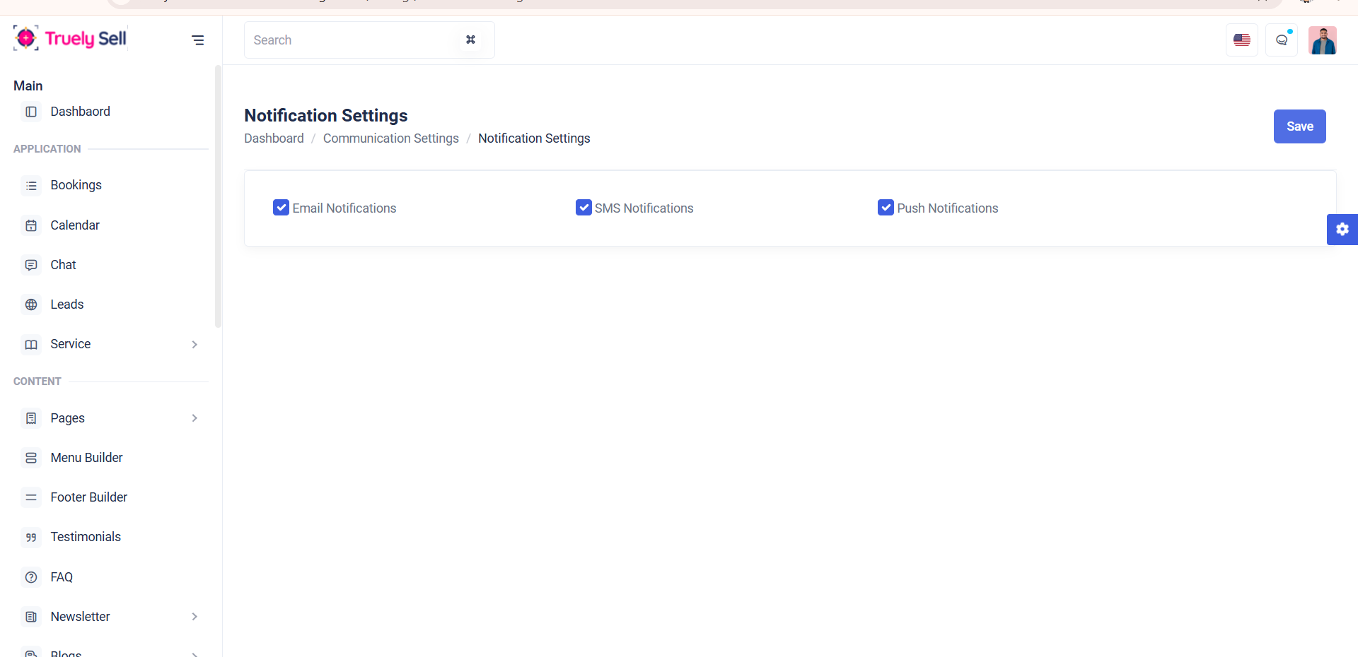
Available Notification Options
- Email Notifications:
- SMS Notifications:
- Push Notifications:
Sent via email to inform users about important updates, such as password resets, system alerts, new messages, or promotions.
Configuration includes SMTP settings to ensure reliable email delivery.
Sent via text message (SMS) to a registered phone number.
Ideal for urgent alerts, one-time passcodes (OTP), order confirmations, and reminders.
Requires integration with SMS gateway providers like Twilio and Nexmo (Vonage).
Delivered directly to a user’s device (mobile, desktop, or web app) in real-time.
Typically used for engaging users with app updates, promotions, or time-sensitive alerts.
Requires proper push notification service integration (e.g., Firebase Cloud Messaging for mobile apps).
Templates
Templates are pre-designed, reusable formats or layouts used for rendering content across an application, ensuring consistency, efficiency, and maintainability. They act as blueprints for sms, emails, notifications, or documents by defining structure and design while allowing dynamic content to be populated programmatically.
Templates Fields include:
Template Type
- SMS
- Notifications
Notification Type
Notification type defines categorized by their purpose in user communication. Types like Registration Notification, Forgot password, Booking Success, Booking Cancel, Etc…
Title
Title describes about template based on notification type
Subject
It describes the subject sent to email
Description
In this field, we can create template format to send sms,email,notifications.
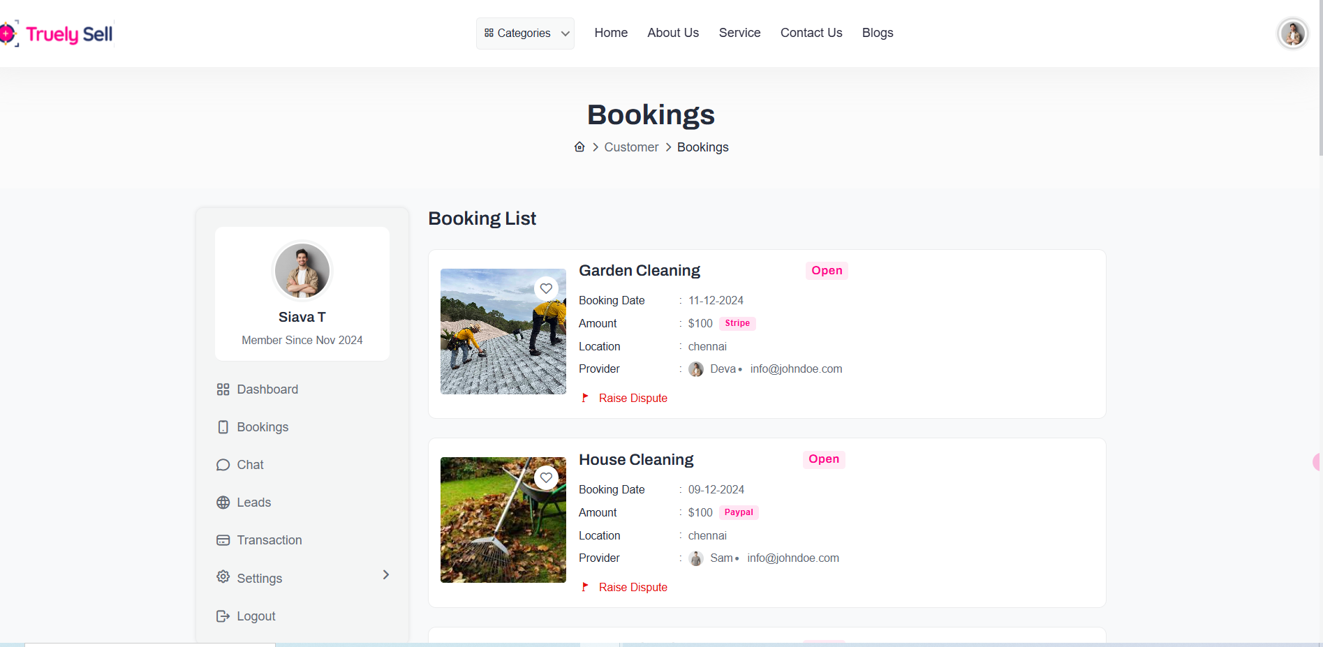
Booking List
- User - Booking List
- Provider - Booking List
The Booking List refers to a comprehensive, organized view or report that displays all the booking records associated with a user, provider and service. It provides an overview of booking details, status, and relevant information for efficient management, tracking, and user interaction.
The Provider Booking List is a detailed and organized view that allows service providers to manage and monitor their bookings.
After a customer books a service, the provider will get a booking list as shown below.
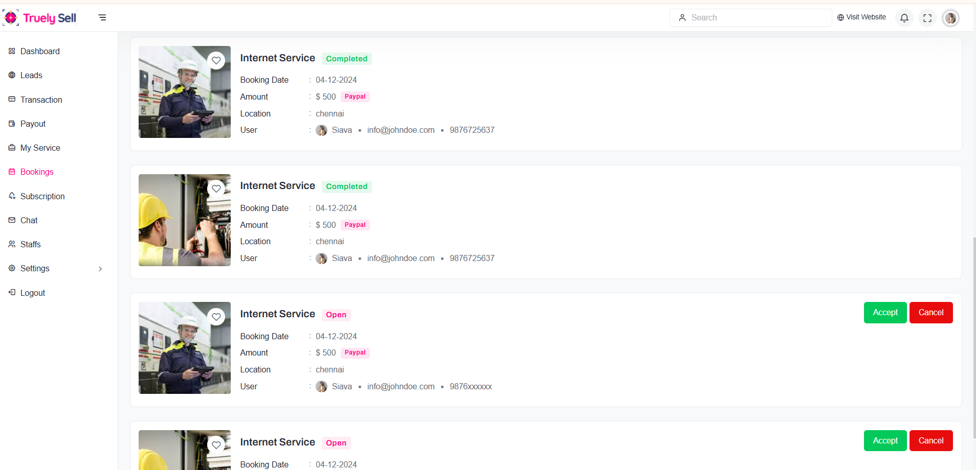
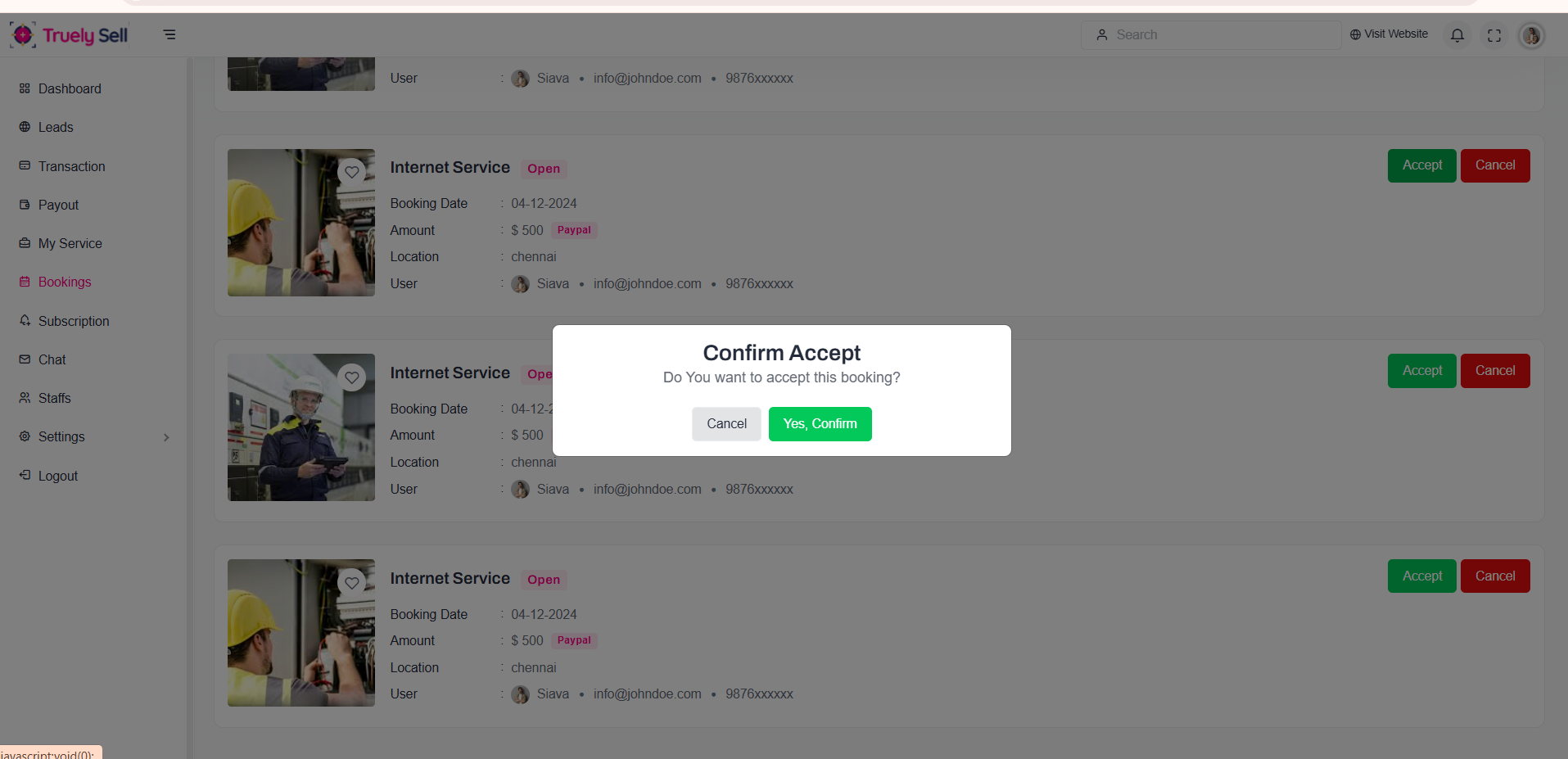
Provider When accept the Bookings, it shows the confirmation popup like this,
After, Accept the bookings, the booking status changed as Inpogress as highlighted in below screenshot.
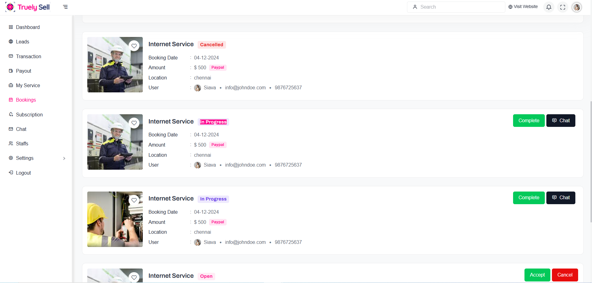
Provider can chat with user, after accept bookings. After service completion, provider will complete the order. Booking status will be changed as completed.
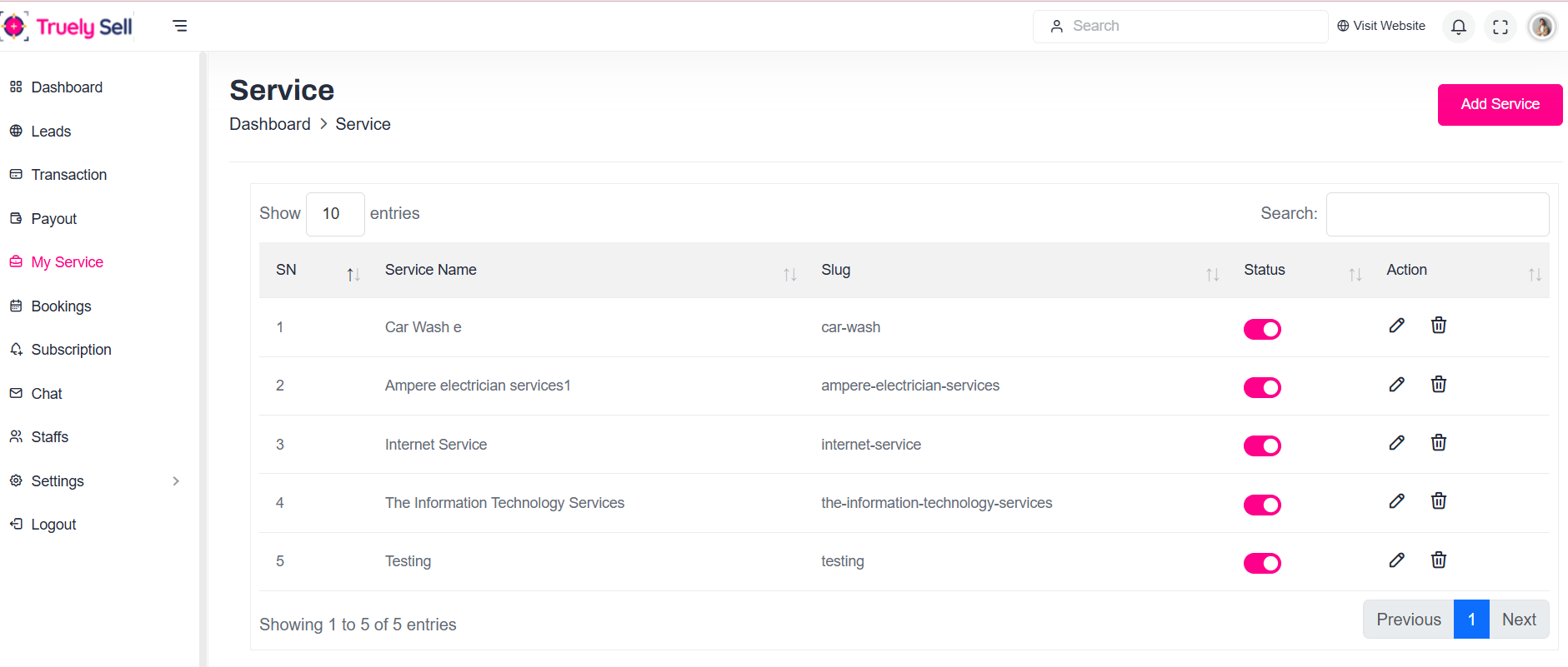
The system will still display the list of available services to the provider even if their subscription has ended.
Expired Subscription: For expired subscriptions, the provider can still browse the services they had access to before the subscription expired.
Subscription Status: Display a message indicating that the subscription has expired and prompt the provider to renew or upgrade.
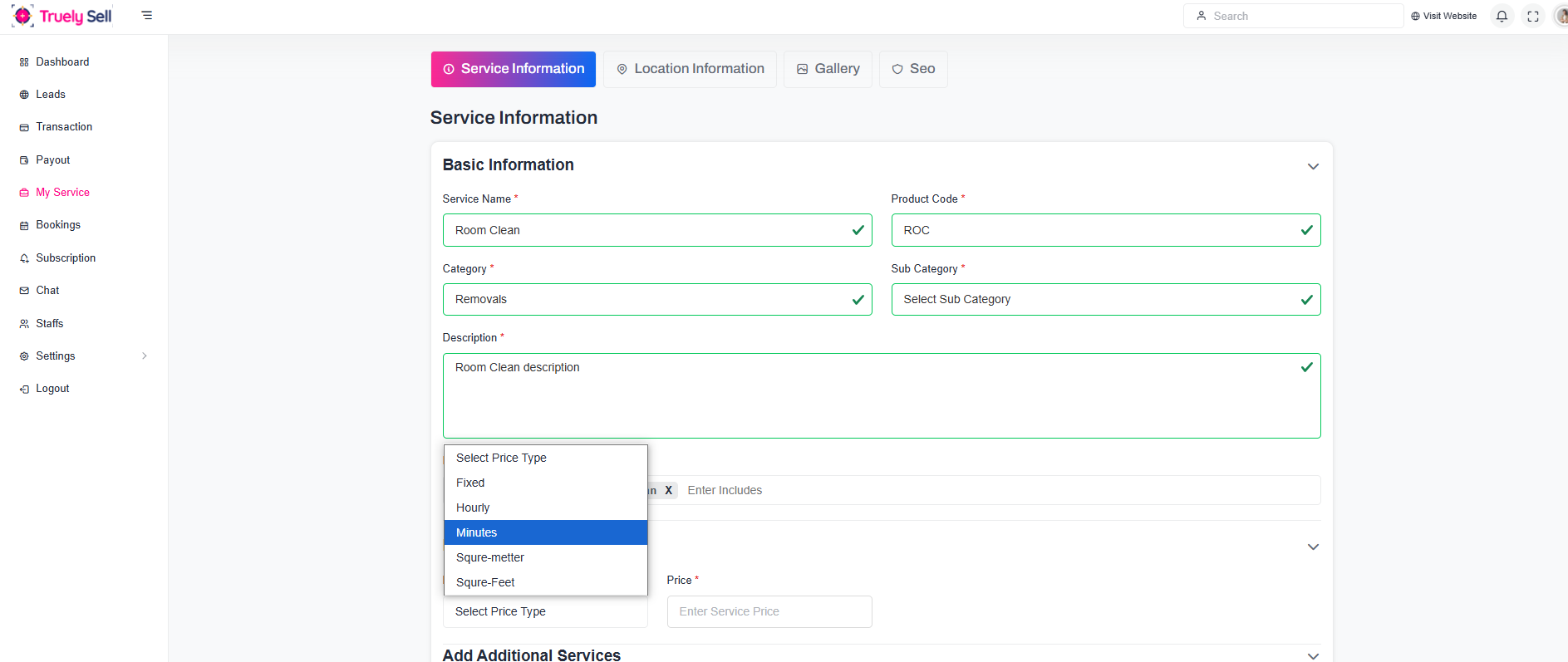
Form Overview
Purpose: Allow the provider to add a new service .
Layout: The form should be clean, intuitive, and easy to follow. Each section will be clearly labeled, and validation messages will guide the provider through the process.
Responsive Design: Ensure the form works well on both desktop and mobile devices.
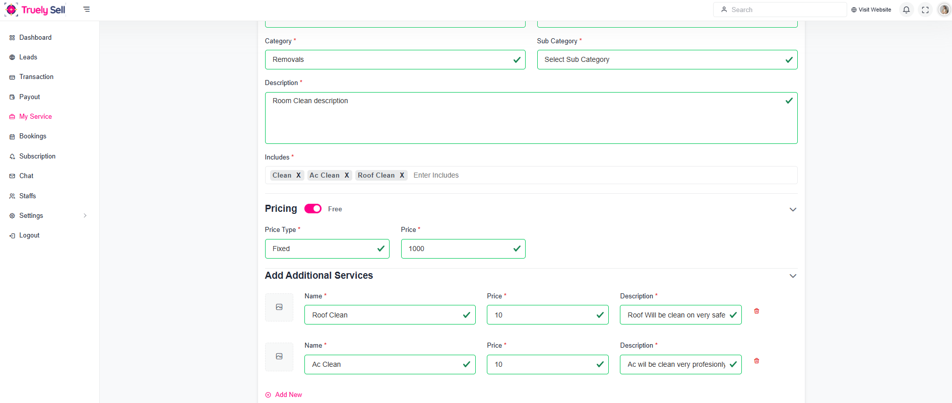
Form Overview
Dynamic Pricing:The form adjusts based on the service type chosen, showing relevant pricing
Price can be set for each additional service
Layout: The form should be clean, intuitive, and easy to follow. Each section will be clearly labeled, and validation messages will guide the provider through the process.
Responsive Design: Ensure the form works well on both desktop and mobile devices.
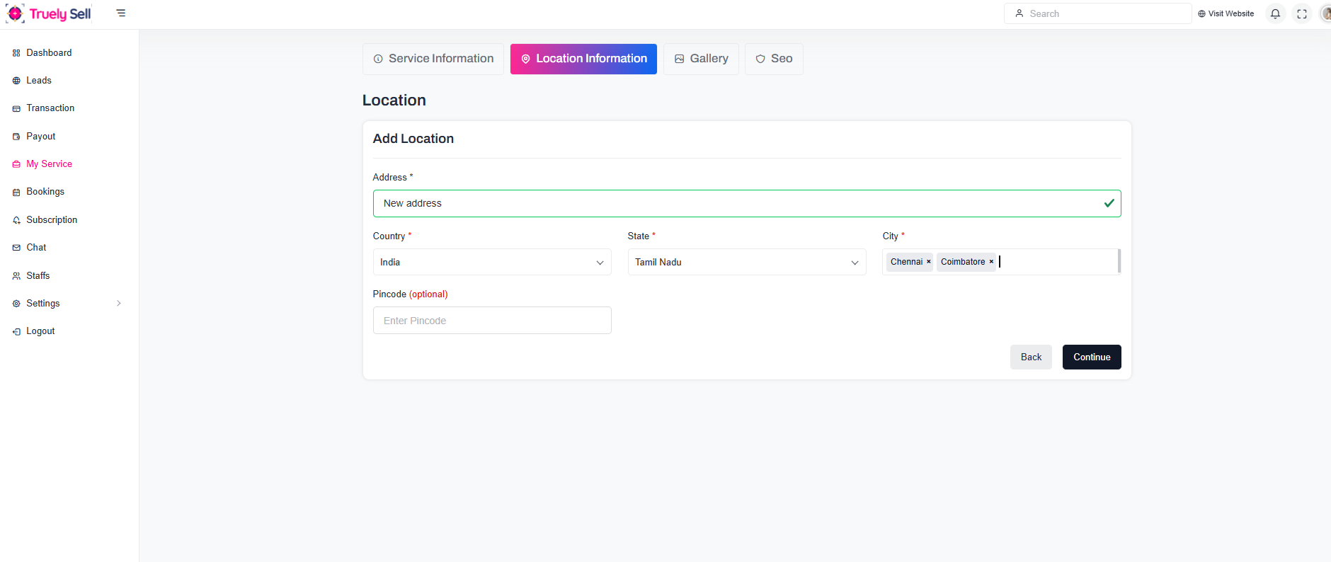
Allow Users to Book Services Across Locations:
If customers can book a service across different locations:
Ensure the frontend lets users select a location before choosing a service.
Backend should filter service availability by location.
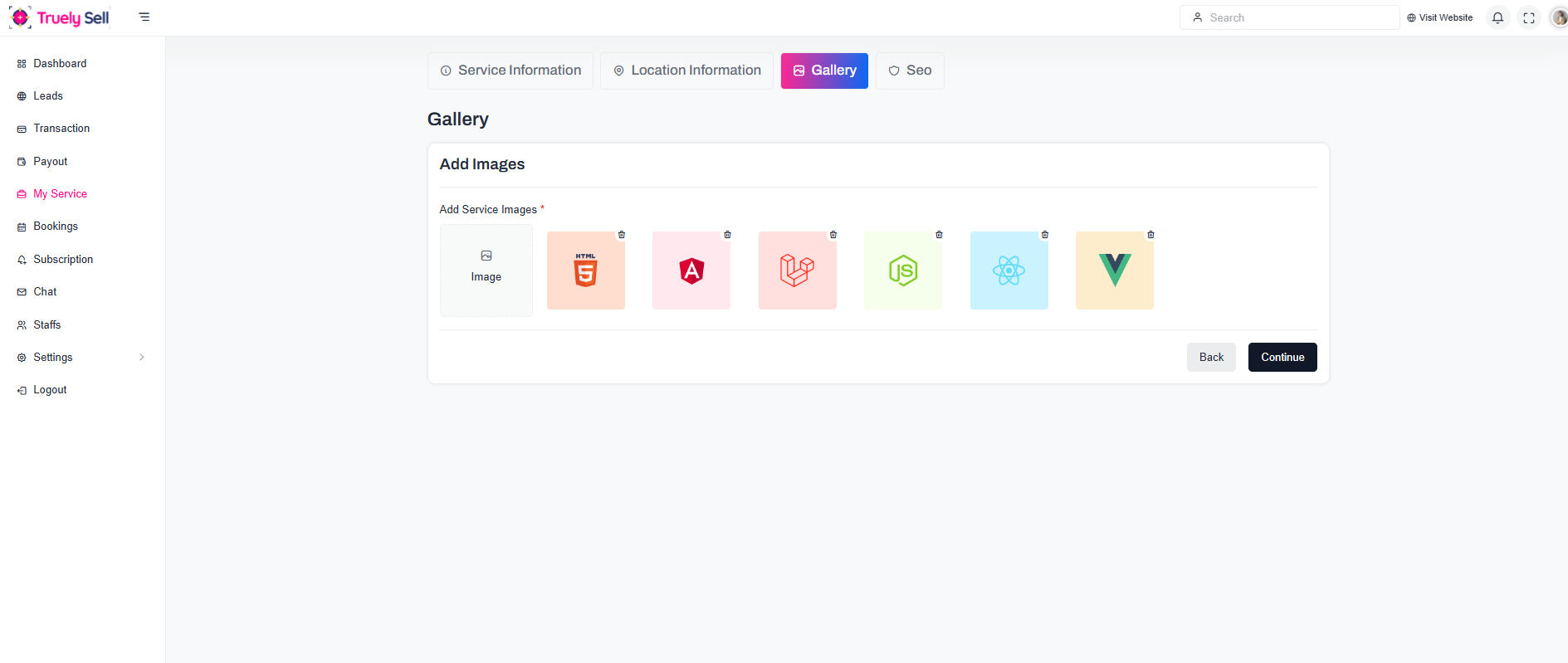
To allow multiple images to be added for each service in a user-friendly and structured way, we can extend the Add Service Form to include a section for image uploads. The images will be displayed for users to view the service offerings
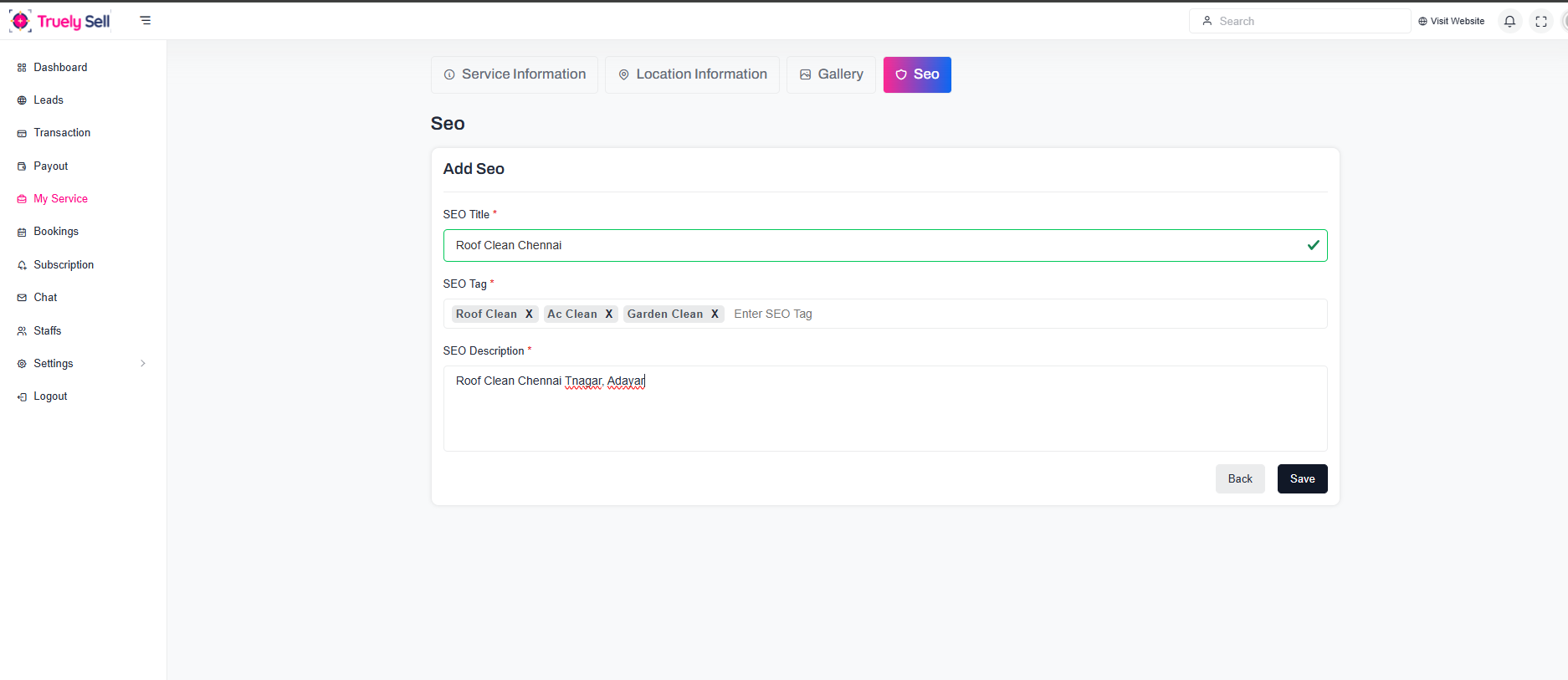
When creating or updating a service:
Add options to input SEO metadata.
Validate metadata to ensure it meets SEO standards (e.g., length of meta descriptions).
User's View:
The system will not display the list of available services to the user when Provider subscription has ended.
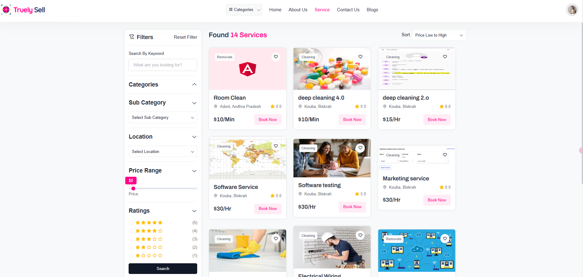
Search
Combine the filter with a search box to allow keyword-based searches
Search based on Category , Sub category , Location , Price range , Rating
Sorting
Allow sorting results by:
Price (Low to High/High to Low)
Relevance
c. Default Recommendations
Display featured or popular services when no filters are applied.
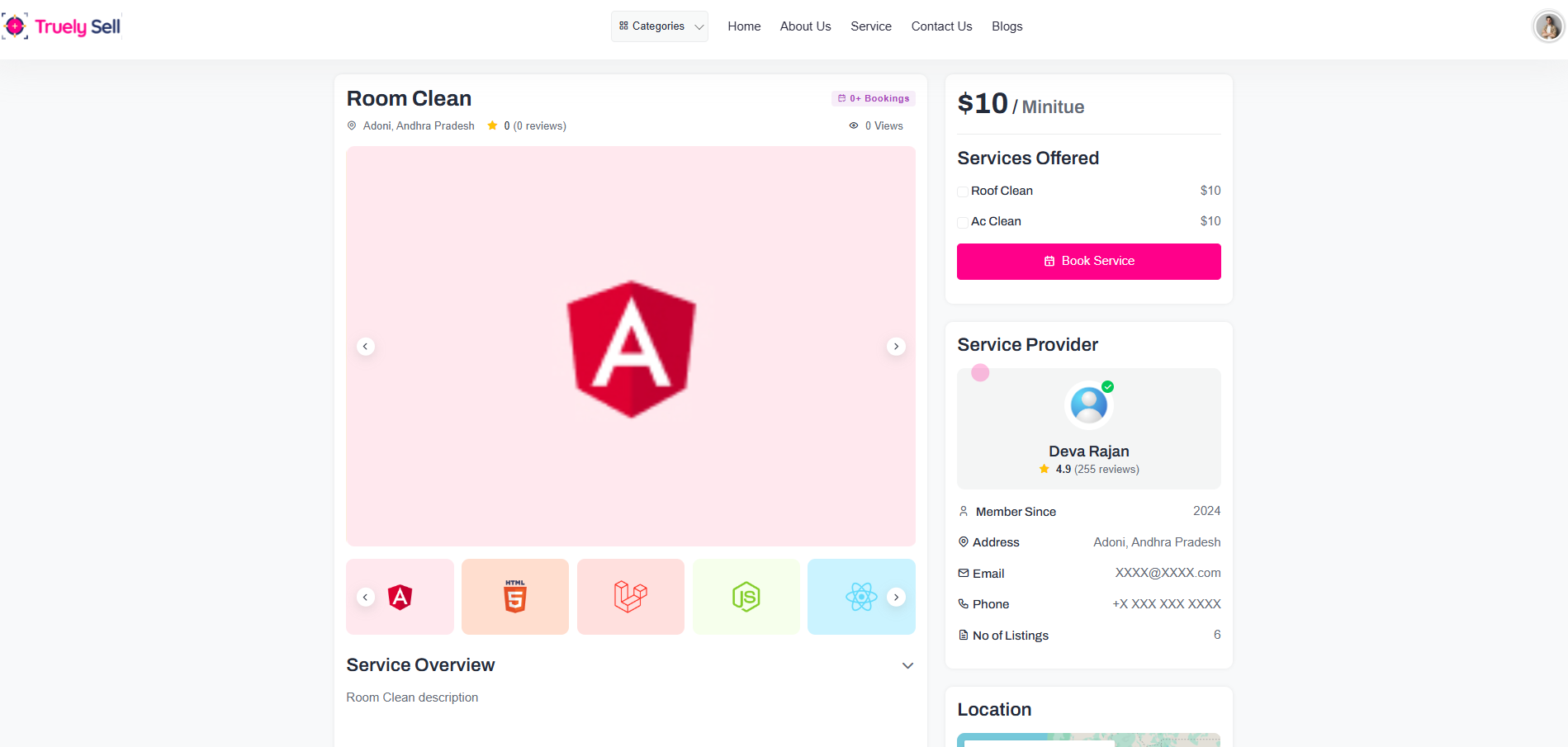
Core Service Information Section
- Category & Subcategory:
- Location(s):
- Rating and Reviews:
- Price:
E.g., "Category: Automotive, Subcategory: Car Wash."
List the locations where the service is available.
Optionally include a map for convenience.
Display the average rating (e.g., ⭐⭐⭐⭐ 4.5) and total reviews count (e.g., "150 reviews").
Add a "View All Reviews" button.
Show the price clearly (e.g., "$50 per session").
Include any discounts or offers (e.g., "20% off for first-time customers").
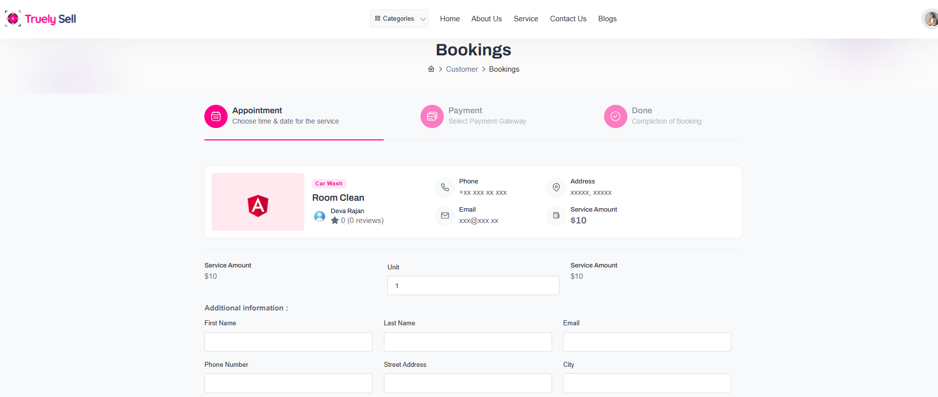
Provide User Details
Collect user information and needed details above proceed Service details bookings

Payment Options:
Provide multiple payment options:
Paypal
Stripe
Bank Transfer
Payment Options:
Provide multiple payment options:
Paypal
Stripe
Bank Transfer
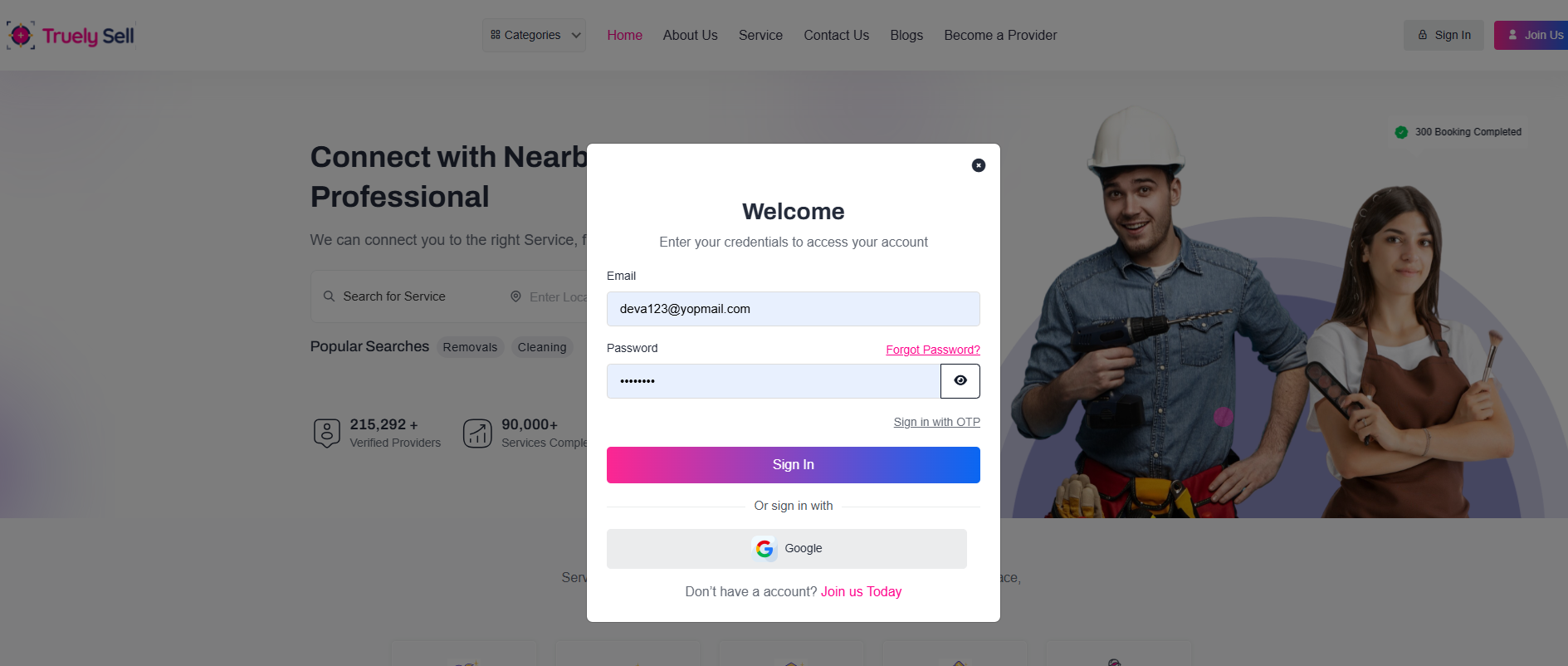
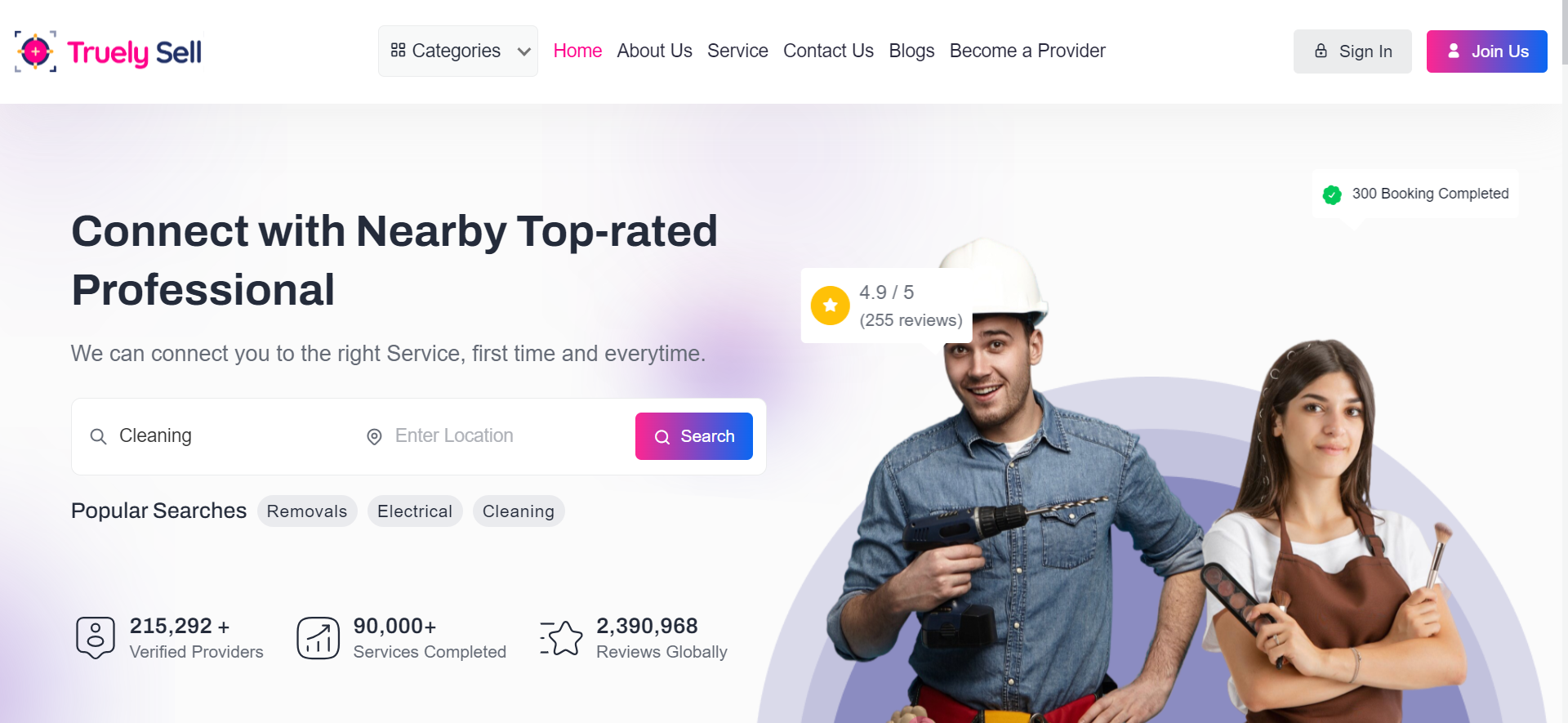
User accesses the Login Page.
Provide a clear choice of login options with visually distinct buttons:
Username/Password Login
Login via OTP
Login with Google
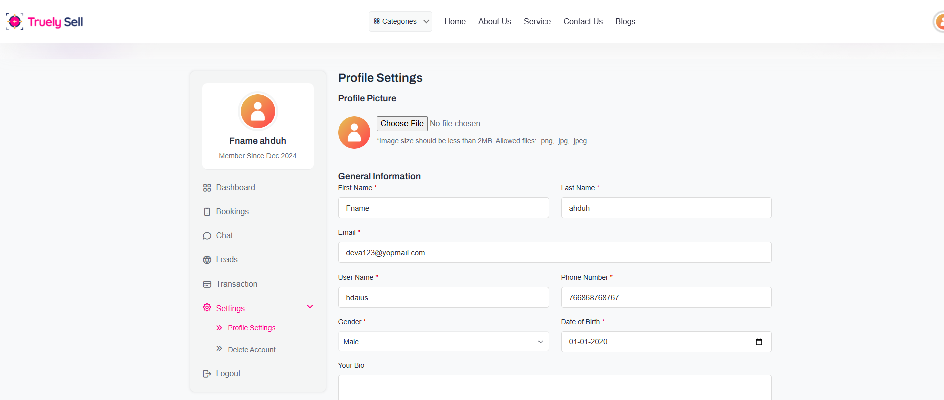
- Personal Information:
- Profile Picture:
- Account Settings:
- Address Information (if applicable):
Name: First and Last Name.
Email Address: Editable but requires re-verification if changed.
Phone Number: Editable with an option to verify via OTP.
Date of Birth (if applicable).
Gender (optional).
Option to upload a new profile picture or remove the current one.
Show live preview after upload.
Username (if allowed to edit).
Password reset option (e.g., "Change Password" with redirect or modal).
Primary Address (editable fields for street, city, state, zip code).
Add/Edit multiple addresses with tagging (e.g., "Home", "Office").
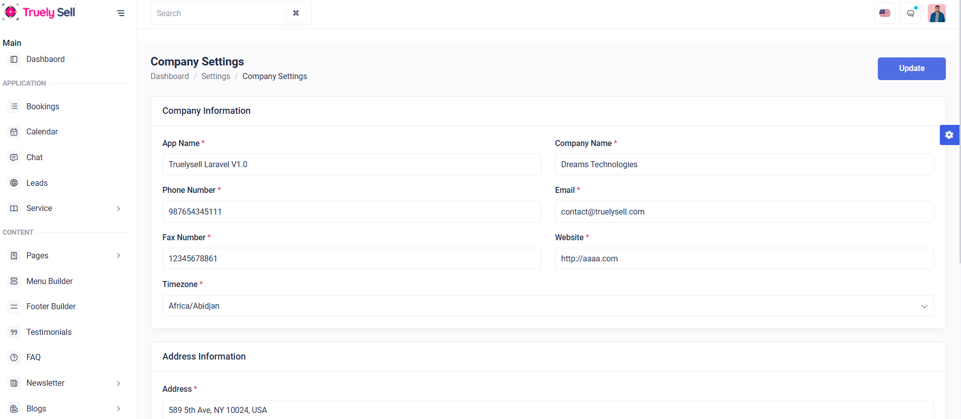
Purpose:
Allow the admin to manage Company Settings efficiently through a clean, intuitive interface. The settings include company information, contact details, and address information.
Layout:
The form is designed for clarity and ease of use:
- Section Header:
- Company Information Section:
- Address Information Section:
- Update Button:
The bold title "Company Settings" clearly indicates the purpose of the page.
Breadcrumb navigation (Dashboard / Settings / Company Settings) provides context to users.
Fields are displayed in a two-column layout for improved readability:
App Name
Company Name
Phone Number
Fax Number
Website
Timezone
Required fields are marked with an asterisk (*) for user clarity.
A dedicated section for the company’s address ensures organized input.
A prominent "Update" button in blue at the top-right corner saves changes efficiently.
Responsive Design:
On mobile devices, fields stack vertically for a smooth user experience.
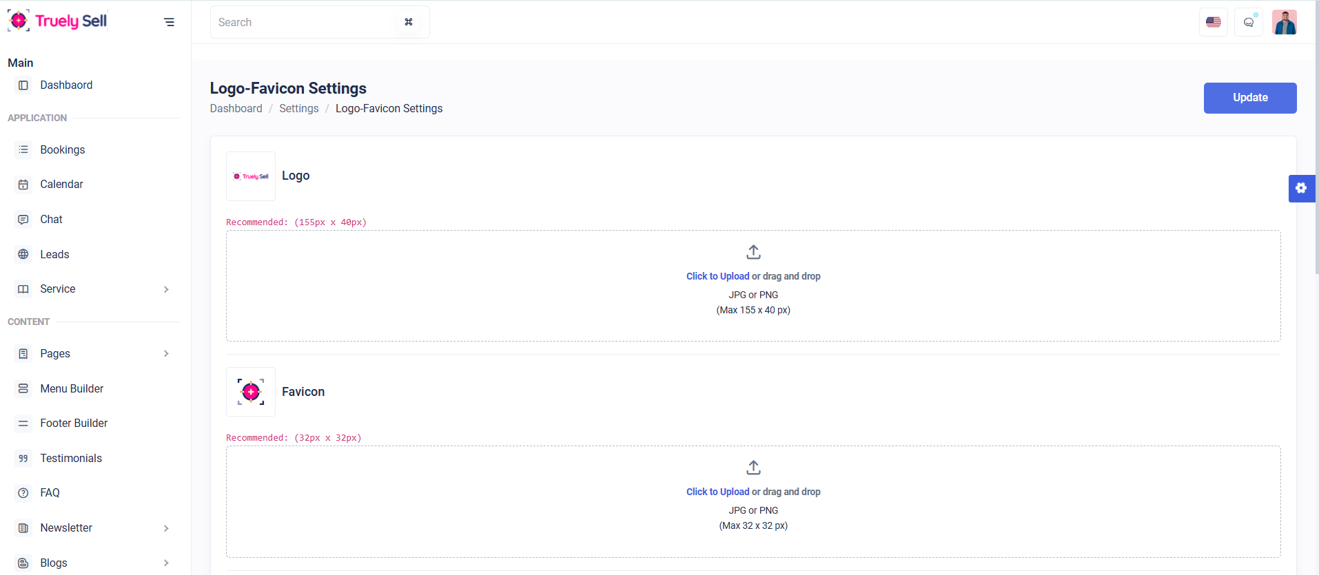
Purpose:
Allow the admin to upload or update the site’s logo and favicon.
Layout Design:
- Section Header:
- Logo Upload Section:
- Favicon Upload Section:
- Update Button:
A clear and bold title, "Logo-Favicon Settings," ensures users immediately understand the purpose of the page.
A breadcrumb navigation trail (Dashboard / Settings / Logo-Favicon Settings) gives context to the current page.
Header: "Logo" (clearly labeled).
Instructions:
Recommended dimensions (155px × 40px) are displayed in red to emphasize the importance of the size requirement.
Allowed formats: JPG or PNG.
Upload Area:
The drag-and-drop file upload area is outlined with a dotted border for visual clarity.
A "Click to Upload" link allows manual file selection.
A placeholder upload icon enhances user understanding.
Header: "Favicon" (clearly labeled).
Instructions:
Recommended dimensions (32px × 32px) are displayed in red for emphasis.
Allowed formats: JPG or PNG.
Upload Area:
Similar drag-and-drop zone with a dotted border and an upload icon.
"Click to Upload" option for manual selection.
A prominent blue "Update" button is placed at the top-right to save changes.
The placement ensures quick access for users after uploading the logo and favicon.
Responsive Design:
The layout scales seamlessly on mobile and tablet devices:
Upload areas stack vertically for a clean and accessible view.
The "Update" button remains fixed at the top for quick access on small screens.
Purpose:
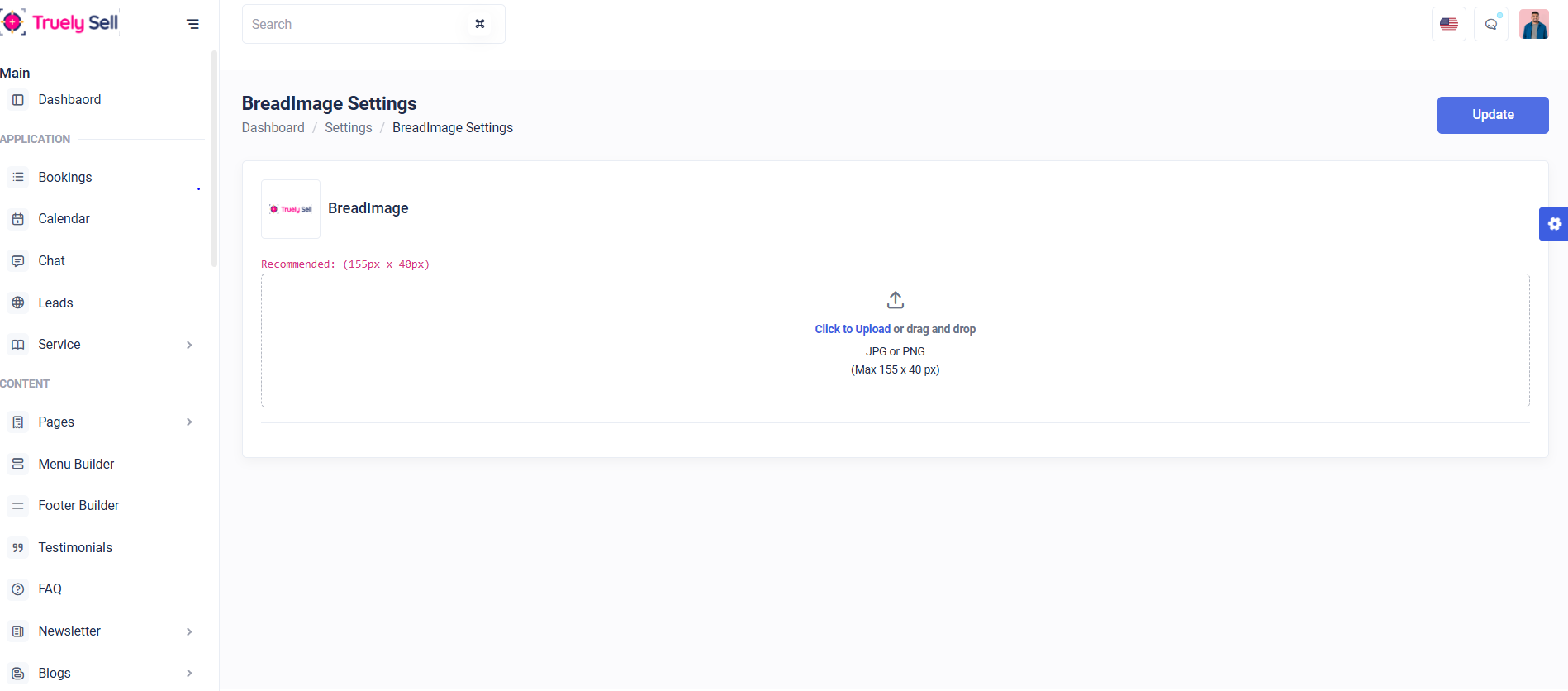
Allow the admin to manage BreadImage Settings efficiently by providing a user-friendly upload interface.
Layout:
- Section Header:
- Image Upload Area:
- Update Button:
The bold title "BreadImage Settings" ensures clarity.
Breadcrumb navigation (Dashboard / Settings / BreadImage Settings) provides context.
A clean, drag-and-drop upload box simplifies the upload process.
The recommended dimensions (155px x 40px) are displayed in red for user guidance.
Supported formats are JPG or PNG with a size restriction of 155px x 40px.
A clickable "Click to Upload" link makes the upload intuitive.
A prominent blue "Update" button at the top-right ensures quick changes are saved.
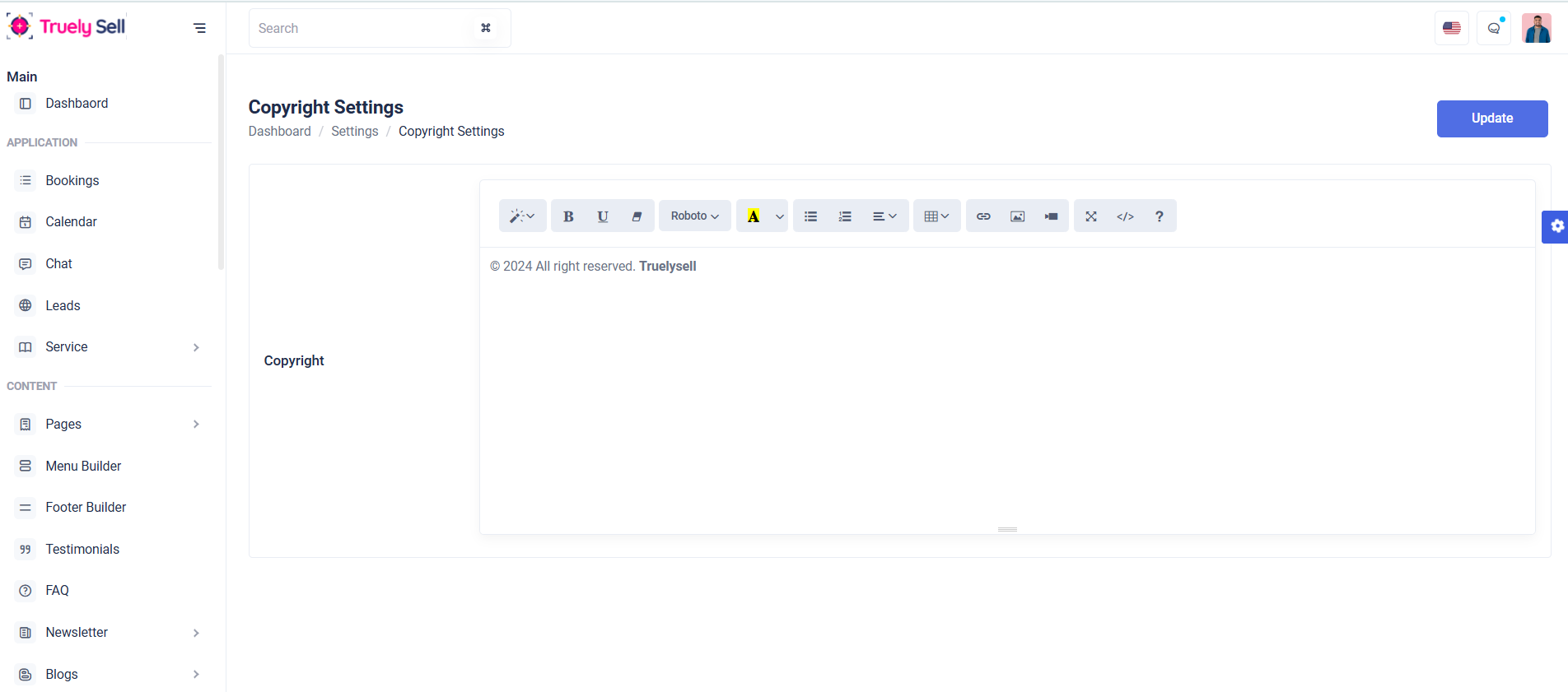
Purpose:
The form enables providers to add new service details effectively. Specifically, the input field labeled "Copyright" allows them to include copyright text relevant to the service. This ensures all necessary legal or informational content is documented properly for the service being added.
Layout:
The form is designed to be clean, user-friendly, and intuitive. The "Copyright" section is prominently placed within a bordered and rounded container, making it visually distinct and easy to locate. Labels and placeholders clearly communicate the purpose of each input field, while the use of a textarea provides adequate space for providers to input text. Validation messages, such as those displayed by the copyright_error span, appear beneath the relevant field to provide immediate, actionable feedback without overwhelming the user.
Responsive Design:
The form adopts a responsive layout that adjusts seamlessly across desktop and mobile devices. The grid-based structure, utilizing Bootstrap's col-xxl and col-lg classes, ensures that elements are appropriately sized and aligned on various screen sizes. Text areas, buttons, and validation messages remain usable and readable regardless of device, maintaining a consistent and professional appearance. This approach guarantees accessibility and usability for all providers, enhancing their overall experience.
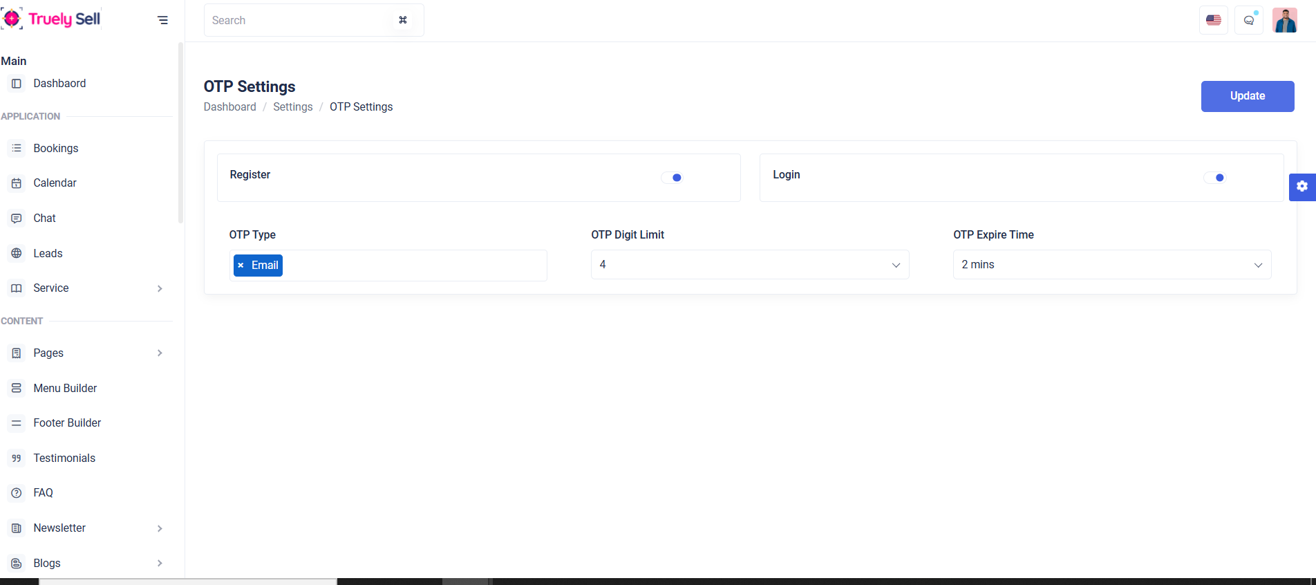
Purpose:
This form allows administrators to configure user authentication settings, including toggling registration and login functionality, selecting OTP types, setting OTP digit limits, and defining OTP expiration times. It provides a streamlined way to customize authentication mechanisms for improved security and user experience.
Layout:
The form is structured for clarity and ease of use. Each section is enclosed in a bordered and rounded container for visual segmentation. Toggle switches for "Register" and "Login" are grouped into two distinct rows for better organization and quick accessibility. The OTP-related configurations, including type, digit limit, and expiration time, are placed in a second row using evenly spaced columns to ensure logical grouping and alignment. Labels are prominently displayed alongside their respective inputs, and validation messages appear directly beneath the relevant fields to provide immediate feedback.
Responsive Design:
The form is built with responsive principles to ensure usability across all devices. The Bootstrap grid system adapts layout elements based on screen size, maintaining alignment and readability on desktops, tablets, and mobile devices. Input fields, toggle switches, and dropdowns are touch-friendly, ensuring smooth interaction on smaller screens. This design guarantees a consistent experience for all users, regardless of their device.
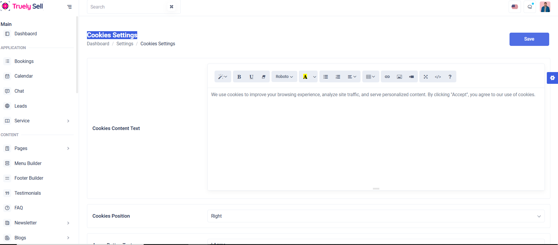
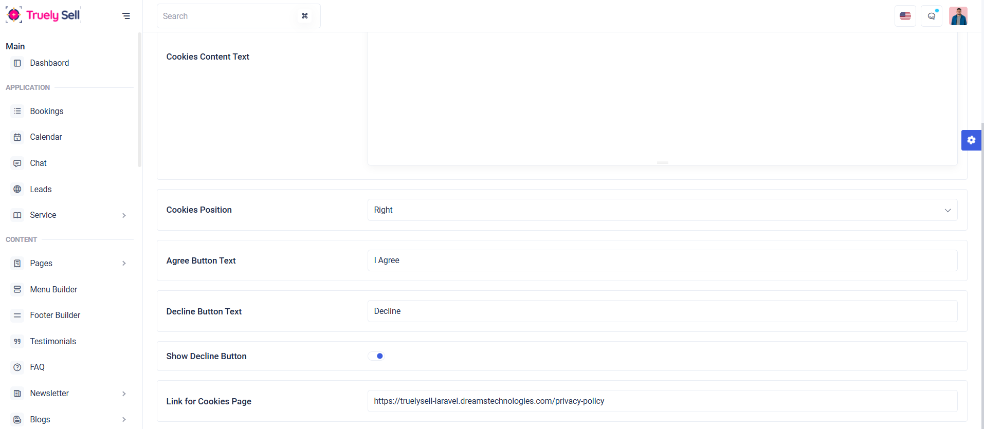
Purpose:
This form provides a customizable interface for managing cookie consent settings on a website. Administrators can configure the cookie content text, banner position, button texts, and additional options like showing a decline button or linking to a cookies policy page. It ensures compliance with privacy regulations like GDPR by allowing users to accept or decline cookies with transparency.
Layout:
The form is divided into distinct sections for each configurable element, wrapped in bordered and rounded containers for visual clarity. The "Cookies Content Text" section includes a text area for detailed information, while dropdowns for "Cookies Position" and "Agree" and "Decline" button labels allow easy selection of predefined values. A toggle switch is used to enable or disable the "Show Decline Button" option, providing a modern and interactive control. Each input is accompanied by validation error messages to guide the user in case of incorrect or missing data.
Responsive Design:
Built using a responsive framework, the layout adapts seamlessly to different screen sizes. The col-xxl and col-lg classes ensure proper alignment and spacing on larger screens, while the stacked layout on smaller devices maintains usability. The touch-friendly inputs and clear labels guarantee accessibility and a consistent user experience across all devices.
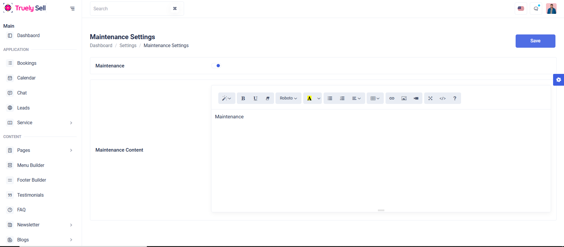
Purpose:
This form is designed to configure maintenance mode settings for a website. It enables administrators to toggle maintenance mode on or off and customize the content displayed to users when the website is under maintenance. This ensures effective communication with users during downtime, providing essential information or updates while preventing access to the site's full functionality.
Layout:
The form consists of two main sections, each enclosed in a bordered and rounded container for a clean and organized appearance. The first section includes a toggle switch labeled "Maintenance," allowing administrators to easily enable or disable maintenance mode. The second section provides a text area labeled "Maintenance Content," where administrators can specify the message displayed to users during maintenance. Clear headings and concise labels ensure the form is user-friendly, with sufficient spacing between elements for readability.
Responsive Design:
The layout is fully responsive, leveraging col-xxl and col-lg classes to adapt seamlessly across different screen sizes. On larger screens, the sections are displayed side by side for efficient use of space, while on smaller screens, the elements stack vertically for better accessibility. Touch-friendly controls and a simple, intuitive interface ensure a consistent and effective user experience on desktops, tablets, and mobile devices.
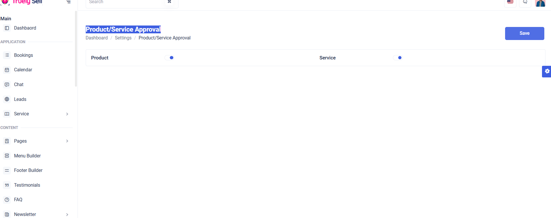
Purpose:
This form is designed to manage the activation of "Product" and "Service" features on a platform. Administrators can enable or disable these features using toggle switches, ensuring flexibility in offering specific functionalities based on operational needs.
Layout:
The form is structured into two sections: "Product" and "Service." Each section is neatly aligned within a bordered container, with headings and toggle switches for clear interaction. The use of col-md-6 ensures both sections are displayed side-by-side on larger screens for better visual balance.
Responsive Design:
The layout adjusts seamlessly across devices. On smaller screens, the sections stack vertically, maintaining usability and accessibility. The toggle switches are touch-friendly, ensuring smooth interaction on mobile devices.
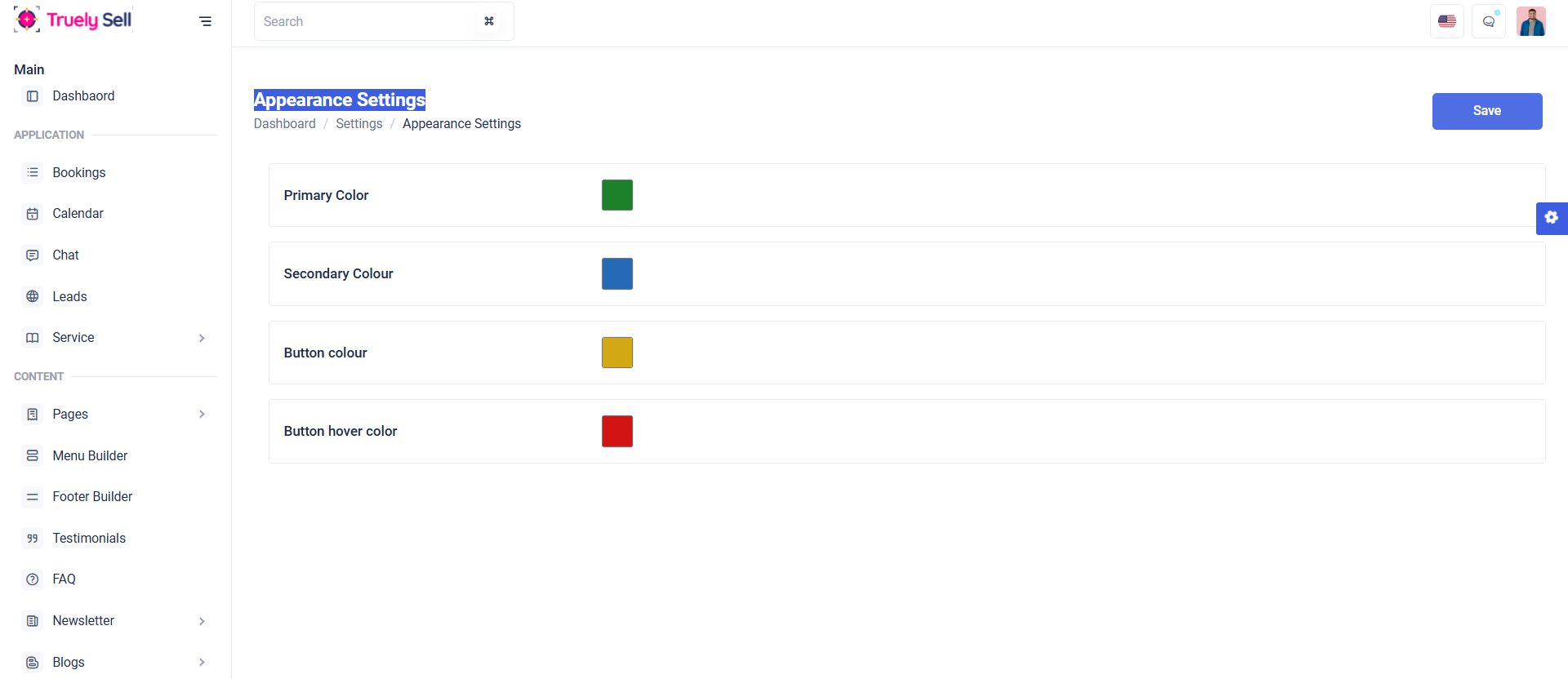
Purpose:
This form allows administrators to customize the color scheme of a website or application. The form includes options for configuring the primary color, secondary color, button color, and button hover color. By using color pickers, administrators can visually adjust and set color values that will be reflected across the platform's interface, ensuring a personalized and cohesive design.
Layout:
The form is organized into a series of distinct sections, each dedicated to a specific color setting (primary, secondary, button color, and button hover color). Each section is clearly labeled with a heading for easy identification. The form inputs use color pickers, which provide a user-friendly way to select colors. These inputs are paired with labels, making the form intuitive and easy to navigate. The overall structure is neatly spaced and visually balanced, with each section enclosed in a bordered container, creating a clean, organized design.
Responsive Design:
The form is fully responsive, using flexible grid columns to ensure that the layout adjusts fluidly across different screen sizes. On larger screens, the input fields and labels are displayed side-by-side, while on smaller devices, they stack vertically. This ensures the form remains user-friendly and accessible on any device, whether it’s a desktop, tablet, or mobile phone. The color pickers are also touch-friendly for easy interaction on mobile devices.
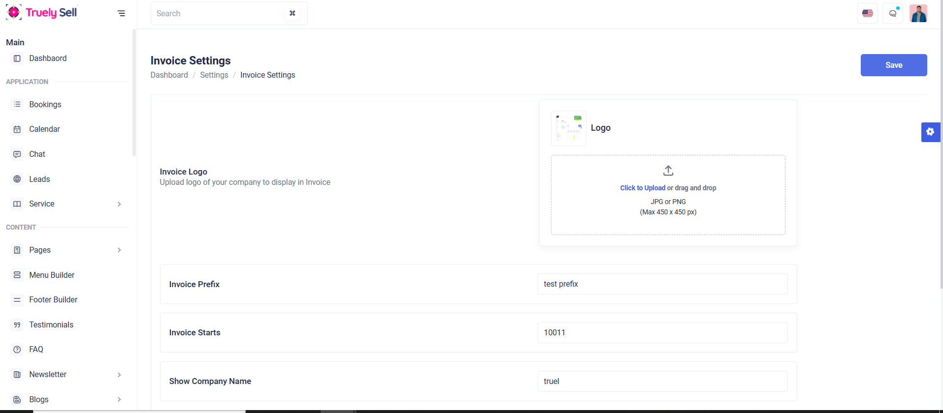
Purpose:
This form is designed for managing the invoice settings of a company. It allows administrators to upload the company logo, define the invoice prefix, set the starting invoice number, display the company name, and customize the header and footer terms of the invoice. These settings ensure that the invoices generated by the system adhere to the company’s branding and formatting requirements. The form provides a straightforward way for administrators to personalize invoice details to suit the company's needs.
Layout:
The form is organized into distinct sections, each with a clear title and associated input fields. The first section allows the uploading of a company logo, followed by sections for configuring the invoice prefix, starting number, company name, and invoice header/footer terms. Each setting is enclosed in a bordered container with a label, an input field, and an optional description. The form is designed to be user-friendly, with clear error messages placed below each input field to guide administrators in filling out the form correctly.
Responsive Design:
The form is fully responsive, utilizing a flexible grid layout with columns that adjust depending on screen size. On larger screens, the form content is spread across multiple columns for easy readability, while on smaller devices, the content stacks vertically for a more compact view. This ensures that the form remains accessible and functional on any device, whether it’s a desktop, tablet, or mobile phone. The logo upload area also accommodates touch interactions for mobile users.
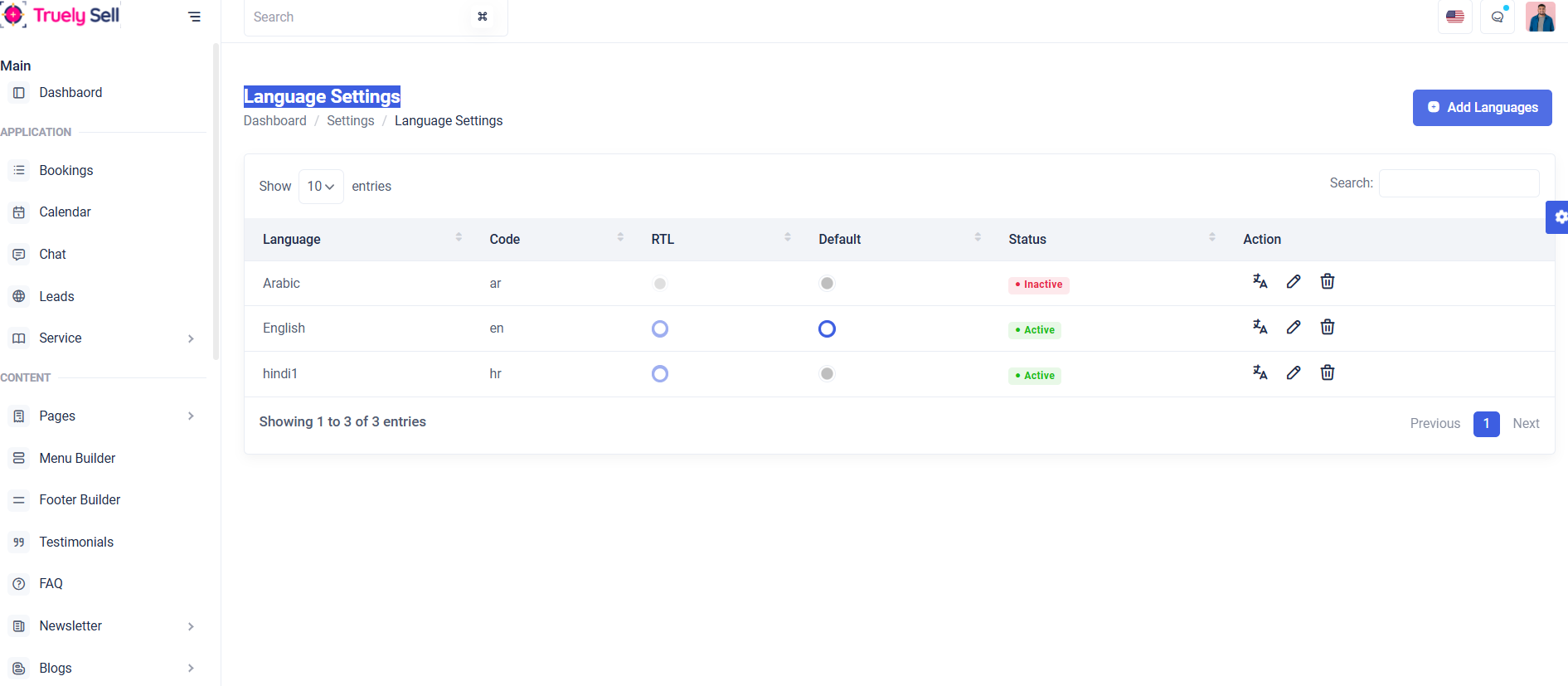
Purpose:
This table is designed to display a list of languages, showing their name, code, direction (RTL or LTR), default status, and current status. It serves as a management interface for administrators to review and manage available languages in the system.
Layout:
The table features a clean, structured layout with columns for language details and an action column for each language. The table header is clearly defined with labels for each field, and an "Action" column is provided for editing or deleting languages.
Responsive Design:
The table is responsive, ensuring readability on various screen sizes. On smaller screens, the table can rearrange or hide certain columns to maintain a clean and user-friendly display without compromising functionality.
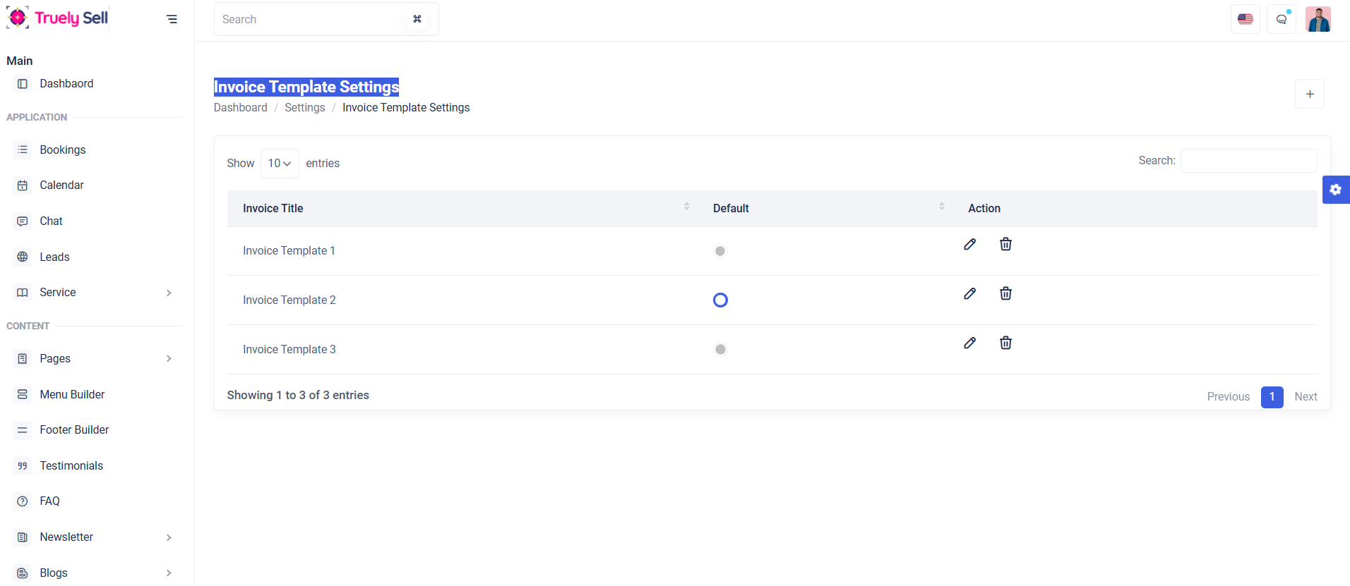
Purpose:
This table is designed to display and manage invoice templates, showing essential details such as the title of each template, its default status, and available actions for managing templates. It provides a clear and efficient way to review and modify invoice settings.
Layout:
The table features a structured layout with three columns: "Invoice Title" for identifying templates, "Default" for indicating the primary template, and "Action" for performing operations like edit or delete. The header uses a light theme for distinction.
Responsive Design:
Optimized for all devices, the table adapts to smaller screens using scrollable containers or stacked rows, ensuring functionality and readability on mobile.

Form Overview
Dynamic Commission Rate: This form adjusts based on commission type chosen (Percentage or Flat).
Commission rate can be set for each (percentage or flat).
Layout: The form should be clean, intuitive, and easy to follow. Each field will be clearly labeled, and validation messages will guide the provider through the process.
Tax Options

Overview
This table is designed to display a list of tax options, showing their tax type, tax rate status toggle(enable or disable), action (edit or delete). It serves as a management interface for administrators to review and manage available tax options in the system.
Add Tax

Edit Tax:
Features
Add Tax option:
Admins can create new tax options by providing a tax type, tax rate and allows to add a maximum of 5.
Edit Tax option:
Modify existing tax options.
Delete Tax Option:
Remove outdated or irrelevant tax option
Status Toggle:
Enable or disable tax option dynamically.
Add:
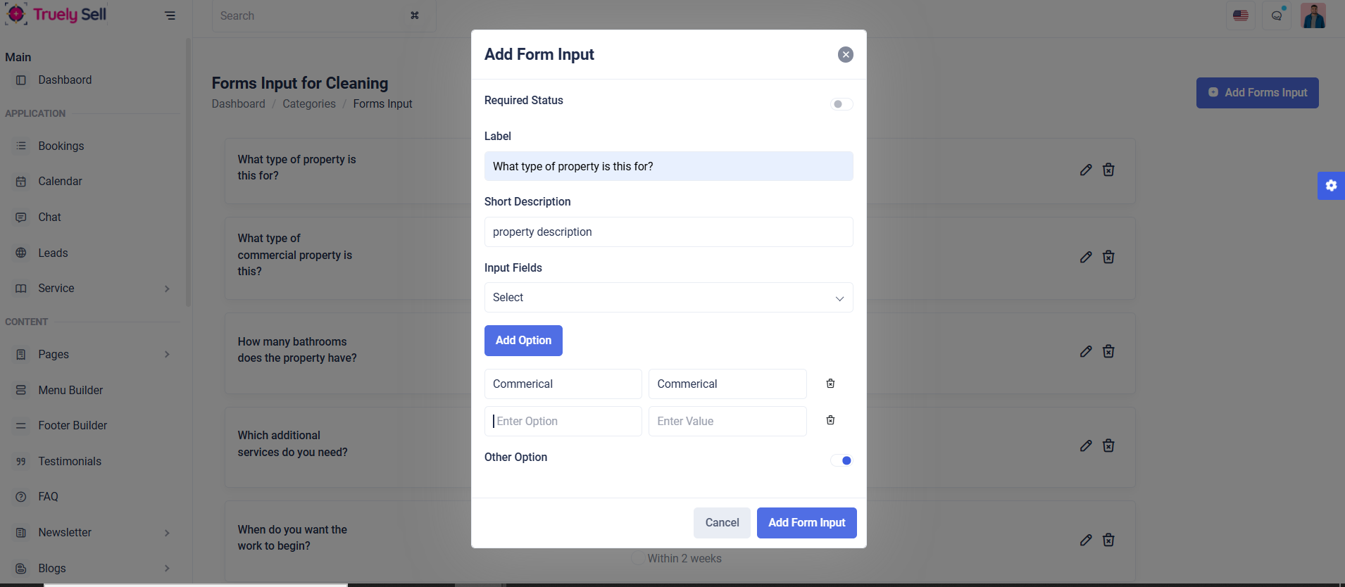
Purpose:
This form dynamically creates customizable input fields for forms, supporting various input types like text, checkboxes, and date pickers. It includes options for placeholders, file sizes, and toggling "required" and "other" statuses.
Layout:
The form uses a clean modal structure with Bootstrap for alignment and spacing. Input fields are grouped logically with labels, toggles, and placeholders. Error validation spans ensure proper user feedback.
Responsive Design:
Bootstrap’s grid (col-md-12) ensures responsiveness on all screen sizes. Elements stack vertically on smaller screens for usability. JavaScript toggles (e.g., placeholder_div, file_size) dynamically display relevant fields, enhancing interactivity.
List:
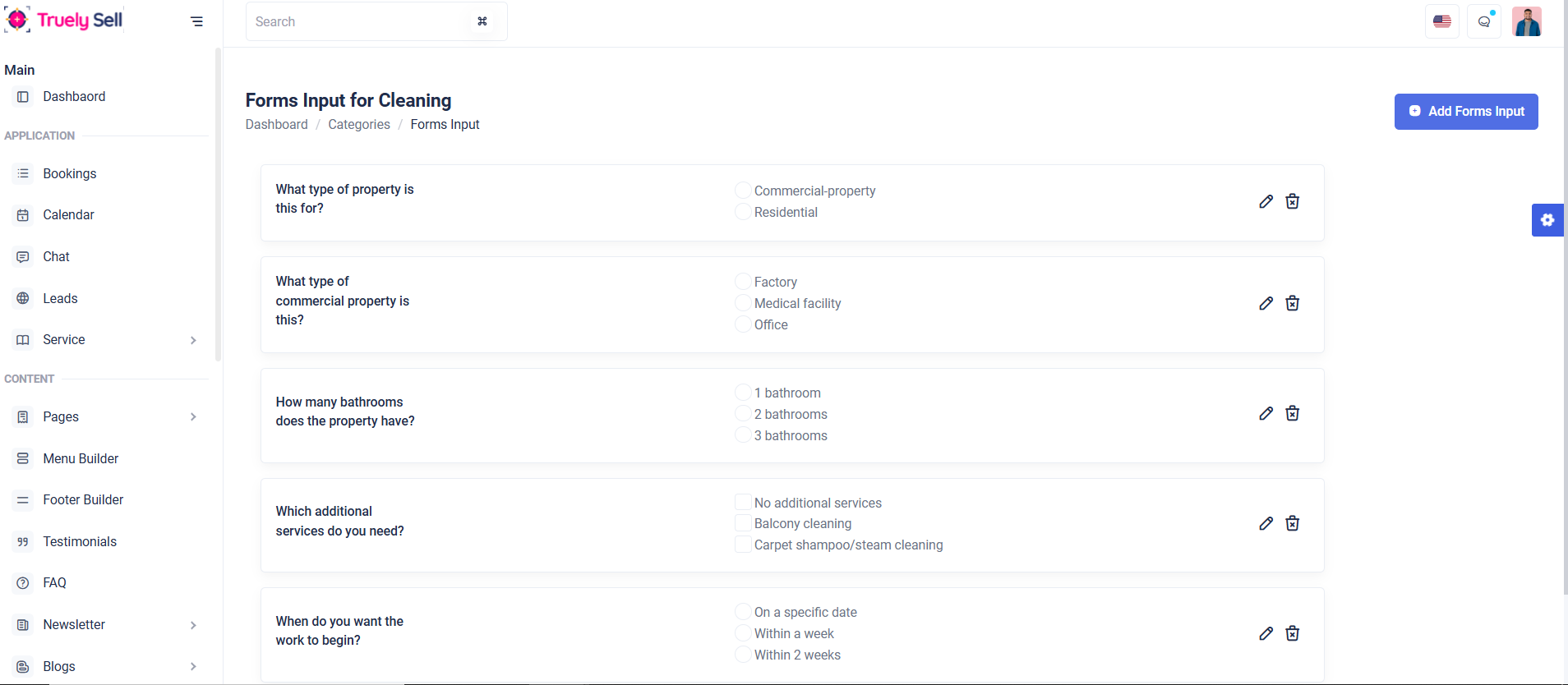
Purpose:
The list view displays dynamically created form inputs in a structured, readable layout. It allows users to view, edit, or delete existing form fields, providing a comprehensive way to manage input options.
Layout:
Using Bootstrap, the list is organized into rows with columns for key details like label, input type, placeholder, and actions (edit/delete). Buttons are styled for clear user interaction, ensuring accessibility.
Responsive Design:
Bootstrap ensures responsiveness, stacking list elements vertically on smaller screens. Action buttons adapt to mobile views while maintaining usability. Dynamic JavaScript can be used for smooth sorting, filtering, and inline editing.
Edit:
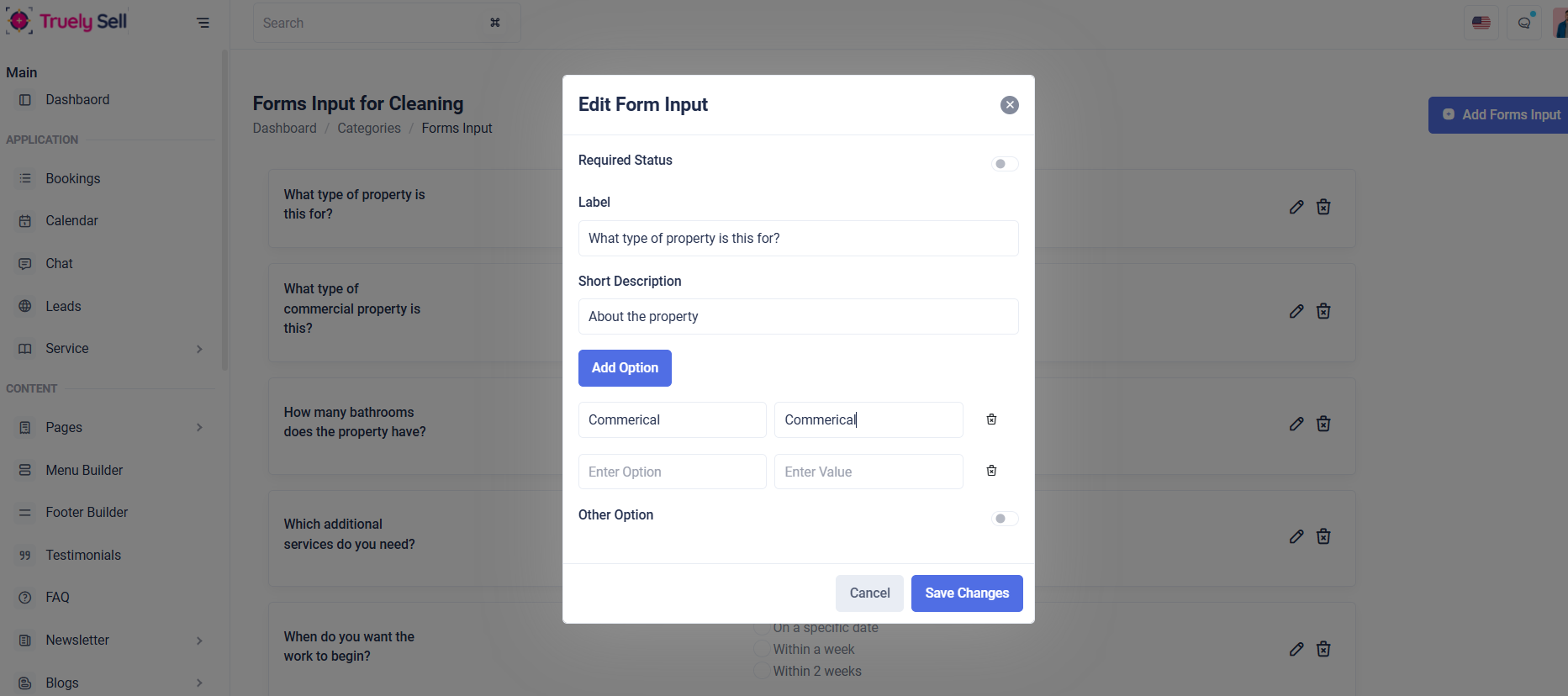
Purpose:
The form is designed for editing existing input fields dynamically with options such as label, description, placeholder, file size, and additional configurations. It ensures flexibility for updating form inputs efficiently.
Layout:
The form uses Bootstrap's grid system to maintain a clean structure. Fields are grouped logically, and elements like toggles and buttons are styled with Bootstrap classes for clarity and user experience.
Responsive Design:
The form adapts seamlessly to various screen sizes. On smaller devices, input fields and buttons stack vertically. Conditional fields (like placeholder and file size) toggle visibility dynamically to avoid clutter.
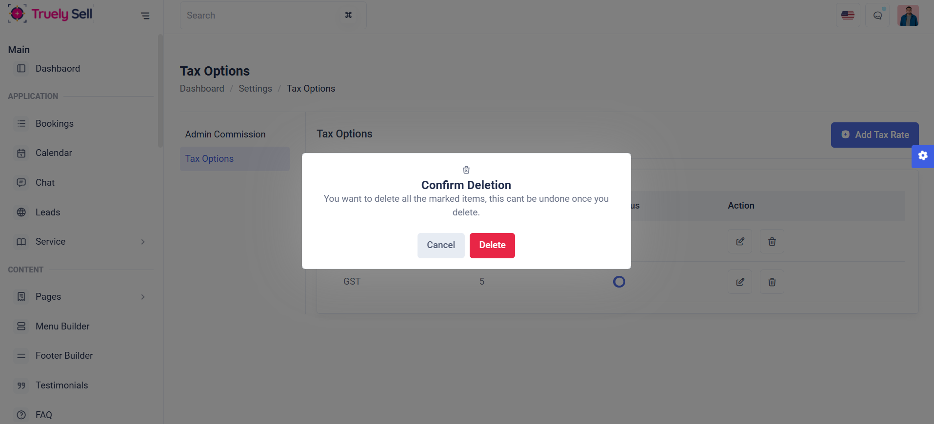
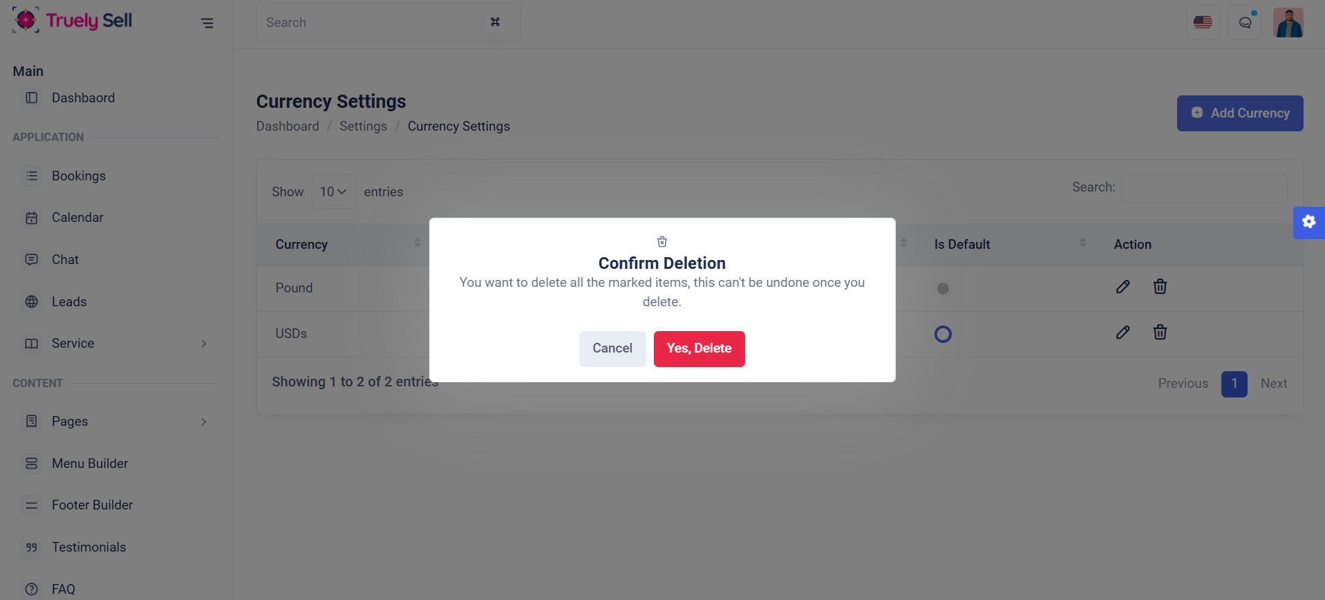
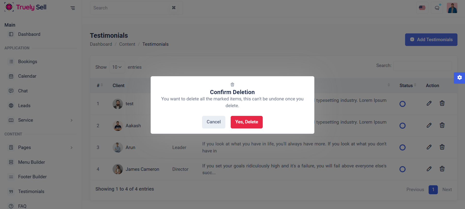
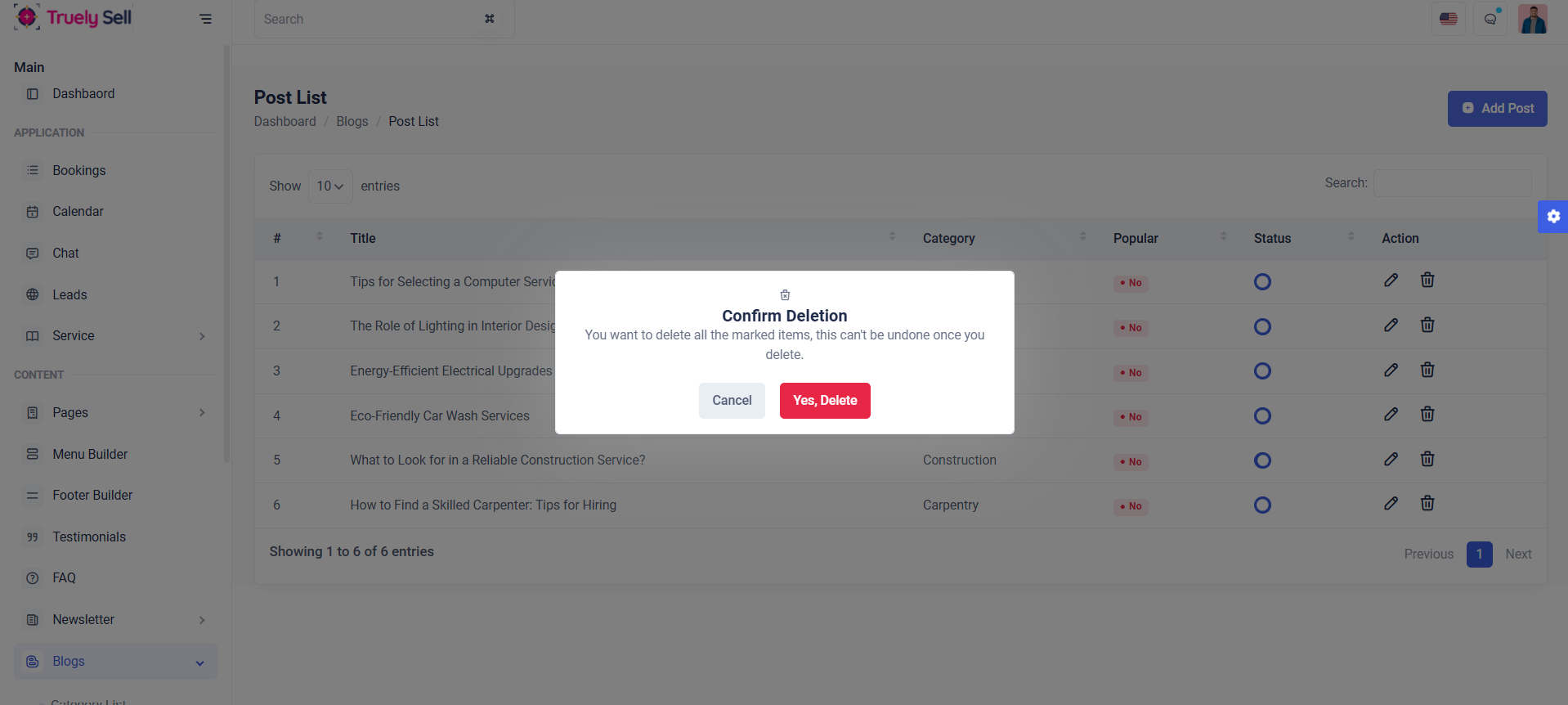
Delete:
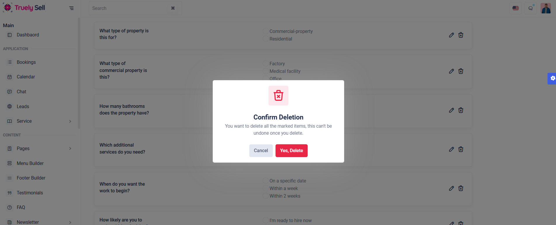
Purpose:
This form serves as a confirmation dialog for deleting marked items. It ensures users acknowledge the irreversible nature of the action before proceeding, reducing accidental deletions.
Layout:
The form uses a centered modal layout with a delete icon, header, and a descriptive message. Two buttons—Cancel and Confirm Delete—are aligned for easy decision-making.
Responsive Design:
The modal remains centered, and buttons stack properly on smaller devices, maintaining usability and clarity.
Purpose:
This form enables users to search for Category. It dynamically displays input fields for category selection on the banner configuration, making it adaptable to different use cases.
Layout:
The form uses a clean, horizontal layout with input fields and a submit button. Bootstrap’s input-group ensures proper alignment of icons and inputs. Icons enhance visual clarity, while tooltips guide users.
Responsive Design:
By leveraging Bootstrap's d-md-flex and utility classes like w-100, the form adjusts seamlessly on various screen sizes. Fields stack vertically on smaller screens while maintaining usability and alignment.
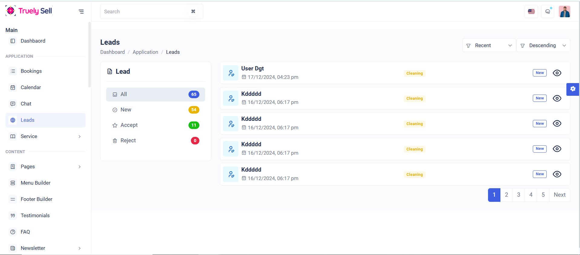
User Leads
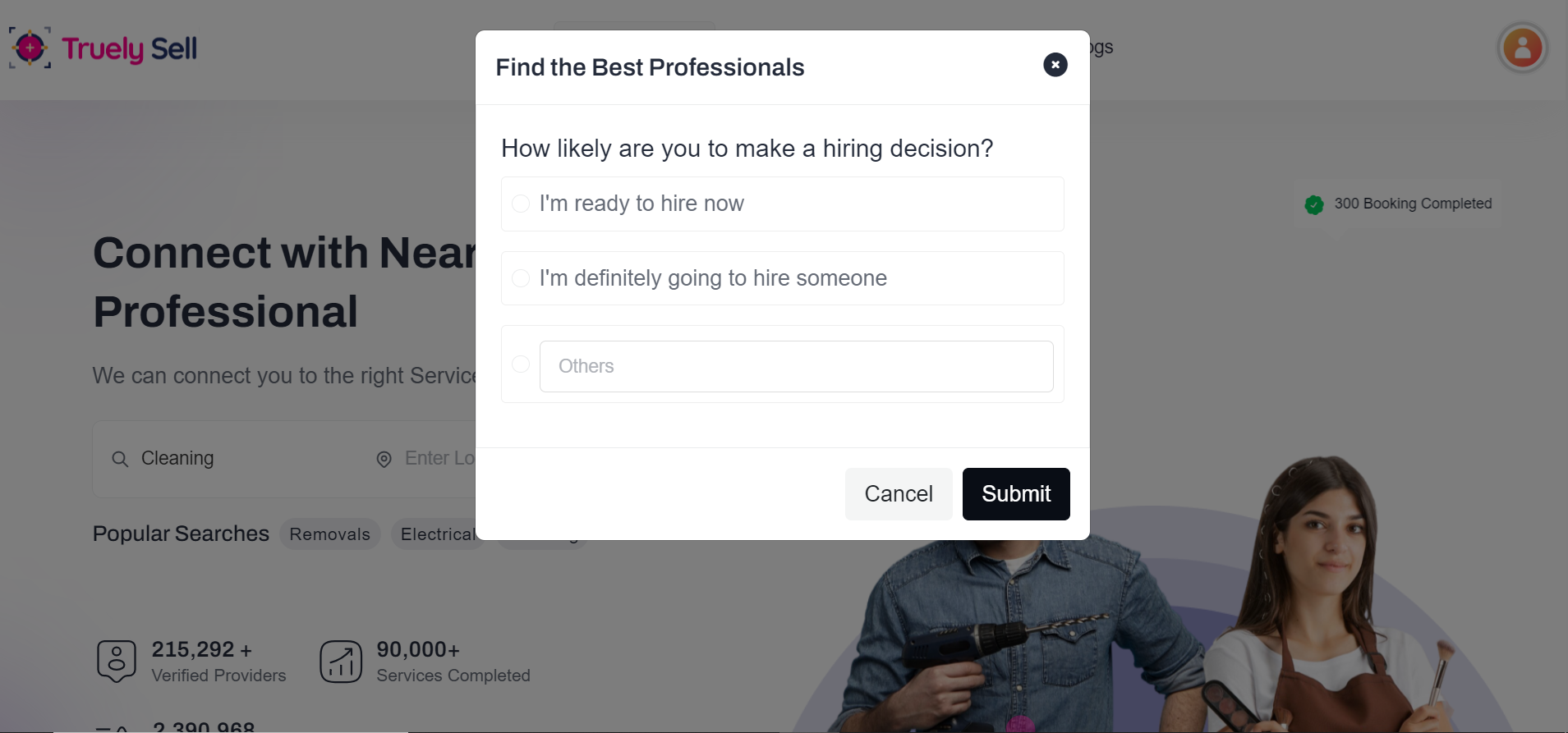
Purpose:
After selecting the all the form Question in the model,finally click the ‘Submit’ button to save the leads and it direct to the provider based on the selected category.
Layout:
The form uses a clean, horizontal layout with input fields and a submit button. Bootstrap’s input-group ensures proper alignment of icons and inputs. Icons enhance visual clarity, while tooltips guide users.
Responsive Design:
By leveraging Bootstrap's d-md-flex and utility classes like w-100, the form adjusts seamlessly on various screen sizes. Fields stack vertically on smaller screens while maintaining usability and alignment.
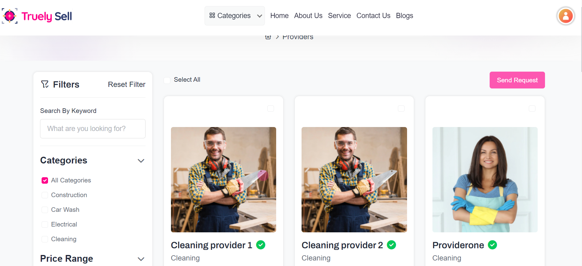
Purpose:
This code dynamically generates provider cards, displaying individual provider details including name, profile image, ratings, and an action button for sending requests. It allows users to select multiple providers using checkboxes and view their details through links. The card is interactive, visually appealing, and functional.
Layout:
The structure uses Bootstrap's grid system (col-xl-4 col-md-6) to create responsive three-column layouts on larger screens and two-column layouts on medium screens. The card component organizes content into sections:
Header: Contains a checkbox for provider selection.
Body: Displays the profile image and essential details.
Rating & Action: Displays a star rating with dynamic classes (filled) and a call-to-action button.
Icons (fa-check-circle, fa-star) and dynamic data integration (provider_name, averageRating, totalRatings) enhance usability. The profile image uses a fallback URL when unavailable, ensuring a clean user experience.
Responsive Design:
Using Bootstrap classes, the layout is fluid and adjusts based on screen size:
On large screens (xl): Cards display in three columns.
On medium screens (md): Cards stack into two columns.
On small screens: Cards appear in a single column.
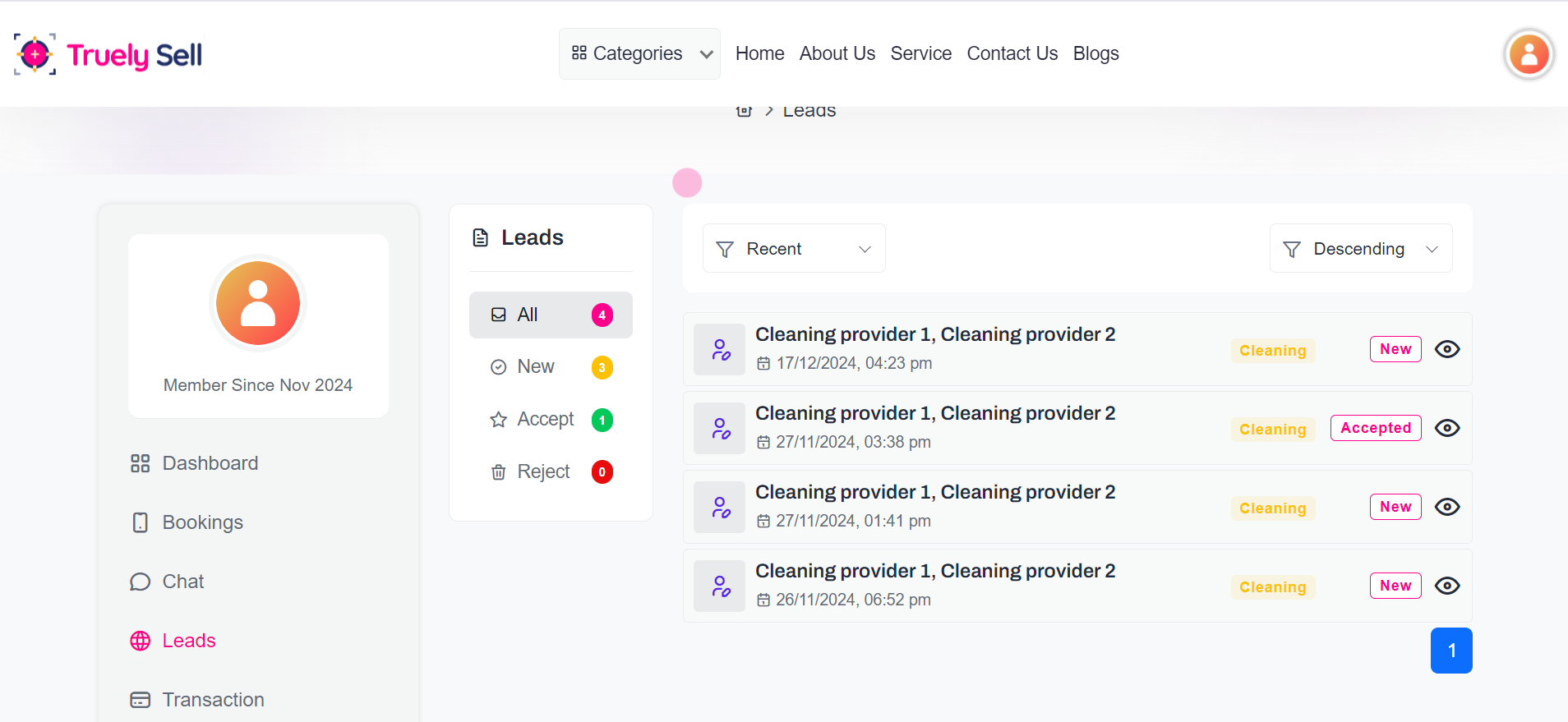
Purpose:
This code dynamically generates a responsive card to display task-related details, such as the provider name, creation date, category, and status. It includes an action link (View) for further details, making it ideal for task management or leads tracking.
Layout:
The card uses Bootstrap's grid for structured alignment. It consists of:
Left Section: Displays the avatar, provider name, and creation date.
Right Section: Shows the category, status badge, and a "View" link for interaction.
Responsive Design:
The layout adjusts to screen sizes, stacking elements vertically on smaller screens while maintaining horizontal alignment on larger devices. Padding , spacing , and responsive text ensure readability and usability across devices.
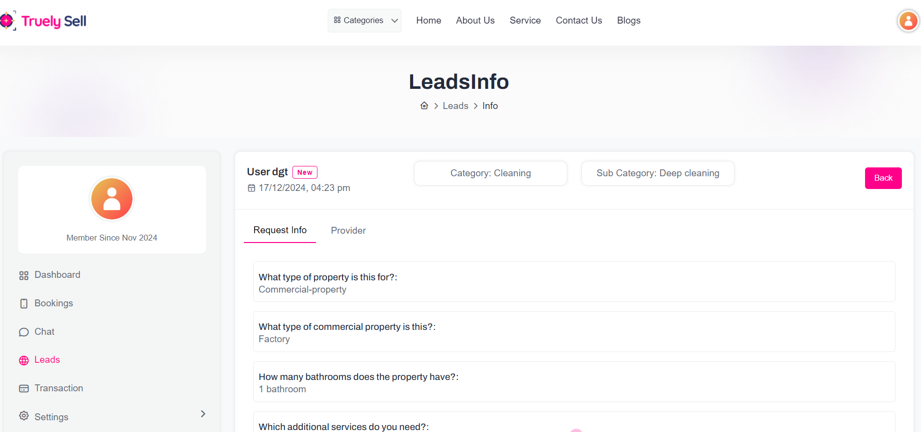
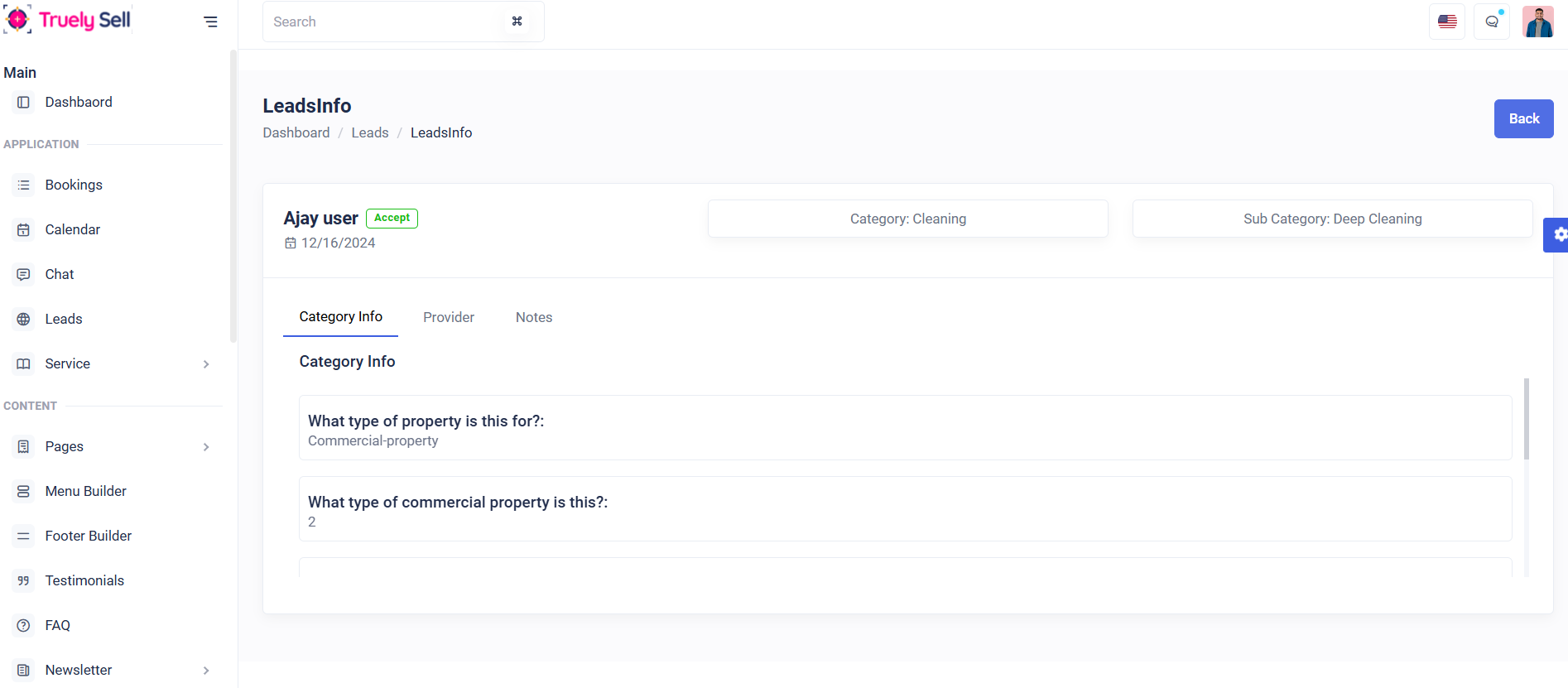
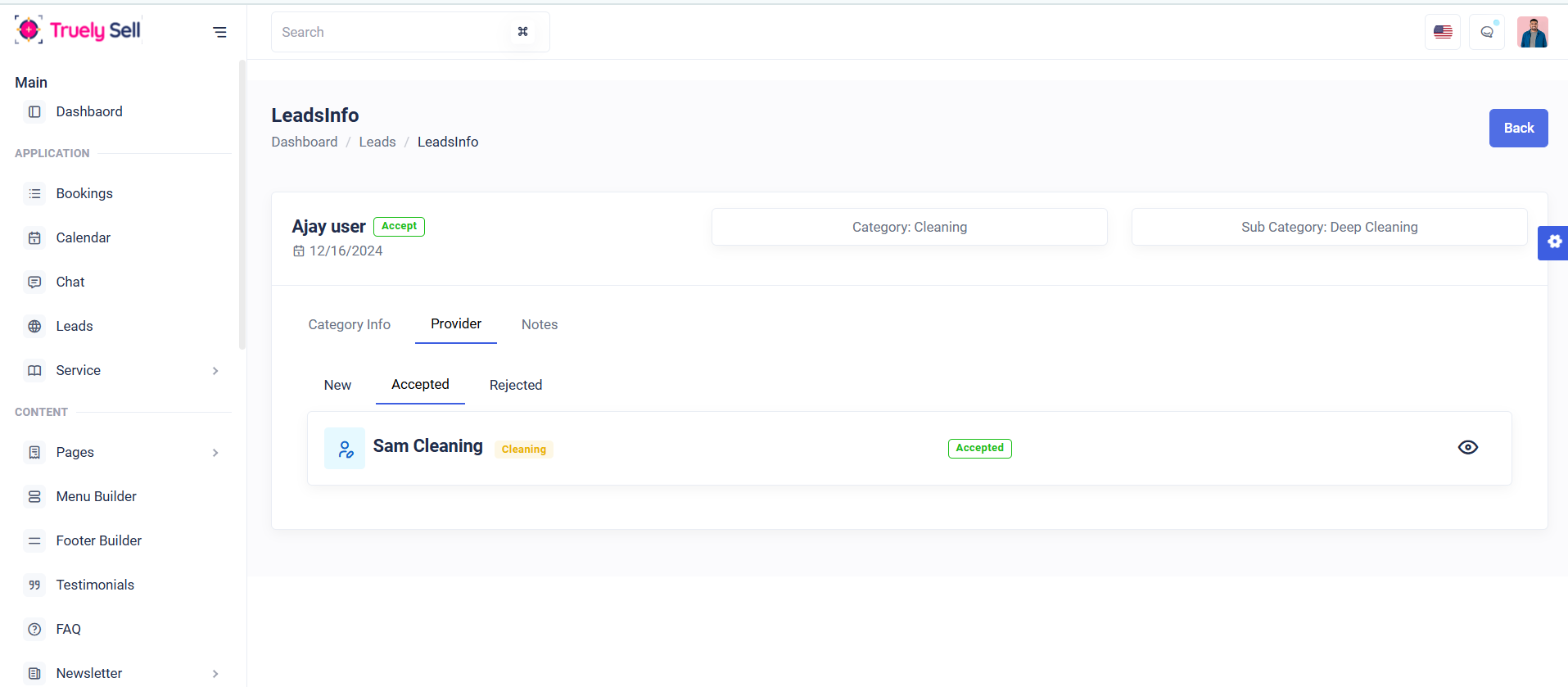
Purpose:
This code generates a detailed lead management card featuring user information, status, category, and sub-category. It includes navigation tabs to organize "Request Info," "Provider" lists, and "Notes," enhancing usability for tracking and managing leads.
Layout:
The layout uses a Bootstrap grid to divide content into structured sections:
Top Row: Displays user details, category, sub-category, and a "Back" button.
Tabs: Organizes lead details (Request Info, Providers, Notes). Sub-tabs within "Provider" categorize leads as "New," "Accepted," or "Rejected."
Responsive Design:
The design adapts seamlessly to varying screen sizes, ensuring horizontal content alignment on larger screens and vertical stacking on smaller devices. Bootstrap classes ensure responsiveness and spacing.
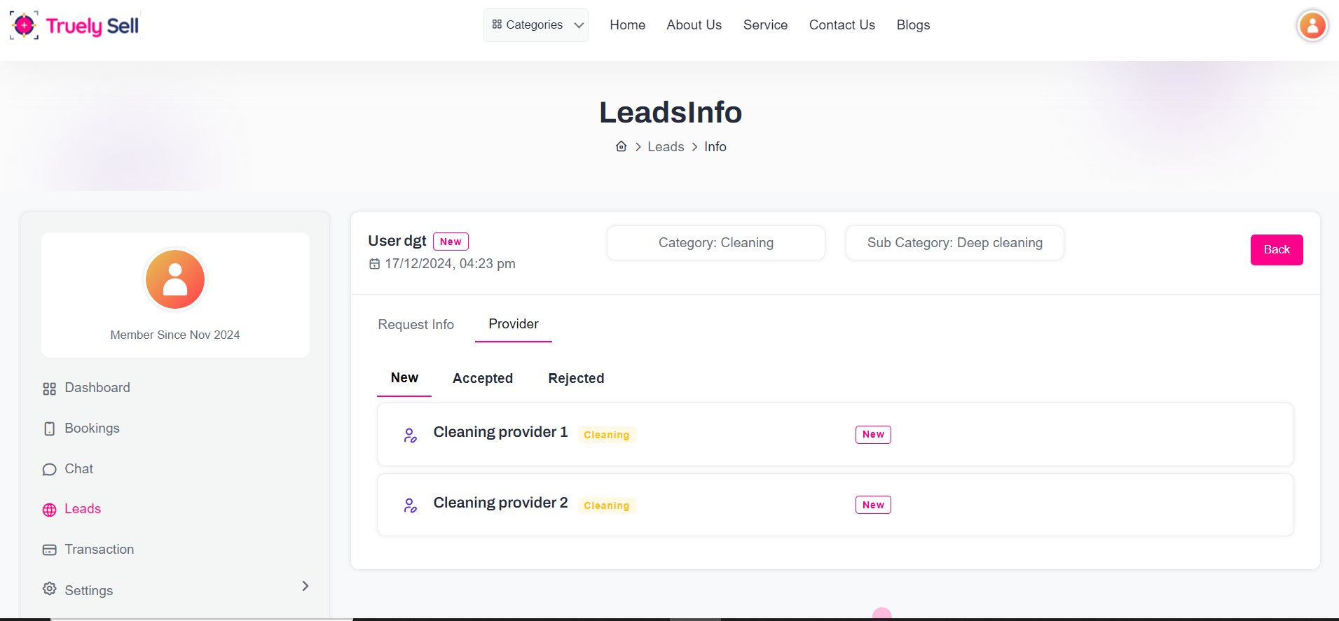
Purpose:
The provided code dynamically generates provider cards within a lead management system. It displays provider details such as name, category, status, quotes, and actions like Accept, Reject, Chat, and Pay Now. The functionality enhances user interaction and decision-making for managing leads.
Layout:
Header Section: Displays provider name, category badge, and status.
Body Section: Includes expandable "Quote Details" (quote, start date, description) and action buttons.
Conditional buttons (Accept, Reject, Chat, Pay Now) adapt based on provider and lead status.
Responsive Design:
Using Bootstrap the layout adapts seamlessly for various devices. Content stacks vertically on small screens while maintaining spacing and alignment.
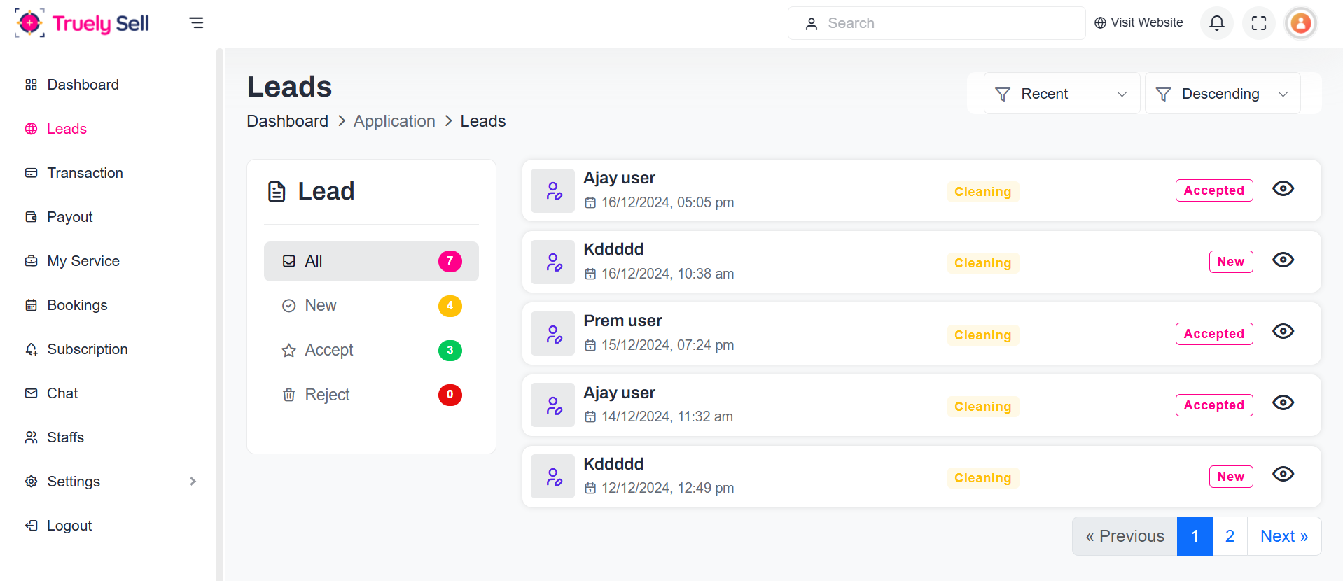
Purpose:
The provided code dynamically generates a user card displaying key information such as the user's name, category, creation date, and status. It allows for easy viewing of lead details through a clickable "view" button. This setup is intended for lead management systems, enabling users to quickly access and review lead data.
Layout:
Left Section: Displays user name, formatted with uppercase first letter, and creation date.
Right Section: Shows category, status badge, and an action button ("View").
The layout is structured using rows and columns for proper alignment and spacing.
Responsive Design:
The design uses Bootstrap for responsiveness. On smaller screens, the content adapts by stacking vertically and maintaining legibility with adequate padding and spacing. The layout remains functional and visually appealing across different device sizes.
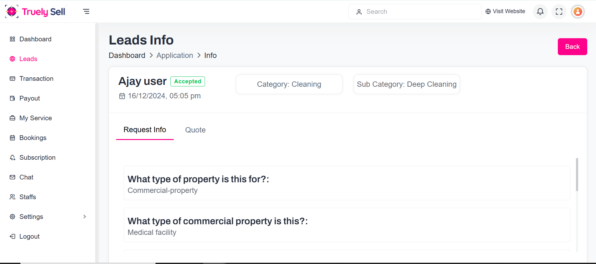
Purpose:
The provided code is designed for displaying lead details and providing an interface for submitting quotes to providers. It includes sections for showing user information, category details, and status with options to accept or reject the lead. Users can also view and submit a quote with associated details like start date and description through a form.
Layout:
Top Section: Displays user name, status, creation date, and categories in separate columns.
Tab Section: Includes tabs for "Request Info" and "Quote."
Quote Form: Allows submission of quote details with input fields for quote amount, start date, and description.
Responsive Design:
The design is built with Bootstrap grid to ensure responsiveness on various screen sizes. On mobile screens, the layout adapts by stacking elements and maintaining clarity with proper spacing and element resizing for readability.
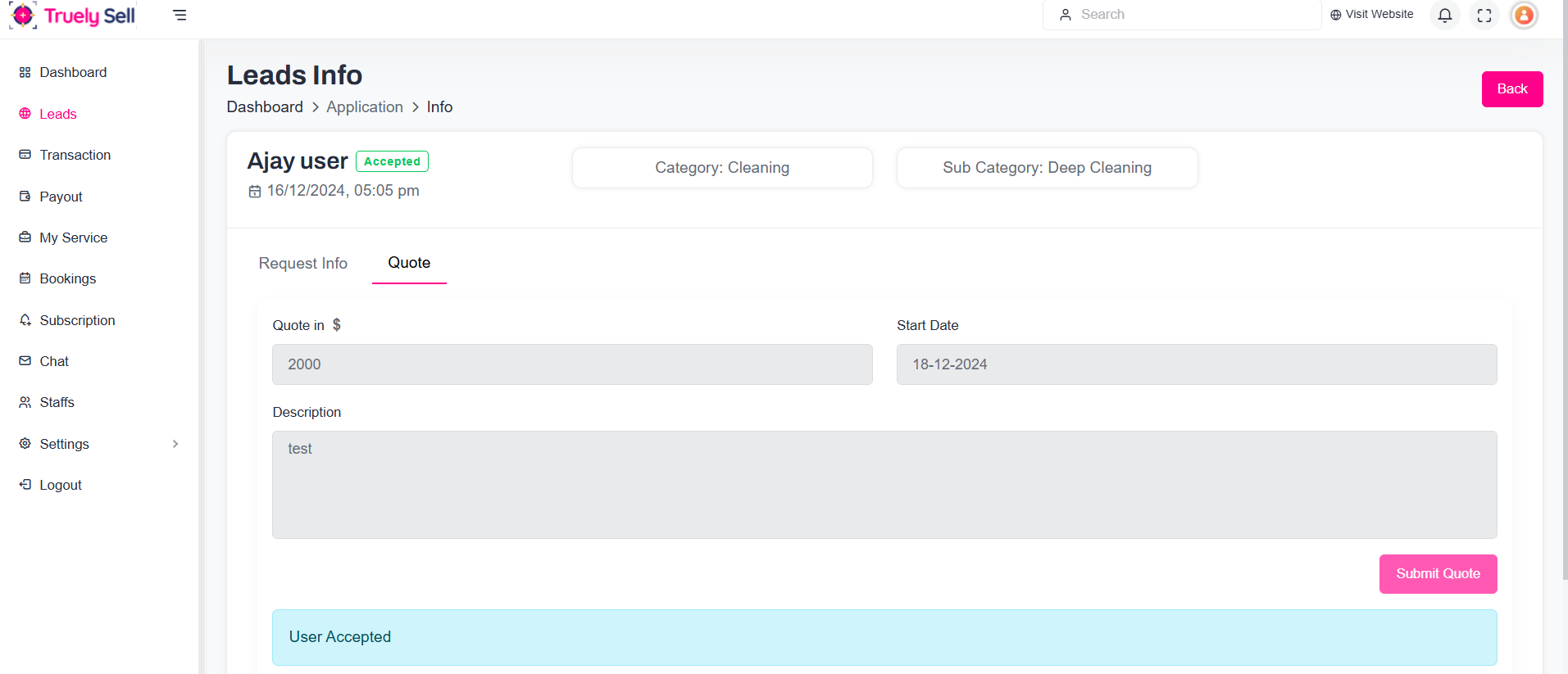
Purpose:
The code represents a form for submitting a provider quote, with fields for entering the quote amount, start date, and a description. Each field is validated, and error messages are displayed if any field is incorrectly filled. The form includes a submit button to send the data.
Layout:
The form is structured in a two-column layout for larger screens, with fields for the quote amount and start date positioned side by side.
The description field spans the full width beneath the other fields.
The submit button is aligned to the right for consistent action placement.
Responsive Design:
The layout uses Bootstrap's grid system (via col-md-6) to ensure responsiveness. On smaller screens, the form fields stack vertically, ensuring readability. The form is mobile-friendly, and the text
Purpose:
This code dynamically generates a responsive card to display task-related details, such as the provider name, creation date, category, and status. It includes an action link (View) for further details, making it ideal for task management or leads tracking.
Layout:
The card uses Bootstrap's grid for structured alignment. It consists of:
Left Section: Displays the avatar, provider name, and creation date.
Right Section: Shows the category, status badge, and a "View" link for interaction.
Responsive Design:
The layout adjusts to screen sizes, stacking elements vertically on smaller screens while maintaining horizontal alignment on larger devices. Padding , spacing , and responsive text ensure readability and usability across devices.
Purpose:
This code generates a detailed lead management card featuring user information, status, category, and sub-category. It includes navigation tabs to organize "Request Info," "Provider" lists, and "Notes," enhancing usability for tracking and managing leads.
Layout:
The layout uses a Bootstrap grid to divide content into structured sections:
Top Row: Displays user details, category, sub-category, and a "Back" button.
Tabs: Organizes lead details (Request Info, Providers, Notes). Sub-tabs within "Provider" categorize leads as "New," "Accepted," or "Rejected."
Responsive Design:
The design adapts seamlessly to varying screen sizes, ensuring horizontal content alignment on larger screens and vertical stacking on smaller devices. Bootstrap classes ensure responsiveness and spacing.
Purpose:
The code defines a provider card layout that displays essential details of a provider's quote submission. It includes the provider's name, category, quote details (quote amount, start date, and description), and a status badge. The view button allows the user to view more detailed information about the quote. The design also handles dynamic data display, ensuring that missing values are replaced with "N/A."
Layout:
Top Section: Displays the provider's name, category, and status with actions (view button).
Details Section: Displays quote information (quote amount, start date, description) in a collapsible panel.
Responsive Design:
The layout uses a flexbox approach for alignment, ensuring the content adjusts based on screen size. On smaller screens, elements stack naturally, maintaining readability and accessibility. The w-50 class ensures the content remains balanced, while the use of Bootstrap's grid system ensures responsiveness.
Please note that our respond can take up to 2 business days.
- Availability to answer questions, Answering technical questions about item’s features, Assistance with reported bugs and issues, Help with included 3rd party assets.
- Any customization request will be ignored.
- Please make sure to read more about the support policy.
If this documentation does not address your questions, please feel free to contact us via email at Item Support Page
We are in the GMT+5:30 time zone and typically respond to inquiries on weekdays within 12-24 hours. Please note that in rare cases, the response time may extend to 48 hours, especially during holiday seasons.
We strive to offer top-notch support, but it's only available to verified buyers and for template-related issues such as bugs and errors. Custom changes and third-party module setups are not covered.
Don’t forget to Rate truelysell!
truelysell is developed by Dreams Technologies and is available under both Envato Extended & Regular License options.
Regular License
Usage by either yourself or a single client is permitted for a single end product, provided that end users are not subject to any charges.
Extended License
For use by you or one client in a single end product for which end users may be charged.
What are the main differences between the Regular License and the Extended License?
If you operate as a freelancer or agency, you have the option to acquire the Extended License, which permits you to utilize the item across multiple projects on behalf of your clients.
Do you need a customized application for your business?
If you need a customized application for your business depends on your specific requirements and goals, Please contact us.
Customization can be the key to success, ensuring your project perfectly aligns with your unique goals and requirements.
Don't Miss Out on the Benefits of Customization!
Unlock the potential of your project. It's time to ensure that your project isn't just another cookie-cutter solution but a truly unique and effective one.
Discover how customization can make a difference in your project's success. Let's create a solution that's as unique as your vision!
- We'll tailor the application to meet your specific needs and preferences.
- We will upload your website to the server and ensure it is live.
- Added Support for AWS S3 Storage and Azure Storage
- Added Wishlist functionality
- Enhanced Home Page Banner Section: Added typed text animation and admin-controlled show/hide options for floating labels, search box, and badge counts (Admin → Content → Pages → Sections → Banner One → Edit)
- Added Provider Approve/Reject option
- Fixed “Hour” field displayed for all price types in provider services (Create and Edit)
- Fixed End time selection issue in provider services (Create and Edit) when price type is Fixed, Square Meter, or Square Feet
- Added Provider - Reschedule and cancel settings
- Added User - Bookings reschedule
- Added Whatsapp - chat
- Added Chatbot
- Added Provider - Promote option
- Added Service - Promote option
- Added Admin - Clear cache
- Added Recurring Subscription - Stripe and Paypal
- Update OTP - Email and Booking logical change
- Added Provider - Badge and Featured option
- Added Provider - Profile URL generation
- Added Provider - Approval notification
- Added Provider - Documents upload on the profile page
- Added Address autofill - Geolocation based address autofill for the user, provider and the admin
- Updated COD - Payout calculation issue fixing
- Added Bank Transfer for subscription
- Added Bank Transfer for service booking
- Update Service provider - staff - Email notifications
- Added Integrated social media links and sharing functionality
- Added Google Maps Location API integration
- Added Booking and email notifications configured successfully
- Added Admin panel enhancements: Provider and Service approval options are added
- Bugs General bug fixes and performance improvements
- Added MQTT Chat
- Update Ehnanced the Category and Sub-category as a user-friendly
- Bugs Resolved the issues based on the language and the currency
- Updated User - Easy appointment slot booking
- Updated Provider - Add locations, staff, and services based on location and staff.
- Updated Provider - Manage roles and permissions.
- Updated Features - ChatGPT support for service content search.
- Updated Features - Payment gateway integration (Mollie and Cash on Delivery).
- Updated Features - Database backup.

Thank You
Thank you once again for downloading truelysell.
We hope you're enjoying your experience, and we kindly request that you take a moment to share your valuable review and rating with us.